Monochrome Logo Branding on Umbrellas for Clean Retail Presentation
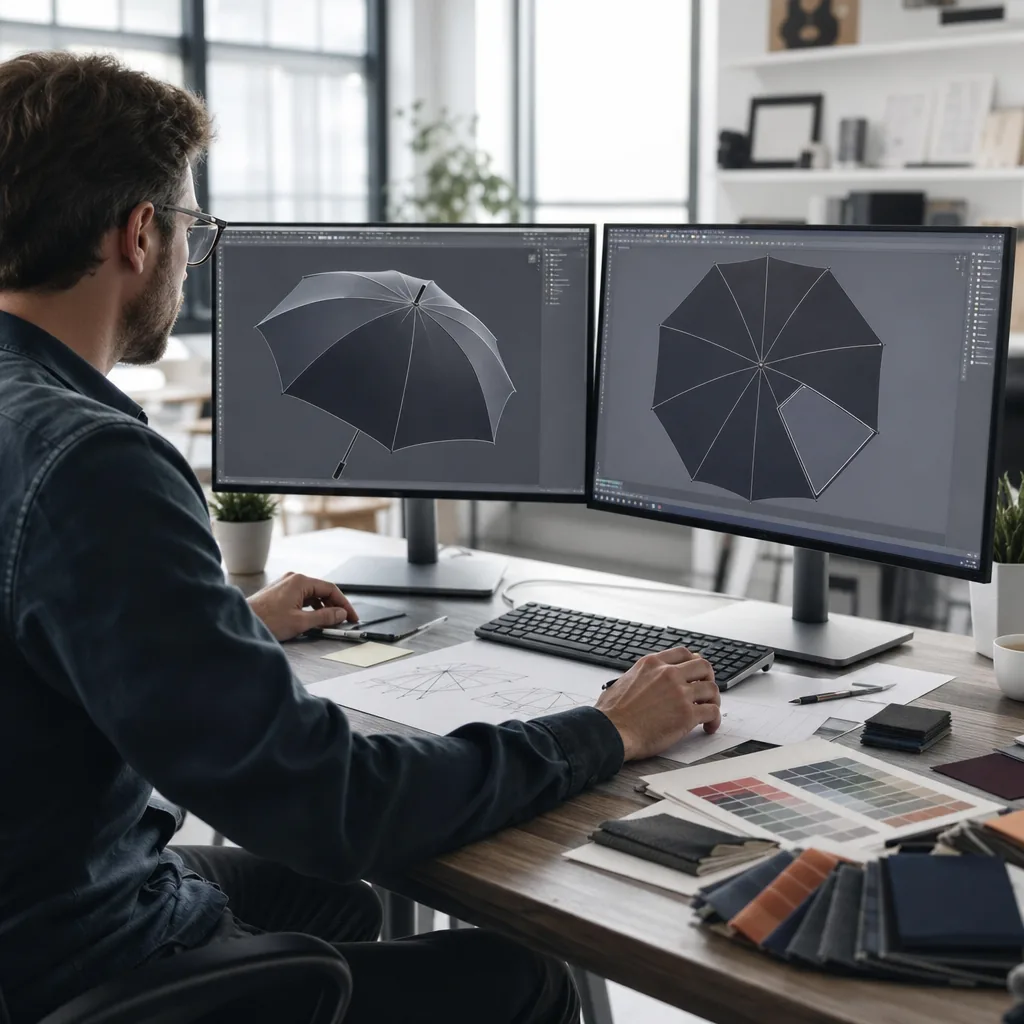
For retailers, a logo on an umbrella has to read cleanly at arm’s length, stay consistent across canopy colors, and survive the realities of wet fabric, seam placement, and curved panels. A monochrome umbrella logo often solves those problems better than a full-color print because it gives sharper contrast, faster visual recognition, and more predictable production results when the artwork is small or the budget is tight.
Why one-color branding can outperform multicolor designs
A monochrome umbrella logo usually outperforms a full-color mark because the canopy is curved, segmented, and constantly moving. On 21" to 30" umbrellas, especially 8K and 10K fiberglass frames, panel tension and seam breakpoints can distort fine details; a one-color umbrella branding layout keeps strokes, letterforms, and icons more readable from across a store aisle and at an angle. That is a practical advantage in retail umbrella decoration, where shoppers make fast decisions based on shelf impact, not close inspection. Production is simpler as well: one screen or transfer layer, one ink mix, fewer registration errors, and less risk of a mismatched rerun on tight MOQ programs. For buyers, that usually means lower setup complexity, steadier color control, and fewer rejected samples before bulk approval.
The strongest results come from high-contrast pairings matched to the canopy material. Bold black on white or light silver POE canopies gives a sharp, premium read for retail display, while white on navy, forest green, or charcoal pongee 190T delivers strong logo contrast on umbrellas without looking busy. On UV-coated canopies, a single-color mark also works well because the surface already has a technical finish; the print only needs to stay crisp, not compete with the base cloth. Metallic-like single-color prints, such as silver or gold ink, are useful when a brand wants a more polished retail umbrella decoration style without moving into multicolor artwork. These choices keep branded umbrella artwork cleaner and easier to scan whether the product is open, closed, or hanging on a display wall.
The same approach reduces risk across different umbrella constructions. Auto-open-close models, double-canopy vented windproof styles, and EVA or PVC rain umbrellas all respond differently to heat, pressure, and curing, so limiting the decoration to one ink color makes sample approval and bulk production more predictable. A white print is usually the safest option on black or other dark solid canopies; black typically gives the strongest read on pale fabrics and UV-coated materials. In export programs, it is standard to confirm print method, fabric weight, and canopy color before sampling, because a clean monochrome umbrella logo often survives folding, warehouse abrasion, and repeated handling better than a layered multicolor design. For buyers balancing cost, durability, and turnaround time, that usually makes one-color artwork the lower-risk choice.
Color contrast rules for different canopy shades
A monochrome umbrella logo needs enough value contrast to stay legible through canopy color, fabric texture, and coating sheen. On white, ivory, or pale gray 190T/210T pongee, black or charcoal artwork usually gives the cleanest edge definition and the lowest risk of fill-in. On black, navy, forest green, and other dark canopies, white ink or a high-opacity silver print is the practical choice, but the press must lay down enough ink to hold opacity after curing and panel sewing. For retail umbrella decoration, judge the mark at 1 to 2 meters under store lighting, not only on a screen. A contrast target of roughly 70% value separation is a good production screen: lower than that, the logo often blends into the weave, sheen, or panel seams and reads as generic color noise instead of a mark.
Transparent POE canopies behave differently because the background comes from the environment behind the umbrella. One-color umbrella branding can look crisp on clear film with moderate ink density, but thin strokes, small type, and tight spacing are vulnerable where ribs, stretch points, and panel curvature distort the image. Patterned canopies are harder still: stripes, checks, and camouflage reduce logo contrast on umbrellas by breaking up counters and weakening outline clarity, so branded umbrella artwork should use thicker strokes, simpler shapes, and fewer fine details. UPF 50+ coated fabrics add another variable because the coating changes surface reflectance and how ink sits on polyester or pongee. That can mute dark inks on light canopies and flatten bright inks on dark ones, so approve from a coated strike-off under retail lighting. A PDF proof cannot show how the finished umbrella will read in hand or on display.
Production methods that handle monochrome logos efficiently
Screen printing is usually the most cost-efficient method for a monochrome umbrella logo when the artwork is fixed and the order is large enough to spread setup over volume. A single screen, one ink color, and one registration pass keep labor and waste low on 1,000-piece-plus programs, especially for 21", 23", 27", and 30" umbrellas with a consistent panel placement. On pongee 190T or 210T canopies, the process gives stable repeatability for solid wordmarks and simple icons, and one-color umbrella branding reduces prepress checks, ink matching, and approval loops before bulk production. For retail umbrella decoration, that usually means lower unit cost, fewer sampling revisions, and less schedule risk when the buyer needs the same result across a full shipment.
Digital printing is better when branded umbrella artwork changes often, includes fine line work, or has variable placement across SKUs, but for a true monochrome umbrella logo it is often harder to justify on cost. It removes screen-making and can speed sample turnaround, which helps short runs and mixed programs, yet the per-piece price is usually higher than screen printing for high-volume orders. Transfer sits between the two: it gives sharper edges than direct screen print in some cases and works well for small panels, sleeve labels, and accessory patches, but it adds its own film and heat-press steps. Because the artwork is single-color, proofing is simpler, logo contrast on umbrellas is easier to judge, and fewer colors can cut approval steps and lead time for fixed-calendar orders. For buyers, the main tradeoff is straightforward: screen print for lowest cost and repeatability, digital for flexibility, transfer for tighter detail on smaller applications.
Brand use cases for retail, hospitality, and promotions
Monochrome branding fits best when the umbrella supports an existing brand system: hotel lobby service, store merchandise, museum retail, cosmetics counters, fashion retail, and corporate reception use. In those settings, the mark must read cleanly from 3 to 5 meters without turning the canopy into a promotional billboard. A monochrome umbrella logo usually works better than full-color artwork on black, navy, stone, white, or ecru 190T/210T pongee because the buyer controls contrast, placement, and ink behavior with fewer variables. For hotels and hospitality groups, the practical build is often a 23" or 27" straight umbrella with 8K fiberglass ribs, auto-open shaft, and a matte black J handle or color-matched rubberized handle. Screen print handles most one-color umbrella branding on pongee; heat transfer is better for tighter details. Both reduce registration risk because production controls one ink deposit instead of stacking colors across seams, panel tension, and curved fabric.
Retail umbrella decoration looks more premium when it matches the restraint of the store identity. Brands already using black-on-white, white-on-black, tonal packaging, or uniform staff presentation usually lose consistency when they force multicolor canopy graphics into the line. Strong programs start with canopy color: white print on black 210T pongee, black print on ecru, or charcoal on light gray when the goal is quieter logo contrast on umbrellas. The format also affects cost and sell-through. A 21" folding umbrella works for checkout merchandise and travel-friendly retail bins; a 30" golf umbrella suits storefront use, VIP service, and outdoor brand visibility. Buyers also get faster approvals because strike-offs are easier to judge, and repeat POs stay more stable when the same Pantone black, white, or gray is carried across seasons instead of recalibrating multicolor artwork for every order.
For event giveaways and corporate gifts, one-color branded umbrella artwork is the practical choice when budget, launch date, and audience range matter. A 3,000-piece campaign using manual 21" foldables or auto-open-close 23" compacts can move faster because setup is simpler, print waste is lower, and carton assorting stays straightforward. At ZheBrella, we usually recommend a monochrome umbrella logo when the delivery term is FOB or DDP with a fixed event date, or when the umbrella must sit beside uniform items such as tote bags, notebooks, jackets, or hotel amenities. It also fits premium gifting better than busy promotional layouts: a subtle white mark on a black double-canopy vented windproof frame, or a blind-debossed handle paired with one-color canopy print, gives the buyer cleaner presentation with less production risk.
Artwork and QC points that protect the final look
Most artwork failures on umbrellas come from thin one-color marks, not complex full-color graphics. For a monochrome umbrella logo, set positive strokes at 0.35 mm minimum for screen printing on 190T or 210T pongee; use 0.5 mm when a water-repellent or Teflon-coated canopy may limit ink flow. Reversed detail needs more clearance because the fabric color must remain open inside the printed area: 0.6-0.8 mm after curing is a practical floor. Treat taglines and legal copy differently from paper packaging. Below 6 pt, many fonts clog on woven canopy fabric, especially near rib seams where panel tension changes. Keep counters open in A, O, P, and R, remove hairline icons, and leave enough negative space around the mark so one-color umbrella branding stays readable after ink spread, drying, folding, and handling.
Check logo contrast on the actual canopy material, not only on a PDF or digital mockup. Black on navy pongee, white on silver UV coating, and dark gray on bottle green can pass on screen but lose visibility under retail lighting. For retail umbrella decoration, approve a physical strike-off on the selected fabric, printed at final size on the real panel curve before bulk cutting. Judge edge sharpness only after drying or heat setting, when bleeding, pinholes, uneven opacity, and weak coverage become visible. POE, PVC, and EVA clear umbrellas need a separate adhesion check because the wrong ink system can scratch, lift, or lose definition even when the first print looks clean. The buyer should be able to read the mark from 2-3 meters on a shop floor; if contrast or edge quality fails at that distance, revise the artwork before production.
QC must control placement as tightly as print quality. ZheBrella locks a signed pre-production sample showing panel position, distance from tip, distance from seam, logo orientation, ink color reference, and allowed tolerance before bulk production starts. On a 23-inch straight umbrella, 5-8 mm of placement drift can look uneven when units hang together on a retail rack; on 21-inch folding umbrellas, tolerance often needs to be tighter because the visible panel area is smaller. During AQL 2.5 inspection, pull samples across cartons instead of checking only the top layer. Inspect for skewed artwork, inconsistent opacity, cracked ink, dirty transfer edges, clogged letters, fuzzy edges, and batch-to-batch placement mismatch. Sample approval, batch reference photos, and carton-level random checks reduce the risk that a monochrome umbrella logo looks clean on one carton but inconsistent across the shipment.
Frequently Asked Questions
Is monochrome branding cheaper than full-color printing on umbrellas?
Often yes, because it can reduce plate or setup complexity and simplify production. The exact savings depend on print method, logo size, and order quantity.
Does a one-color logo always look premium on umbrellas?
Not always, but it often looks cleaner and more retail-friendly when the artwork has strong shape and contrast. It works best when the brand wants a restrained, high-clarity look rather than a decorative one.
When is a one-color umbrella logo better than a full-color print?
A one-color logo is usually better for retail umbrellas when the brand needs clean shelf presentation, strong contrast, and consistent reproduction across fabric colors. It is especially practical for screen printing because solid artwork prints more reliably than gradients or fine multi-color details.
What artwork files are needed for monochrome umbrella branding?
Vector files such as AI, EPS, or PDF are preferred, with all text outlined and the logo supplied as a true one-color design. Buyers should also provide Pantone or standard color references for both the fabric and print color to confirm contrast before sampling.
What are the common production limits for single-color umbrella logos?
Most factories recommend avoiding very thin lines below about 0.3 mm and small text under 6-8 pt because umbrella fabric texture can reduce sharpness. For OEM orders, a physical pre-production sample is usually made before bulk production, with typical sampling taking 5-10 days depending on materials and print setup.
Looking to Launch Your Custom Umbrella Line?
ZheBrella is a Zhejiang-based OEM/ODM umbrella manufacturer with 17 years of export experience. Free design, low MOQ from 100 pieces, windproof construction, full-color print.
Get Free Quote Now »People Also Search For
Related Articles
Artwork Setup Rules for Clean Umbrella Branding Results
Get practical artwork setup rules for umbrellas, including bleed, panel alignment, safe zones, and production tolerances...
Read More »
Branded Umbrella Decoration for Corporate Gifts and Resale
Compare decoration choices for corporate gift and retail umbrellas, including print placement, finishes, packaging tie-i...
Read More »
Custom Umbrella Sleeve Printing for Stronger Brand Presentation
Plan branded umbrella sleeves that look consistent with the canopy, control print quality, and fit procurement targets f...
Read More »