How Fabric Choice Changes Logo Sharpness on Custom Umbrellas
A logo can look crisp in a proof and soft on the finished umbrella if the canopy fabric is wrong. At the factory floor, the difference often comes down to weave density, coating, and how the ink sits on the surface, which is why umbrella fabric for printing matters as much as the artwork itself. Choosing between 190T, 210T, and other materials affects sharpness, color visibility, and how reliably the print holds through production.
Why fabric weave changes printed logo definition
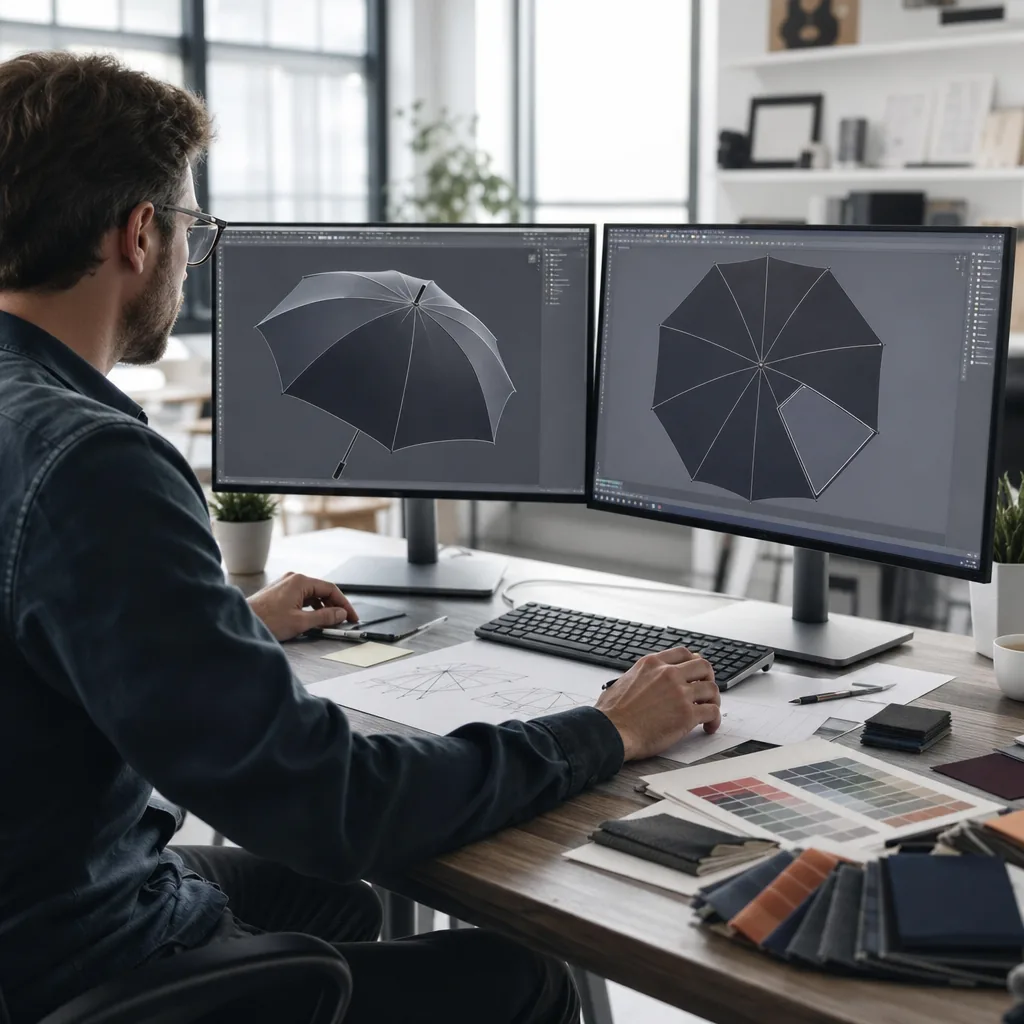
The first thing that changes logo sharpness umbrellas is not the ink, it is the cloth structure under it. On a printed umbrella canopy, the weave acts like a tiny grid: if the yarns are thick and the gaps are uneven, the edge of a logo can break up or feather before the ink fully settles. That is why umbrella fabric for printing is not judged only by color or hand feel. The coating matters too. A PU or silver backing can reduce strike-through and keep the print on the top surface, while a rougher coating can make fine lines look slightly ragged. In our standard practice at ZheBrella, we check weave consistency, coating weight, and surface tension before approving art with thin strokes or small text.
Between pongee 190T 210T, the 210T version usually gives cleaner definition because the yarn count is tighter and the surface is more uniform. On 190T pongee, simple logos and bold letters usually print fine, but small serifs, hairline borders, and tight registration in brand graphics umbrellas can start to blur at the edges. That is not a color issue, it is a dot gain issue: the ink lands, spreads a little along the weave, and makes the line wider than the art file intended. With 210T, the tighter construction reduces that spread, so you get better edge control and more stable halftones. If the artwork has gradients or very small type, the difference is visible immediately under normal viewing distance.
Yarn thickness also changes how much detail survives after curing and repeated folding. Thicker yarns create deeper texture, so the print sits across peaks and valleys rather than on a flat plane; that can make a black outline look uneven and a white knock-out look less crisp. A tighter printed umbrella canopy with finer yarn and stable coating gives better ink holdout, which is why small badges, thin outlines, and dense QR-style elements usually perform better on 210T than on 190T. For customer artwork, I usually advise matching the fabric to the weakest detail in the file, not the largest shape. If the design is mostly blocks of color, 190T is acceptable. If the job depends on precise edges, 210T is the safer umbrella fabric for printing.
Best fabric choices for solid logos and fine text
For solid one-color logos, 190T pongee is usually the safest umbrella fabric for printing because the surface is tight enough to hold clean edges without making the canopy feel heavy. A bold mark, a large wordmark, or a simple icon will stay readable on a printed umbrella canopy even when the umbrella is curved and moving in the wind. If the logo has thick strokes and generous spacing, 190T pongee gives predictable ink laydown for screen printing and heat transfer, and it is less likely to show the minor waviness you see on looser fabrics. ZheBrella’s standard practice is to test artwork at full canopy scale, not on flat proofs, because logo sharpness umbrellas are affected by the panel seams and the arc of the frame as much as by the ink itself.
When the design includes small type, thin lines, or fine registration, 210T pongee is the better choice. The denser weave gives a flatter visual field and improves edge definition, especially for brand graphics umbrellas that need to be read from several meters away at a trade show, stadium queue, or sidewalk promotion. That extra density does not magically fix tiny text, though; if letters are too small, they will still fill in after stitching and panel tension. As a rule, bold one-color marks stay clean at much smaller sizes than multi-color artwork, but fine serif fonts and hairline details need more safety margin on the mockup and at least 3 to 5 mm of stroke weight in production. For buyers comparing umbrella fabric for printing, 210T is the better starting point when the logo has any detail you cannot afford to lose.
POE, PVC, and EVA can work for budget umbrellas, but they are weaker choices when the priority is crisp branding. They tend to show more surface texture, glare, or distortion, which hurts logo sharpness umbrellas once the canopy is opened and viewed at an angle. For readable branding from a distance, keep the art simple: one or two colors, no gradients unless you are using high-quality sublimation, and enough negative space around letters so the viewer does not need to study the panel. If the brief calls for small regulatory text, sponsor lists, or multiple logos on one panel, ask for a strike-off or sewn sample before mass production. That is the fastest way to confirm whether the umbrella fabric for printing matches the artwork, instead of discovering too late that a printed umbrella canopy looks acceptable flat but fails when assembled and tensioned.
How waterproof coatings and UV finishes affect color appearance
The first thing that changes logo sharpness umbrellas is not the ink, it is the surface you print on. On umbrella fabric for printing, a tighter face like pongee 210T gives cleaner edge definition than a looser 190T weave because the yarn gaps are smaller and the ink sits more evenly. Once you add a waterproof coating, that picture changes again: a smooth PU or TPU back-coating tends to make brand graphics umbrellas look denser and more uniform, while a rougher DWR finish can break up fine strokes and soften small type. In practice, a printed umbrella canopy with a very glossy film will show stronger saturation, but it can also create specular glare that makes the logo look less crisp at an angle.
Matte versus glossy is not a style choice only; it changes how the eye reads color. Matte finishes scatter daylight, so the printed area looks flatter, darker, and usually more stable from different viewing angles. Glossy coatings bounce light back and can make red, blue, or black seem richer, but they also expose registration errors, halftone grain, and weak borders more easily. This is why the same artwork can look sharp in a sample photo and slightly washed out on the production umbrella fabric for printing once it is held outdoors. At ZheBrella, we usually test the same file on pongee 190T and 210T before approving a run, because logo sharpness umbrellas depends as much on reflectivity as on thread count.
Daylight is the real test for color appearance. Under direct sun, UV and visible light together can make a printed umbrella canopy look either more vivid or more muted depending on the coating stack. UPF 50+ treatments often use dense pigment, silver backing, or UV-absorbing layers, and those layers usually increase perceived color density and contrast because less light passes through the cloth. The tradeoff is that some light brand colors lose brightness and shift cooler, especially on white, yellow, or pastel artwork. If the brief is brand graphics umbrellas with small text, the safest path is a low-gloss finish, a tight weave, and a UV treatment that blocks transmission without adding a heavy mirror-like sheen.
Matching fabric to umbrella structure and use case
The fabric choice changes logo sharpness as much as the print method. For umbrella fabric for printing, pongee 190T is the baseline because the weave is tight enough to hold fine edges without looking plasticky, and 210T gives a slightly denser surface that usually improves crispness on small type, thin rules, and gradient marks. On cheap polyester, the weave opens up and the ink bridges unevenly, so brand graphics umbrellas lose edge definition fast. In practice, I look at thread count, coating, and hand feel together: a smoother 190T pongee with a proper water-repellent finish will reproduce a cleaner printed umbrella canopy than a thicker but rougher fabric that drinks ink or shows pinholes after curing.
Frame structure matters because the canopy does not sit the same way on every build. Fiberglass ribs flex more consistently than steel ribs, which helps the cloth recover after gusts, so the print stays flatter and logo sharpness umbrellas can hold up better in use. An 8K frame has wider panel spans and more visible curvature, so logos placed too close to the seam can distort when the panel is tensioned. A 16K construction reduces the panel size and usually gives a flatter visual field, which is better for detailed brand graphics umbrellas, but it also means registration has to be tighter because you are repeating the image across more panels. The real issue is not just print quality; it is how the fabric stretches during sewing and final opening.
Windproof double-canopy models need different art placement because the top and bottom layers move independently when the umbrella vents in strong wind. If you print across the vent line or put a large solid block near the seam, the design can buckle, split visually, or show mismatched alignment when the canopy opens under load. On these models, I usually keep the main mark centered on the lower panel area and avoid crossing the vent opening, especially on larger 23 inch and 27 inch frames where movement is more noticeable. That is one reason we test umbrella fabric for printing on the actual structure, not just as loose yardage. The same ink and fabric can look clean on a straight steel frame but appear warped on a double-canopy fiberglass build if the placement ignores panel tension and airflow paths.
What to request in a pre-production sample
Request a production-like sample, not a showroom piece. For umbrella fabric for printing, the buyer should specify the exact canopy cloth, usually pongee 190T or 210T, the print method, ink system, and panel count before anyone starts cutting. The sample check must judge logo sharpness umbrellas by the actual printed umbrella canopy, not by a flat swatch. Ask for close-up photos and a physical sample under daylight and 5000K light so you can see edge bleed, halftone loss, and whether thin strokes hold on curved panels. If the artwork includes small type, reverse knockouts, or gradients, those must be tested on the same fabric, because brand graphics umbrellas often look fine on paper and fail on woven cloth. The sample should also confirm the final panel layout, seam positions, and the exact center point of the logo so the repeat lands where the buyer approved it.
The second check is color density and registration across the whole canopy, not just one panel. Ask for Pantone targets, then verify whether the ink sits opaque enough on dark fabric and whether a white underbase is needed for the chosen umbrella fabric for printing. On pongee 190T, fine detail usually survives better than on looser weaves, but 210T can still shift slightly if curing temperature or tension is off, so the sample should be folded and opened several times before approval. Inspect seam alignment at every rib line, because a good printed umbrella canopy can still be rejected if the graphic drifts over the stitch. Folding marks matter too: after one open-close cycle, the print should not show permanent whitening, cracking, or crease distortion. For brand graphics umbrellas, the sample should be judged in the same way the mass run will be judged, with no “sample-only” exceptions.
Approval should be tied to a written AQL 2.5 standard, not a vague “looks good” note. Define critical defects as wrong logo placement, obvious color mismatch, broken seams, or heavy print misregistration; major defects include weak color density, blurred edges, and folding marks that damage the artwork; minor defects are small cosmetic issues outside the main graphic area. The sample should be signed off against those rules, with one retained master sample and one photo record showing panel-by-panel checks. For delivery planning, FOB orders usually move faster once the sample is approved, while DDP schedules need extra time for carton labeling, customs data, and final-mile transit. In practice, buyers should expect the sample-to-production handoff to lock the lead time in days before mass cutting starts, because any change after approval resets the clock. That is the only way to keep the printed umbrella canopy consistent from pilot piece to shipment.
Frequently Asked Questions
Is 210T pongee always better than 190T for branding?
Not always. 210T can improve print definition and hand feel, but 190T is often sufficient for standard logos and can reduce cost on large promotional runs.
Will a darker canopy make logos harder to see?
Yes, especially for light inks with low opacity. On dark canopies, buyers should ask for underbase printing or higher-contrast colors to keep the logo readable after the umbrella is folded and used outdoors.
Does 210T fabric always print sharper than 190T on custom umbrellas?
Usually yes, but the difference is modest. 210T has a slightly tighter weave, so small text and thin logo lines often look cleaner, especially on dark colors. Ink type and coating still matter, so a strike-off on the exact fabric is the safest way to confirm sharpness.
What logo details are most likely to blur on printed umbrella canopies?
Very thin strokes, small serif text, and gradients are the first details to lose clarity. As a rule, text under about 6 pt and line weights below 1.5 mm should be checked carefully on a fabric sample before mass production.
What should a buyer ask the factory to confirm before approving umbrella artwork?
Ask for the exact fabric spec, print method, and a physical or photo strike-off on the same canopy material and color. For B2B orders, that sample check usually adds 3-7 days, but it helps avoid blurry logos, color washout, or unexpected edge spread in production.
Looking to Launch Your Custom Umbrella Line?
ZheBrella is a Zhejiang-based OEM/ODM umbrella manufacturer with 17 years of export experience. Free design, low MOQ from 100 pieces, windproof construction, full-color print.
Get Free Quote Now »People Also Search For
Related Articles
Ink, Fabric, and Logo Sharpness on Branded Umbrellas
See how ink choice, fabric weave, and canopy construction affect logo sharpness, wash durability, and consistency across...
Read More »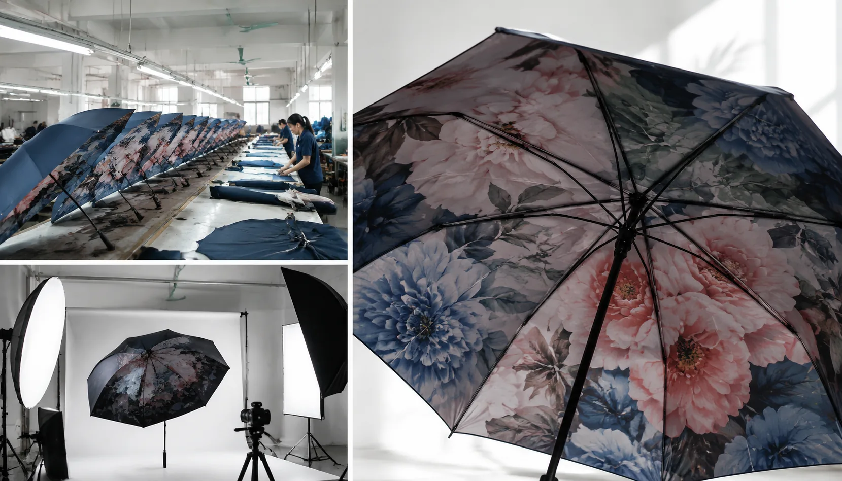
Inside-Canopy Umbrella Printing for Hidden Brand Moments
Design inside-canopy umbrella prints that surprise users while controlling fabric opacity, frame specs, sampling, MOQ, a...
Read More »Brand Color Control for Umbrella Decoration Programs
Keep logo and canopy colors consistent across umbrella orders with practical specs for Pantone targets, fabric limits, a...
Read More »