Umbrella Logo Placement: Design Best Practices for Maximum Impact
Getting umbrella logo placement right is harder than it looks: a mark that reads clearly on a flat screen can disappear once it crosses curved panels, seams, and stitching. Buyers need branding that stays crisp in production, not just in a mockup, because the canopy surface, panel count, and print method all change what the eye sees. From the factory floor, we see the same issue repeatedly: the best results come from planning for structure first, then artwork.
How umbrellas are actually seen
The first mistake in umbrella logo placement is designing for a flat mockup instead of how the umbrella is actually carried. Most people see the canopy from a front three-quarter angle while the user is walking, so the panel facing slightly toward the viewer and the adjacent panel are the best real estate. On a standard 23" or 27" stick umbrella, the shaft blocks the exact centerline, which means a logo placed too close to the pole gets cut up visually even when the print itself is clean. Our standard practice at ZheBrella is to treat the seam lines as hard boundaries and keep the custom umbrella logo centered within one panel, not straddling two panels unless the artwork is intentionally built for that break. That is the core of umbrella logo placement: give the eye one uninterrupted field, not a graphic that fights ribs, stitching, and the runner.
For umbrella branding design, the viewing angle changes with the mechanism and canopy size. A manual 8K or 10K compact umbrella is usually seen at waist height in crowds, where lower-panel graphics disappear into hands, sleeves, and bags; a golf umbrella with a 16K frame sits higher and gives you a much cleaner read from across a parking lot or entrance queue. Double-canopy vented models also change the canvas because the upper vent hides part of the lower edge when the wind opens the crown, so the safest print zone is the mid-panel area away from the vent line. If you want a custom umbrella logo to be legible at a distance, avoid thin type, small outlines, and busy gradients. A bold mark, one or two colors, and strong contrast beat a complicated umbrella print layout almost every time.
The real question is not where the logo looks best in a presentation file, but where it survives movement, folding, and human behavior. People tilt umbrellas forward in rain, angle them against the wind, and tuck them under one arm when not in use, so the panel that faces outward during carriage is more valuable than the panel that looks centered when opened on a table. On clear POE or PVC canopies, backlighting can make dark artwork read well, but on 190T or 210T pongee you need enough ink density to hold shape without bleeding at the seams. For event programs and retail branding, I usually recommend one primary panel plus a smaller repeat mark on the opposite side if the budget allows; that gives the umbrella logo placement a second chance to be seen when the user turns. Good umbrella print layout follows the viewing path first, decoration second.
One panel, alternating, or full canopy
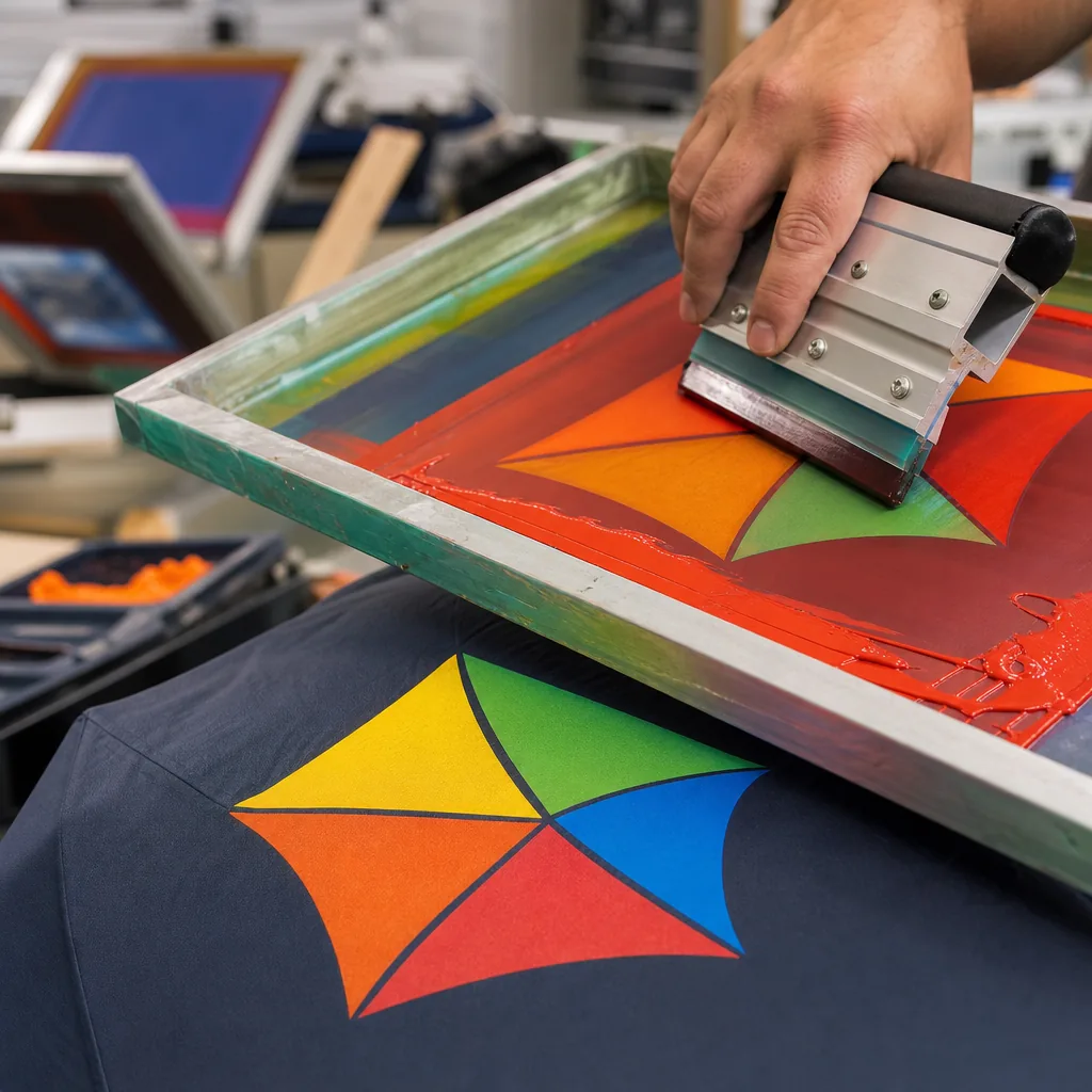
For umbrella logo placement, the cheapest option is usually one panel print on a single gore. It uses the least screen setup, the least ink, and the fastest labor, so it is the best fit for giveaways, tight MOQs, and retail programs where the logo only needs to read from one side. The tradeoff is obvious: once the umbrella turns, the branding disappears. If the canopy is 8K or 10K, a single-panel mark can look fine on a 21" folding umbrella or a 23" stick umbrella, but the artwork has to stay clear of seams, vent cuts, and ribs. In umbrella branding design, a small logo near the lower third usually survives fabrication better than a large centered graphic, because center placement gets interrupted by panel curvature and stitch distortion. Standard practice at ZheBrella is to check the artwork against the actual panel template before quoting, because a logo that looks simple on screen can land awkwardly across a rib line.
Alternating-panel placement costs more, but it gives better visibility and a more deliberate custom umbrella logo presentation. Printing on every other panel increases screen count and setup time, and the cost rises again if the artwork has to be registered across multiple panels, but the result reads from more angles and feels less like an afterthought. This works best on 8K, 10K, or 16K canopies with enough panel width to keep the logo from shrinking into the seam allowance. For umbrella print layout, alternating panels are usually safer than trying to stretch one large design across the full canopy, because each panel can be proofed independently for color density and edge alignment. If the umbrella is a windproof double-canopy style, alternating placement also avoids the vent area and reduces the risk of the print being cut by the opening between layers. That matters more than people expect when the canopy is made from 190T or 210T pongee, where saturated ink can shift slightly after curing.
Full-canopy branding is the highest-impact option and the most expensive, because it needs more ink, more labor, and stricter file preparation. Dye sublimation or all-over transfer can work well on polyester pongee, especially for promotional runs where the artwork is meant to cover most of the surface, but the cost rises fast when you need accurate color matching, multiple print passes, or proofs for each size. It is also less forgiving on manual-open-close folding umbrellas, where the canopy creases repeatedly and can make large areas of print look broken at the fold lines. A full-canopy layout makes sense when the umbrella is part of a brand display, a retail drop, or a campaign where the canopy itself is the message. For plain merchandise orders, it usually costs more than the value it adds. The practical rule is simple: one panel for efficiency, alternating panels for balance, full canopy only when the client is paying for visibility rather than just logo placement.
Designing around panels and seams
The first rule in umbrella logo placement is simple: keep the artwork inside one panel’s safe zone and away from the seam line. On a cut-and-sewn canopy, the panel edge is not a neutral boundary; it is where fabric tension changes, stitching pulls, and the print can warp. For standard 21" and 23" umbrellas, I usually treat the seam allowance and stitch line as no-print territory and keep key text or brand marks centered well inside the panel, not stretched into the gutter. That matters even more on 8K and 10K frames, where panel width is narrow and a logo that looks fine on a flat proof can get pinched once the canopy is tensioned. For umbrella logo placement, a clean single-panel position almost always prints and reads better than trying to force symmetry across multiple panels.
Umbrella branding design should follow the construction, not fight it. If the canopy uses pongee 190T or 210T, the fabric will take ink differently depending on tension, curvature, and coating, so a logo near the edge can look heavier on one side after curing or heat transfer. The same problem shows up on POE, PVC, and EVA canopies, where the material has different stretch and surface memory. The practical fix is to build the umbrella print layout around the panel geometry first, then size the custom umbrella logo to leave margin on all sides. On vented or double-canopy styles, the outer and inner layers also shift relative to each other, so alignment marks and repeating patterns need extra clearance. If the artwork includes fine lines or small type, it should stay farther from seams than a bold icon would.
In production, I usually ask for a vector file and a panel map before approving the layout, because the same logo can need a different safe area on a 16K golf umbrella than on a compact 23" folding model. A screen print with one or two spot colors can tolerate a little more curvature than a full-coverage sublimation image, but both need a seam-aware placement plan if the buyer wants the logo to read cleanly when the umbrella is open from a normal viewing distance. The right rule is to prioritize visibility from 1 to 2 meters away, then verify the art on a mockup that shows panel breaks, not just a flat rectangle. That is the difference between a usable umbrella branding design and a print that looks good in a PDF but fails once the canopy is assembled.
Contrast, size, and legibility
For umbrella logo placement, contrast matters more than decoration. A dark logo on a black 190T pongee canopy disappears the moment the umbrella moves into shade, while a white or high-chroma mark on navy, forest green, or burgundy reads from several meters away. The same rule applies to print method: screen print gives the strongest edge definition for solid shapes, heat transfer is better for tighter multicolor art, and sublimation only stays legible if the underlying fabric is light enough. On a curved panel, thin strokes and small taglines break up fast because the canopy tension distorts the artwork; that is why the umbrella print layout should favor bold marks, clean fills, and simplified text. If the buyer wants the logo to be read by people across a street or in a crowd, the design has to be planned for motion, not for a flat artboard.
Scale is the other half of umbrella branding design, and most failures come from making the mark too polite. On a 21-inch folding umbrella, a logo that looks acceptable in a PDF can collapse into a 45 mm blur once it sits between seams, vents, and rib lines. For distance reading, a single large panel logo usually performs better than scattered small placements, because the eye catches one clear shape instead of searching across six or eight panels. Our standard practice is to size the artwork against the finished canopy diameter, not the open-file size, and to leave enough quiet space around the mark so the copy does not fight the panel curvature. For premium custom umbrella logo work, the safest target is a design that stays readable at 10 to 15 feet, with enough stroke weight to survive stitching, heat, and canopy flex without losing edges.
Combining canopy, handle, and sleeve branding
A coordinated branding system starts with treating the canopy as the primary read, the handle as the tactile identifier, and the sleeve as the pickup point for secondary messaging. For umbrella logo placement, I usually tell buyers to reserve the canopy for the highest-contrast mark, then keep the handle decoration minimal unless the umbrella will be carried open a lot at events or on the street. A 21" or 23" compact with an auto-open-close mechanism usually only has room for one strong canopy hit and a small handle mark, while a 27" or 30" golf style can support a more balanced three-point system. Our standard practice is to align the custom umbrella logo with the panel seams so the artwork does not warp across the ribs, especially on 8K or 10K frames where panel geometry becomes visible quickly.
The umbrella branding design should match the substrate, not fight it. On pongee 190T or 210T, screen print works well for flat solids, while sublimation is better when the client wants gradients or photographic detail; on POE or PVC, ink choice and cure temperature matter more because the film can distort under heat. If the canopy includes a vented double layer or UPF 50+ coating, the print area needs to stay clear of stress points, stitching, and the vent overlap. A clean umbrella print layout usually keeps the main mark centered on one panel or split symmetrically across two adjacent panels only when the artwork is built for that seam break. That is the difference between branding that looks intentional and branding that looks stretched after the first wind test.
Handle and sleeve branding should support recognition, not compete with the canopy. A molded EVA grip, straight wood handle, or rubberized crook each gives a different imprint zone, and the mark there should usually be a logo, wordmark, or short URL rather than a full composition. Sleeves are where you can carry usage instructions, care notes, or a second-color brand lockup without cluttering the open umbrella. For wholesale programs, I recommend one master layout for the canopy and a separate production spec for handle and sleeve so the factory can keep color tolerance, placement, and blank margins consistent across replenishment runs. That matters when you are buying by MOQ, targeting AQL 2.5, and expecting the same look across FOB and DDP shipments with different packing methods.
Frequently Asked Questions
Where should a logo go on a promotional umbrella?
For maximum visibility, place the logo on alternating panels so it reads from multiple angles, or on every panel for full saturation. Keep each logo centered within its panel to avoid seam distortion.
Should an umbrella logo be on one panel or all of them?
A single panel is the most economical and fine for budget runs. Alternating or all-panel placement costs more but dramatically increases how often the brand is seen, which usually justifies the upgrade for marketing.
How much seam allowance should I leave for umbrella logo artwork?
For most canopy prints, allow about 3-5 mm near each seam so the artwork does not lose key details in stitching. If the logo crosses multiple panels, the factory should provide a panel template before finalizing the file.
What is the best file format to send for umbrella logo placement approval?
Vector files such as AI, EPS, or editable PDF are preferred because they keep text and line work sharp at large canopy sizes. A production proof is usually prepared at full panel scale before sampling.
Can a logo be printed on every panel of a golf umbrella?
Yes, but the artwork needs to be set up panel by panel to match the umbrella's rib count, often 8 or 10 panels. Printing every panel increases visual impact, but it also raises setup complexity and can add to sample and production lead time.
Looking to Launch Your Custom Umbrella Line?
ZheBrella is a Zhejiang-based OEM/ODM umbrella manufacturer with 17 years of export experience. Free design, low MOQ from 100 pieces, windproof construction, full-color print.
Get Free Quote Now »People Also Search For
Related Articles
Refined Logo Placement Specs for Branded Umbrella Canopies
Plan logo placement on umbrellas with clear specs for panel size, safe zones, seam breaks, and repeat-order consistency ...
Read More »
Umbrella Logo Placement Guide for Better Brand Visibility
Plan canopy, sleeve, handle, and strap branding with print-size limits, panel layouts, and model selection to improve lo...
Read More »
Umbrella Logo Placement Strategies for Different Brand Goals
Learn how logo placement changes visibility, resale value, and repeat use on branded umbrellas, with print-area and pane...
Read More »