Choosing Logo Colors for Printed Umbrellas Without Losing Contrast
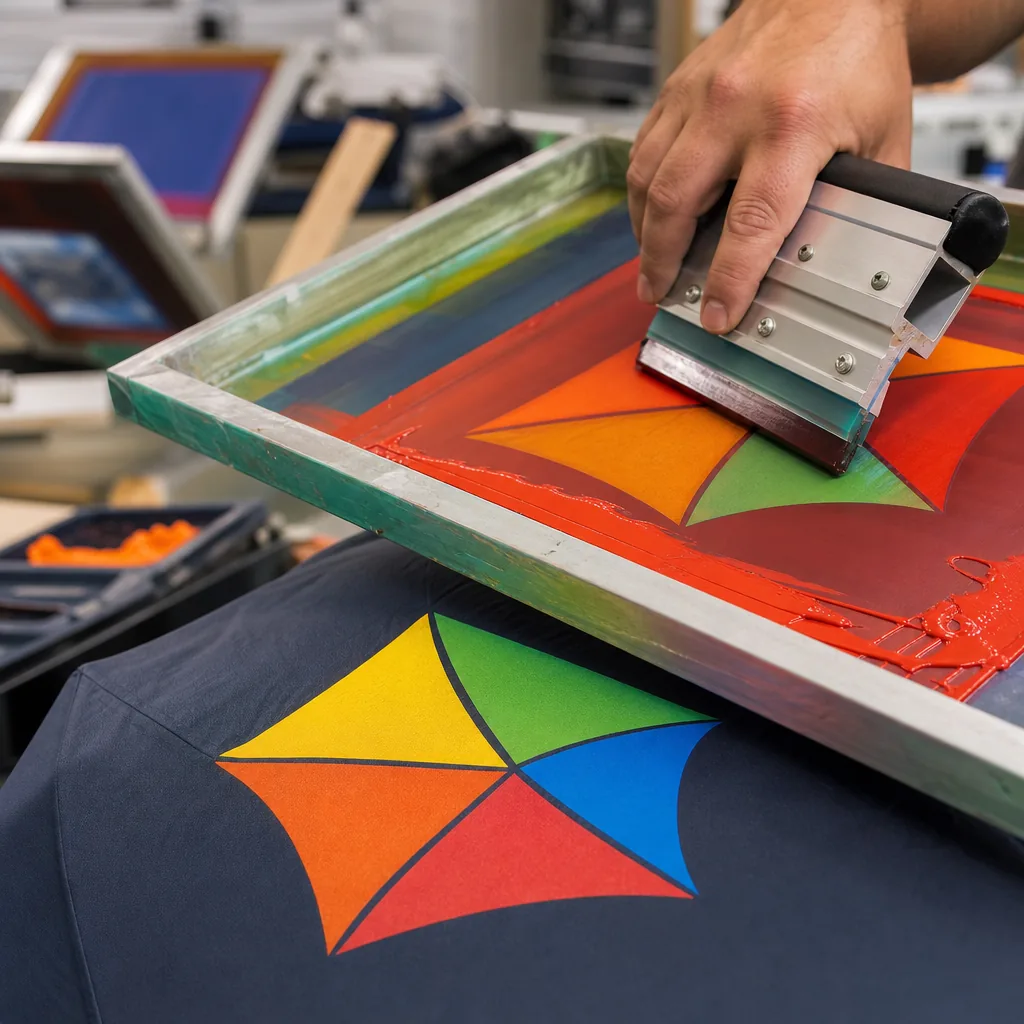
A logo that looks sharp on a screen can disappear once it is printed across wet polyester, curved panels, and alternating canopy colors. On our Songxia factory floor, umbrella logo contrast is checked under real light, on actual fabric, because ink opacity, canopy shade, and panel layout all change readability. For B2B buyers, the goal is simple: keep the brand recognizable at street distance without creating production risks or color surprises.
How canopy color changes logo readability
Canopy color controls logo readability because umbrella fabric is an active background, not a neutral sheet. White 190T pongee reflects enough light for black, navy, or dark green marks to keep a clean edge; the same logo on navy, burgundy, bottle green, or red loses separation because the luminance gap collapses, even when Pantone matching is correct. For reliable umbrella logo contrast, target at least a 60% light-dark difference between the print color and canopy under outdoor daylight, then confirm at finished size. Red can be especially risky: medium blues, greens, and blacks may keep their hue on the fabric but become weak at 10 to 20 meters. White, silver, yellow, and light gray usually read best on dark canopies; dark inks work best on white, yellow, light gray, and selected pastel pongee shades.
Edge clarity is the second control point in branded umbrella printing. Weave texture, water-repellent coating, panel seams, and the curved canopy all reduce the crispness buyers see in a PDF. A 1 mm line, thin serif, small registration mark, or tight gap can break up after screen printing or heat transfer, especially when the canopy flexes open. On 210T pongee, ink normally sits cleaner than on rough budget fabric, but the finished umbrella still needs a viewing test. For a 23 inch straight umbrella, check the open canopy at chest height from 3 meters; for golf umbrellas used at events, test from 8 to 15 meters. When low-contrast corporate colors are required, ZheBrella reviews a printed panel or strike-off before bulk production to reduce approval risk.
Outlines and keylines solve many logo color on canopy problems when the brand color cannot change. A white keyline around a navy logo on red fabric, or a charcoal outline around a yellow logo on white pongee, can restore umbrella logo contrast without changing the core color. Keep keylines production-safe: avoid anything under 1.5 mm for screen print and under 1 mm for heat transfer, because small registration shifts or fabric movement can make the border look uneven. For multicolor marks, separate close Pantone tones with a neutral trap line instead of relying on two similar inks to read on a curved panel. Visibility testing should include the open umbrella outdoors, one photo in shade, one in direct sun, and one view from across a parking lane. If the mark reads without zooming, the color decision is ready for sampling.
One-color, two-color, and full-color logo decisions
Use one-color printing when the buyer needs legibility more than a full brand-manual reproduction. On 23" and 27" umbrellas, each logo prints across curved triangular panels held under tension by 8K or 10K ribs; after cutting, sewing, and opening, thin outlines, tiny registration details, and low-contrast color pairs lose edge sharpness. A white, black, navy, or single Pantone spot color on 190T or 210T pongee usually reads cleaner at 10 meters than a four-color mark that looks correct in a PDF. On black, forest green, burgundy, or other dark canopies, a simplified one-color logo also reduces setup cost, ink buildup, and visible registration faults near panel seams while improving umbrella logo contrast.
Use two-color printing only when the second color has a clear job: separating icon from text, preserving a critical brand accent, or lifting the logo color on canopy fabric that would otherwise mute the mark. Each added screen increases cost and production risk because the print needs separate registration and drying on panels that are already sewn and slightly curved. For branded umbrella printing, ZheBrella reviews samples under daylight and indoor warehouse lighting because a red that looks strong on a white PDF can flatten on royal blue pongee or fade visually on transparent POE or PVC. Pantone matching also depends on substrate: coated polyester holds a sharper edge than EVA, while glossy PVC can shift perceived color through reflection. For two spot colors or tight brand requirements, approve a strike-off before bulk production.
Reserve full-color printing for photo graphics, retail artwork, event designs, and gradients, not standard corporate marks. Heat transfer and sublimation can reproduce more detail than spot-color screen printing, but quality still depends on line weight, panel placement, and base fabric color. Small text below 6 mm, thin gold strokes, and several low-contrast brand colors usually look weaker on a curved umbrella than a simplified mark, reversed white version, or one high-contrast Pantone color. That choice improves umbrella logo contrast and reduces AQL 2.5 inspection issues such as smudging, misalignment, and uneven density. Visibility testing should mean opening the umbrella fully, checking it at arm's length and across a room, reviewing wet fabric when a water-repellent coating is used, and photographing it under normal trade-show or street lighting before bulk approval.
Ink opacity and fabric texture on pongee canopies
Ink opacity should be checked on the actual pongee canopy before bulk branded umbrella printing, because 190T and 210T fabrics take ink differently. A 190T pongee has a more open weave and softer hand, so screen ink can sink into the yarn texture and soften logo edges unless mesh count, squeegee pressure, cure temperature, and flash time are controlled. A 210T pongee is tighter and smoother, which usually gives cleaner definition for small lettering, fine strokes, and multi-part corporate marks. The tradeoff is coating behavior: a slick water-repellent finish can reduce ink bite or reject a heavy ink deposit. For detailed marks, 210T is the safer base; for bold event graphics and one-color imprints, 190T can be cost-effective. Approval should not stop at a Pantone chip or paper drawdown. The logo color on canopy fabric must remain readable after the panel is sewn, tensioned over 8K or 10K ribs, opened, and checked in daylight, showroom LED, and rainy overcast light.
Dark pongee needs a higher-opacity ink system. White, yellow, orange, light blue, and many corporate greens lose chroma on navy, black, burgundy, or forest green unless the ink carries enough titanium dioxide or sits on a white underbase. For reliable umbrella logo contrast, ZheBrella approves a fabric strike-off rather than a Pantone code alone, because Pantone matching on coated polyester is an approximation. A white underbase improves readability, especially on 190T where yarn texture breaks up the printed surface, but it also adds cost, hand feel, and registration risk. On a curved umbrella panel, 1 mm of misregistration can create a visible halo around a clean logo edge. Buyers should treat underbase approval as a cost, durability, and appearance decision, not a simple color correction.
Digital print is more forgiving than screen print when artwork includes gradients, photographic content, or several colors, because it builds tone without separate screens and reduces color-to-color registration problems. On some 210T pongee jobs, it can bridge fabric texture more evenly because the image is applied as a continuous surface rather than isolated spot-color hits. It does not solve every contrast issue: very dark canopies still need a white base layer or an opacity-engineered transfer process. Screen print remains better for simple logos, high-volume orders, and solid Pantone spot colors, but it exposes weak color choices quickly. Medium gray on charcoal may pass a mockup and disappear at 15 feet on a real 23 inch umbrella. Visibility testing should include an opened sample, wet and dry checks, panel rotation under light, and review from normal street distance before mass production.
Testing brand colors on real production materials
Approve color from a strike-off or pre-production sample made on the exact canopy material, not from a PDF mockup or a print on generic white fabric. The same logo color on canopy can shift across 190T pongee, 210T pongee, PVC, POE, and EVA because each surface changes ink absorption, gloss, dot gain, and backlighting. For screen printing, the strike-off must use the planned mesh count, ink system, squeegee pressure, and curing temperature. For heat transfer or sublimation, match the film, release paper, dwell time, and press temperature to the bulk order. A red Pantone that looks clean on coated paper can lose 20-30% visual strength on navy pongee; on transparent POE, it can wash out when light passes through the panel. A valid branded umbrella printing sample should show the final fabric color, logo size, rib shadow position, print method, and panel placement used in production.
Treat Pantone matching as a production target, not a visibility guarantee. Check the approved sample under D65 daylight, then under 4000K office LED and 3000K retail lighting because blues, greens, metallics, and fluorescents can shift sharply by light source. For events, golf, or street promotion, do visibility testing with the umbrella open at normal viewing angles from 10, 30, and 50 feet, not flat on a table. Dark canopies often need a white or light gray underbase to protect umbrella logo contrast; light canopies usually read better with black, navy, red, or high-chroma Pantone colors than with pale corporate tones. At ZheBrella, approved strike-offs are photographed beside the Pantone chip under controlled light and kept as the signed reference for AQL 2.5 inspection, reducing argument when bulk panels are checked against the approved standard.
Use a pre-production sample when the order has tight brand standards, multiple printed panels, or a large logo crossing seams; the extra 5-7 days can prevent bulk rejection. Seam ridges, panel tension, rib pockets, and double-canopy vent construction can distort artwork placed across a stitch line or too close to the panel edge. On 23 inch auto-open promotional umbrellas, keeping the main logo inside one panel reduces alignment risk. On 27 inch and 30 inch golf umbrellas, the larger print area improves readability but makes small Pantone matching errors more visible because the eye sees more color mass. The approval sheet should record canopy fabric, fabric color, Pantone target, print process, logo dimensions, placement from the panel edge, and allowed tolerance. For reliable umbrella logo contrast, approve the worst-case condition: dark canopy, curved panel, indoor light, and normal viewing distance.
Visibility rules for retail, promo, and event use
Set the logo color by viewing distance before approving a Pantone chip. For 21" or 23" giveaway umbrellas handed out at trade show exits, the canopy is usually read from 6 to 15 feet while people are moving, so umbrella logo contrast beats exact brand tone. White, silver, yellow, and light gray screen prints stay legible on black, navy, forest green, burgundy, and other dark 190T pongee canopies; dark blue on black can disappear once rain darkens the fabric. Corporate gifts have a closer read. A 27" golf umbrella for executives is often judged from 3 to 8 feet, where a lower-contrast mark can look intentional if the logo color on canopy is tested on the actual fabric. Retail assortments need the widest range: check open samples under indoor LED light, cloudy daylight, and wet fabric, because rain can darken polyester by roughly half a tone and reduce shelf visibility.
Use reflective, fluorescent, or high-opacity printing when the umbrella must identify people or improve safety. Event crews, road teams, school escorts, race volunteers, and security staff benefit from reflective silver transfer film or opaque screen print on 23" and 27" canopies, especially over black or royal blue panels. In branded umbrella printing, reflective film affects more than color: it changes hand feel, folding behavior, unit cost, and placement limits. Keep it to smaller logos, panel edges, or alternating panels instead of covering a full 16K canopy. For corporate gifts and premium retail, high contrast can still look expensive when the print area is restrained. Matte warm white on charcoal 210T pongee, metallic silver on deep navy, or tonal gloss on black can feel premium if visibility testing confirms the mark reads at the intended distance.
Treat Pantone matching as a production target, not final proof. Fabric texture, base dye, and coatings shift the printed result; UPF 50+ black-out layers, Teflon water-repellent finish, and double-canopy vented construction all change how light reflects from the panel. ZheBrella’s practical rule is to print strike-offs on the actual 190T or 210T pongee, POE, PVC, or EVA canopy material, then check open samples at 10, 20, and 30 feet before bulk production. Retail packaging may justify tighter Pantone matching for close-up photography, while promo distribution usually prioritizes umbrella logo contrast for recognition in a moving crowd. Reduce production risk by approving the strike-off under real viewing conditions, then locking the ink formula, mesh count, curing temperature, and AQL 2.5 inspection criteria before the factory starts the full MOQ run.
Frequently Asked Questions
What logo colors work best on dark umbrellas?
High-contrast colors like white, silver, gold, or bright brand tones usually read best on dark canopies. If the logo is thin or detailed, a keyline or simplified version often improves clarity.
Can a supplier match Pantone exactly on umbrella fabric?
Pantone matching is possible in many cases, but the final result depends on fabric type, print method, and ink system. Buyers should approve a physical sample because coated paper references and fabric output rarely look identical.
What contrast level should we use for logos on dark umbrella canopies?
For dark canopies such as black, navy, or forest green, use white, metallic silver, light gray, or bright Pantone colors with strong separation. Avoid dark red, royal blue, or charcoal logos unless they are outlined in white or printed on a light panel.
Can the factory match our exact Pantone logo color on polyester canopy fabric?
Yes, Pantone matching is common for screen printing, but the final color can shift slightly depending on canopy fabric color, coating, and ink opacity. For large OEM orders, request a printed strike-off sample before mass production; this usually adds about 3-7 days.
How should we handle a full-color logo on mixed-color umbrella panels?
Place the logo on the lightest or most consistent panel when possible, or add a single-color outline/keyline around the mark. For multi-panel umbrellas, many buyers choose one simplified logo color across all panels to keep production cleaner and improve readability from 2-3 meters away.
Looking to Launch Your Custom Umbrella Line?
ZheBrella is a Zhejiang-based OEM/ODM umbrella manufacturer with 17 years of export experience. Free design, low MOQ from 100 pieces, windproof construction, full-color print.
Get Free Quote Now »People Also Search For
Related Articles
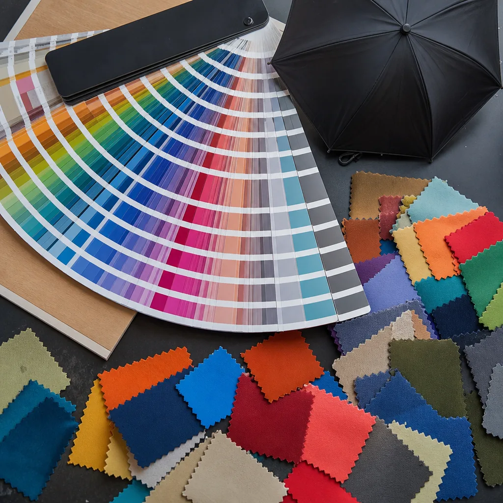
How Canopy Color Changes Logo Visibility on Branded Umbrellas
See how light, dark, and textured canopy colors affect logo contrast, print methods, and proofing so your branding stays...
Read More »
How Umbrella Color Blocking Improves Brand Visibility
See how panel colors, trims, and contrast blocks improve logo visibility on custom umbrellas while keeping brand colors ...
Read More »Brand Color Control for Umbrella Decoration Programs
Keep logo and canopy colors consistent across umbrella orders with practical specs for Pantone targets, fabric limits, a...
Read More »