How Canopy Color Changes Logo Visibility on Branded Umbrellas
Branded umbrellas fail when the logo disappears against the canopy, and the problem usually shows up only after production starts. Light, dark, and textured fabrics all change how ink, film, and embroidery read in daylight, so umbrella logo contrast has to be planned with the final material, print method, and viewing distance in mind. On the factory floor, the difference between a clean mark and a weak one comes down to proofing against the actual canopy, not a screen mockup.
Start with Contrast, Not Just Brand Color
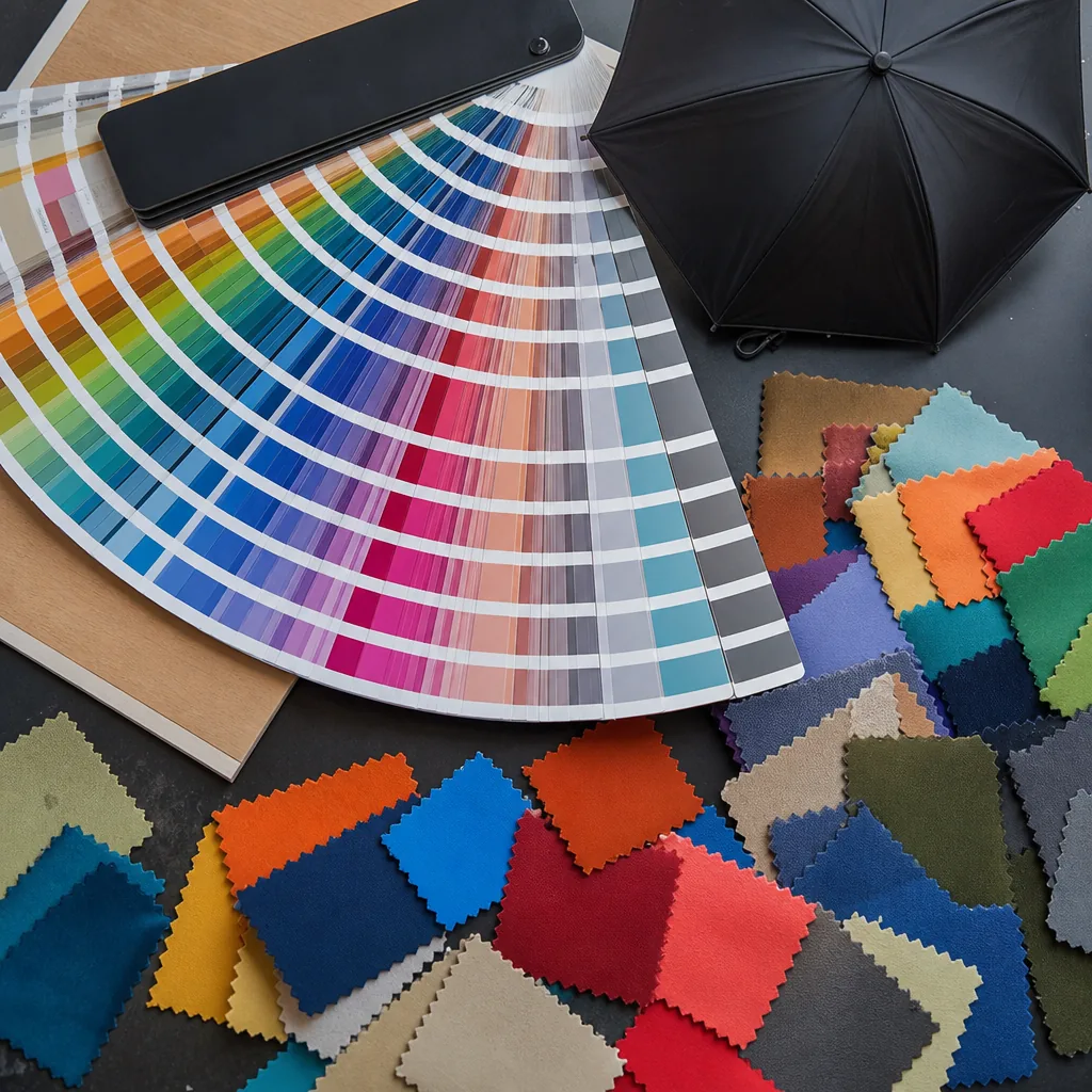
Logo readability on an umbrella starts with umbrella logo contrast, not with matching a Pantone chip and hoping for the best. A deep navy canopy can make a white mark pop, while the same white ink on a bright yellow shell can look washed out once the umbrella is in daylight. That is why canopy color visibility matters more than the theoretical color value on paper. 190T pongee usually drinks in ink a little more evenly than shiny coated polyester, so the same print can look softer and slightly darker on one and sharper on the other. On 210T pongee, the tighter weave often gives cleaner edges and better holdout, which helps small text and thin strokes survive production without closing up. For branded umbrella colors, the real question is not just what the brand wants to see, but what the buyer can still read from three to five meters away in mixed outdoor light.
Dark canopy printing has its own problems. On black, navy, forest green, or burgundy canopies, white, silver, or high-opacity spot colors usually work better than translucent inks, because dark ground fabrics absorb light and kill weak colors fast. Light canopy logos are easier to read, but they also expose defects sooner: pinholes, registration drift, and off-white ink all show more clearly on ivory, pale gray, or pastel fabric. Coated polyester and PVC-backed materials reflect more light and can make the print look glossier, but they can also reduce ink bite if the surface is too slick. By contrast, matte pongee gives better visual depth and usually better hand-feel for promotional umbrellas. The factory fix is simple: test the actual canopy swatch, not a screen file, and check logo visibility under both indoor LEDs and daylight before approving mass production.
Ink choice has to follow the cloth, because coating chemistry changes how color sits on the surface. On 190T and 210T pongee, screen printing and heat-transfer printing behave differently: screen ink can cover better on darker grounds, while transfer can hold fine detail on smaller logos if the fabric finish is stable. Polyester with a water-repellent or UV coating can shift color warmer or duller than the same shade on uncoated cloth, so the same red may read as brick on one canopy and clean crimson on another. If the umbrella is for retail or promotional use, I would usually push for a contrast sample with the real rib count and canopy size, such as 21 inch compact or 27 inch golf, because seam placement changes where the logo lands and how the eye reads it. In practice, good canopy color visibility comes from the full stack: fabric, coating, ink opacity, and the distance from which the customer actually sees the umbrella.
Make Dark Canopies Work for Logos
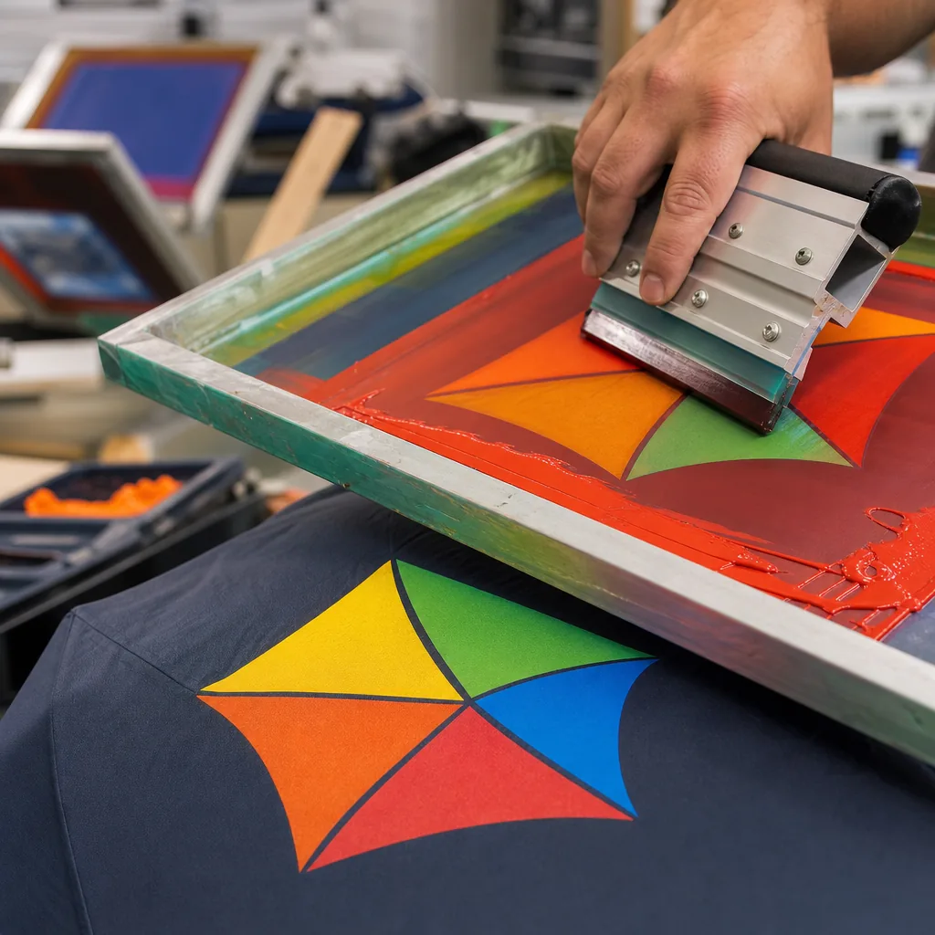
Black, navy, and forest canopies are where umbrella logo contrast becomes a production issue, not a design preference. On 190T or 210T pongee, standard color-on-color printing usually disappears unless we add a white ink underbase or switch to a very opaque spot color. For dark canopy printing, the practical rule is to keep the artwork bold: thicker strokes, larger letterforms, and less reliance on subtle color shifts. Fine-detail crests and multi-color gradients often look clean on screen but lose edge definition once the fabric is tensioned over an 8K, 10K, or 16K frame. For branded umbrella colors, a white logo is the safest choice, but it still needs enough size to survive seam breaks and panel curvature. Small type should be treated as a liability from the start, not rescued later in sampling.
Light canopy logos give you more room, but dark canopies demand discipline. Anything below about 1.5 to 2 mm stroke width is where text starts to fail after heat curing, folding, and repeated opening on auto-open or auto-open-close models. If the artwork has thin lines, half-tones, or smooth gradients, we usually recommend enlarging it or simplifying it to one or two solid colors. On black or navy, a larger print area often works better than trying to pack in more detail, because canopy color visibility depends on how quickly the eye reads the mark at 3 to 5 feet away. If the brand needs a premium look, use a white underbase with a controlled top layer; if the logo is complex, move it to a lighter panel or redesign it for print, because the fabric will not forgive weak geometry.
Check How Structure Affects Readability
Umbrella logo contrast is not decided by color alone. The structure of the canopy changes how the eye reads the mark once the umbrella is opened. On an 8K frame, the larger panels give you fewer seam interruptions, so a centered logo can sit across one face with cleaner edges. On a 16K frame, each panel is narrower and the same artwork gets chopped into more segments, which is where text and fine lines start to look broken. Panel curves also matter: a flat art file can look sharp on screen but stretch toward the crown and tip on a real canopy. Our standard practice at ZheBrella is to place the main artwork in the mid-panel zone, away from the apex, because that is where canopy color visibility is most stable and the logo is least distorted by the frame geometry.
Double-canopy construction adds another layer of risk because the vent opening interrupts the visual field. If the logo sits too high, the viewer sees the vent seam first and the mark reads like two separate pieces. For that reason, dark canopy printing usually works best with bold, high-opacity inks and thicker stroke weights, while light canopy logos can carry finer detail if the substrate is opaque enough and the ink deposit is controlled. Branded umbrella colors should also be chosen with the viewing distance in mind: a navy or black canopy can make a white or silver logo pop, but a low-contrast tone-on-tone treatment often disappears once the umbrella is moving. If the customer wants a premium look, I usually recommend one strong logo panel rather than trying to cover every panel and fighting the seam layout.
Closed umbrellas are a different problem. On the folded product, the artwork is compressed into a narrow, curved bundle, so small type and delicate icons stop reading well. If the logo must stay visible when closed, place it on the tie strap, sleeve, or a single outer panel positioned near the runner area, where the fold is less severe. This is where umbrella logo contrast has to be evaluated in both states, not just open-on-table mockups. For retail and promotion programs, I prefer a simple vector mark with clear spacing, then test it on the actual panel count before release. That avoids the common failure where the open umbrella looks fine in proof but the closed unit loses the brand completely, especially on 10K to 16K vented frames with tighter curvature and more visual breaks.
Proof Brand Colors Under Real Lighting
A logo that reads cleanly on a monitor can fail hard on an actual umbrella, because canopy color visibility changes under sunlight, office LEDs, and gray weather. The first check should always be a strike-off on the real canopy fabric, not a paper proof. I want the art tested on the exact pongee 190T, 210T, POE, or PVC base that will go into production, because dark canopy printing can mute small type and thin strokes, while light canopy logos can wash out if the ink is too translucent. Umbrella logo contrast is not just a design issue; it is a materials issue, and the same PMS color can look different on black, navy, red, or white panels. If the brand color matters, the buyer needs to approve the actual strike-off under direct daylight before anything is released to bulk cutting.
Daylight checks should be done outside and then repeated indoors under neutral white light, because both environments expose different problems. Sunlight will show whether the print has enough opacity, while indoor review reveals edge fringing, halftone loss, and glare on coated fabrics. On a vented double-canopy umbrella, the panel curvature can distort fine registration, so the logo must be checked from the normal viewing distance, not just flat on a table. For branded umbrella colors, the factory should define the color tolerance before production starts, usually against a physical approved sample or a signed lab dip with a clear delta limit. ZheBrella’s standard practice is to keep that approved strike-off with the order file so the press and sewing teams are working from one fixed reference, not from memory or screenshots.
Once the sample is approved, it should be locked against AQL 2.5 inspection standards so the factory does not drift during mass production. That means the inspector is not only checking coverage and placement, but also comparing the printed logo against the approved strike-off for hue shift, ink density, and edge sharpness on sampled units from the lot. If the canopy color visibility changes because the base cloth lot is darker or lighter than the sample, the issue has to be caught before packing, not after export. In practice, the safest workflow is: approve the strike-off, confirm daylight and indoor viewing, sign off the color tolerance, then inspect the first production run under AQL 2.5. That is the only way umbrella logo contrast stays consistent across 1,000 pieces, not just on one perfect sample.
Tie Color Choice to Buying and Planning Decisions
Canopy color changes the real-world read of a logo more than most buyers expect. On light canopy logos, white, navy, red, and black all behave differently because the fabric finish, panel curvature, and print method change the edge sharpness. A 190T pongee with a matte finish usually gives cleaner print reproduction than shiny PVC, and a white or pale canopy can reduce ink count because you do not need an underbase. On dark canopy printing, the job is the opposite: black, navy, forest green, or burgundy often need a white underprint, especially for screen print or heat transfer, or the mark disappears under daylight glare. If the buyer is chasing umbrella logo contrast for a retail shelf or event giveaway, the factory has to treat canopy color as part of the artwork spec, not as an afterthought.
MOQ and lead time are tied to that color decision because every branded umbrella colors change creates a separate cutting and packing stream. Our standard practice is to keep one artwork file and one print layout across multiple SKUs, then change only the canopy fabric color, rib frame, and handle if needed; that works well when the logo stays the same size and placement. It stops being efficient when the campaign mixes 21-inch folding umbrellas, 23-inch auto-open umbrellas, and 30-inch golf umbrellas in the same order, because each canopy needs its own panel set and sometimes its own screen or transfer setup. In practice, one artwork can span several colorways, but the buyer should expect a slightly longer sample approval cycle and a higher MOQ per color if the order uses separate cut bundles. Lead times usually move from about 20-25 days for a single color to 25-35 days when the launch includes multiple canopy shades and mixed packing.
FOB versus DDP matters once mixed colorways are split into one campaign. Under FOB, the buyer can consolidate the full order at the port and handle downstream distribution by destination, which is usually cheaper when the same artwork is going to retailers, distributors, or event sites in different countries. Under DDP, the factory or forwarder has to sort cartons by SKU, ship by consignee, and absorb more documentation, labeling, and last-mile handling, so mixed colorways cost more even when the unit price looks similar. That is where umbrella logo contrast becomes a planning issue, not just a print issue: a black canopy for premium retail, a white canopy for mass giveaway, and a navy canopy for corporate use may all carry the same art, but they will not move through the same freight lane at the same cost. If the buyer wants one launch across three canopy colors, the cleanest path is one artwork, three SKU codes, and a freight plan that matches the chosen Incoterm from the start.
Frequently Asked Questions
Are dark umbrella canopies always a bad choice for logo visibility?
No, but they usually need stronger contrast, such as white ink, an underbase, or a larger logo area. Fine details can disappear if the artwork is too small or the ink coverage is weak.
Does a lighter canopy always reduce decoration cost?
Often it does, because the print stack is simpler and fewer ink layers are needed. The final cost still depends on fabric type, logo complexity, and the number of colors in the artwork.
Which canopy colors usually give the sharpest logo edges for small branding artwork?
Solid light shades like white, ivory, pale gray, and light blue usually give the cleanest edge definition for logos under about 2 inches wide. If the artwork has fine text or thin lines, ask for a minimum line thickness of 1.5 to 2 mm to keep it readable after printing and folding.
Does a textured canopy fabric affect logo visibility?
Yes. Fabrics with heather, melange, or heavy weave textures can soften small details and reduce perceived contrast. For those materials, suppliers should provide a strike-off or photo proof before bulk production so you can check legibility at actual size.
How long should logo proofing and sample approval take before mass production?
For OEM umbrella orders, artwork proofing usually takes 1 to 3 days and a pre-production sample takes about 7 to 10 days. After sample approval, bulk production often runs 25 to 35 days depending on order quantity, print method, and canopy color complexity.
Looking to Launch Your Custom Umbrella Line?
ZheBrella is a Zhejiang-based OEM/ODM umbrella manufacturer with 17 years of export experience. Free design, low MOQ from 100 pieces, windproof construction, full-color print.
Get Free Quote Now »People Also Search For
Related Articles
Choosing Logo Colors for Printed Umbrellas Without Losing Contrast
See how canopy color, ink choice, and logo contrast affect readability on branded umbrellas, with practical rules for da...
Read More »
How Umbrella Color Blocking Improves Brand Visibility
See how panel colors, trims, and contrast blocks improve logo visibility on custom umbrellas while keeping brand colors ...
Read More »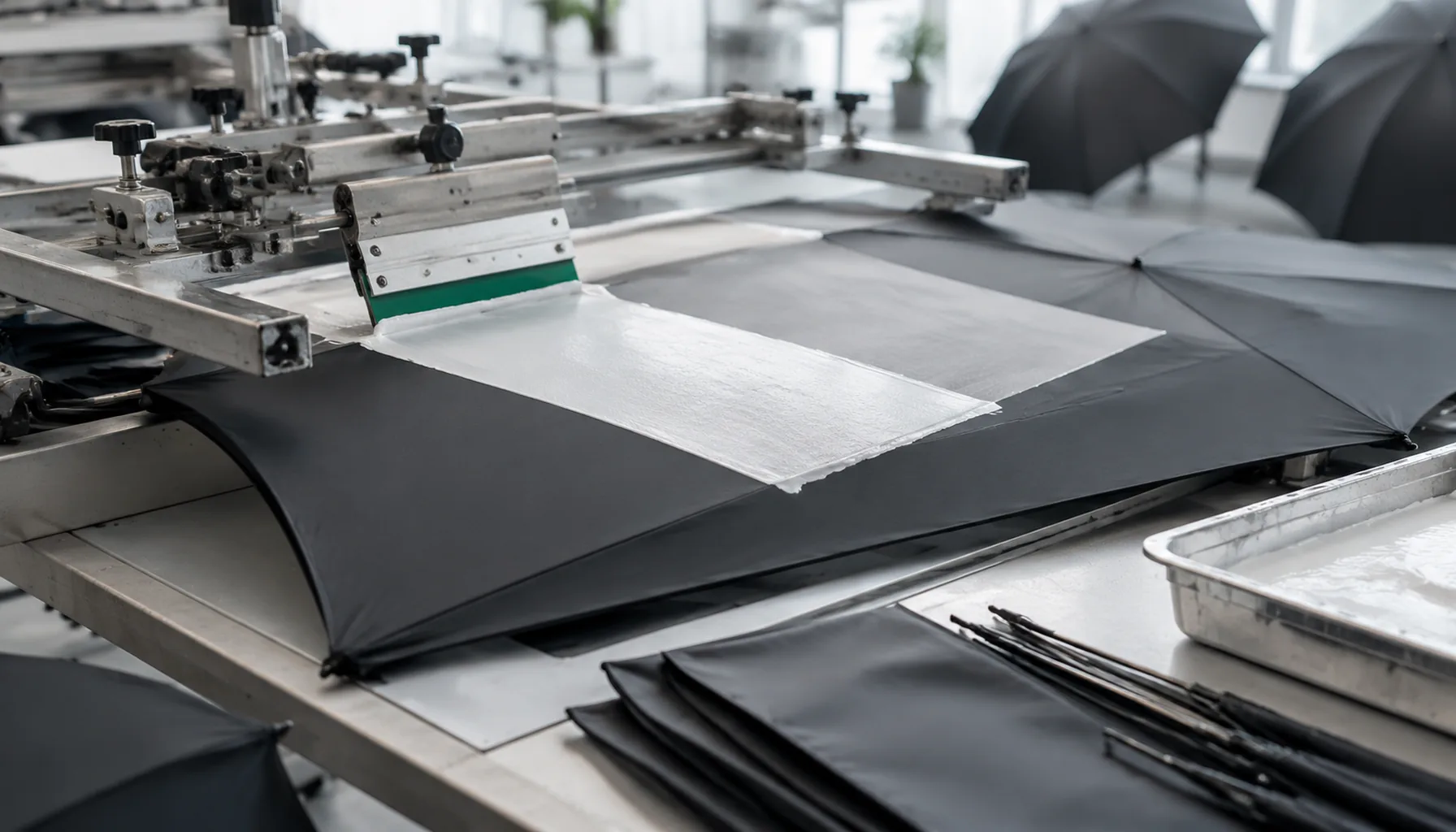
White Ink Underbase Printing for Dark Umbrella Canopies
Use white underbase printing to keep logos bright on navy, black, and red canopies, with clear guidance on ink layers, s...
Read More »