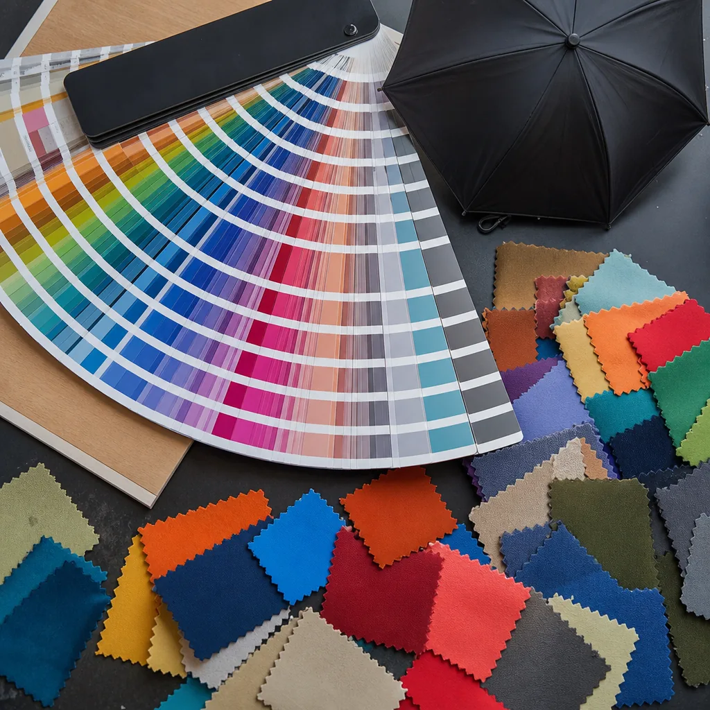
Co-Branding Umbrellas: Laying Out Multiple Logos Cleanly
When a co branded umbrella carries three or four sponsor marks, the problem is rarely the artwork itself; it is getting those logos to read clearly on curved panels without fighting the seam layout or each other. On the factory floor, we look at panel geometry, print method, and viewing distance first, because a clean hierarchy depends on where the eye lands when the canopy is open, moving, and seen in real use.
When co-branding makes sense
A co branded umbrella makes sense when two parties need one physical item to carry shared visibility without turning the design into a crowded billboard. The cleanest use cases are sponsorships, launch events, trade shows, and venue merchandise where the umbrella is doing practical work first and brand work second. In those jobs, a 21" folding model or a 23" auto-open stick usually gives enough print area for two logos, a tagline, and a small event mark without fighting the frame or the panels. Our standard practice is to decide early whether the umbrella is meant to read from a distance or hold up under close inspection, because that choice affects panel count, logo size, and whether the artwork lands better on one panel or across multiple panels.
Partnerships are the other obvious fit, especially when one brand is distributing and the other is paying for the impression. A multi logo umbrella works best when the relationship is straightforward: retailer plus private label, sponsor plus venue, brand plus charity, or distributor plus seasonal campaign. The sponsor umbrella layout should reflect hierarchy, not equality by default. If both marks are the same size and same contrast, the eye has no place to land. If one mark is too small, the partner will treat the piece like a giveaway instead of a co-promotion. On 190T or 210T pongee, screen print is usually sharper for bold logos; sublimation is better when the artwork needs gradients or photo detail.
Establishing visual hierarchy
The cleanest sponsor umbrella layout starts with one decision: which mark owns the canopy and which marks support it. On a co branded umbrella, the primary logo should usually be the brand paying for the piece, owning the event, or driving the retail sale, and it needs the largest uninterrupted panel or the most visible facing position. Secondary logos belong lower on the visual stack: smaller size, flatter color treatment, and placed where they do not fight for attention with the lead mark. On a 23" or 27" canopy, that often means giving the primary logo roughly 60 to 70 percent of the available print height, then scaling partner marks to about half that size or less. If both logos are treated equally, the umbrella looks busy and nobody reads either one cleanly.
Placement matters as much as size. A dual brand umbrella works best when the first logo sits on the same panel on each repeat, or across opposite panels if the artwork is large and simple, while the second logo is moved to the panel seam, lower quadrant, or a contrasting segment near the ferrule line. That keeps the eye moving in a controlled path instead of bouncing between competing graphics. With a multi logo umbrella, I prefer one dominant color block and one supporting lockup rather than two full-color, high-contrast marks fighting for the same space. If the canopy uses pongee 190T or 210T, keep fine text large enough to survive stitch distortion, heat transfer edge blur, and panel curvature. Small legal lines, taglines, and URLs should never be treated like brand marks; they belong in a low-visibility area or on the sleeve.
The production mistake I see most often is designing for flat artwork instead of a curved canopy. A co branded umbrella has a lot of visual interruption from ribs, seams, and panel taper, so the safe rule is to simplify before you size up. Thick strokes, fewer words, and clear negative space always read better than a detailed emblem crammed into a narrow panel. For screen print, leave enough margin so the ink does not break at the seam; for sublimation, check how the graphic lands across adjacent panels; for heat transfer, keep the secondary logo away from high-wear areas near the tips. Standard practice at ZheBrella is to build the sponsor umbrella layout from a top-down hierarchy first, then confirm it on a full-size panel mockup before production, because once you see the art on a curved 8K or 16K frame, weak spacing becomes obvious immediately.
Using panels to separate brands
The cleanest way to build a co branded umbrella is to assign each brand its own canopy panel instead of stacking logos on the same face. On a 8K or 10K frame, that gives you enough real estate to keep a primary logo centered on one panel and a secondary mark on the opposite side, so the graphics never fight for attention. For a sponsor umbrella layout, I usually keep the logos at least one panel apart and avoid placing key text across a seam, because the rib tension will distort circles, small type, and thin lines once the canopy is stretched. On 21" and 23" promotional models, the panel width is limited, so a simple one-color mark or a horizontal lockup works better than a dense badge. Our standard practice is to map the artwork to the actual panel template before production, not after, because a flat file can look balanced and still land badly once sewn to pongee 190T or 210T. A dual brand umbrella works best when one brand owns the lead panel and the other sits on a clearly separate panel with matching visual weight, not equal size by default. If both logos need to be visible in photos, put them on adjacent panels that face different directions when the umbrella is carried, then confirm the orientation against the opening arc and handle position. For a multi logo umbrella, I prefer to use the same print method across both marks, usually screen print for simple solids or heat transfer for tighter registration, so the ink density and edge sharpness stay consistent. With vented windproof or double-canopy builds, panel mapping matters even more because the outer and inner layers can shift slightly; that is where a poor sponsor umbrella layout starts to look sloppy. If the customer wants a co branded umbrella for retail or events, I would always sample one production canopy first and check it in open and closed states before approving mass run.
Color management across logos
The safest background for a co branded umbrella is usually not pure white and not pure black. White makes every logo fight for attention and it shows dirt fast; black can crush dark brand colors and make a sponsor mark disappear at distance. For a multi logo umbrella, I usually push buyers toward a mid-value canopy color like charcoal, navy, forest, or warm gray, then place both logos in high-contrast solids with a controlled ink count. On 190T or 210T pongee, a flat background with no texture reads cleaner than PVC when you are trying to keep two identities from visually colliding. Our standard practice at ZheBrella is to check the logo pair at actual panel size, because a color that looks fine in a mockup can become muddy once it wraps around a curved 23" or 27" panel.
If the sponsor umbrella layout has to carry three or more colors, the background needs to do more than look neutral. It should separate warm and cool palettes without creating a third competing color. A softened heather gray, deep teal, sand, or muted red can hold multiple brand systems better than a bright corporate primary. I avoid saturated background colors when one logo already uses a strong PMS tone, because the eye reads the canopy as another brand block instead of a field for the logos. For a dual brand umbrella, spacing matters as much as color choice: keep at least one panel break or a seam gap between marks so the canopy does not look crowded when the umbrella is open and rotating in the wind.
For print control, ask for spot-color matching rules before approving the sample. A co branded umbrella should not rely on loose digital color assumptions, especially when one logo is a translucent gradient or a metallic tone that will not reproduce cleanly on fabric. If both brands insist on exact PMS matching, the background should be a simple, low-chroma shade so neither logo loses chromatic contrast. On windproof styles with double-canopy vents, I prefer the same background on both layers or a very slight value shift, not two unrelated colors, because mismatched layers look like a production mistake. The practical test is simple: hold the open sample at 3 to 5 meters. If both logos are readable first, and the canopy still looks like one product instead of a collage, the color management is working.
Approval workflow for multiple stakeholders
For a co branded umbrella, the approval chain has to be locked before anyone talks about production. The cleanest process is: one person owns the final yes, every logo is supplied as vector art with brand color codes, and the factory sends a flat layout showing panel count, seam placement, logo size in millimeters, and exact distance from the edge or vent. If there are three stakeholders, do not let each one send separate comments directly to production. Collect all notes into one marked proof, resolve conflicts in writing, and issue a single revision number. That matters more than people think, because a sponsor umbrella layout that looks fine in a PDF can fail once panel curvature, ribs, and seam overlap are real. Our standard practice is to freeze the artwork first, then confirm print method, because screen print, heat transfer, and sublimation all handle small text and gradients differently.
Before bulk order release, require a physical sample or at least a pre-production strike-off on the actual canopy fabric, not just a screen mockup. That is where off-center logos, bad contrast, and hidden sponsor marks usually show up on a multi logo umbrella. Each stakeholder should sign the same approval sheet with date, version, and a short checklist: logo position, Pantone match, canopy color, size, and whether the reverse panel is intentionally blank or mirrored. If the buyer changes anything after sign-off, treat it as a new revision and restart approval, because late artwork changes are the fastest way to miss lead time and create a costly reprint. For a dual brand umbrella, the discipline is simple: one master file, one approver, one production release. Anything else turns into avoidable rework and finger-pointing at packing time.
Frequently Asked Questions
Can an umbrella have more than one logo?
Yes. Umbrella panels naturally separate logos, so you can assign a primary brand to alternating panels and partners or sponsors to others. The key is a clear hierarchy so the canopy doesn't look cluttered.
How do you avoid clutter with multiple logos on an umbrella?
Set one primary logo at a larger size, give each brand its own panels, and keep a consistent background color. Approve a mockup with all stakeholders before production to prevent costly reprints.
How many sponsor logos can fit on a standard 8-panel umbrella canopy without looking crowded?
For most 23 to 27 inch canopies, 2 to 4 medium logos is the practical limit if you want clean spacing. If the logos are small and simplified, you can add more, but you should still leave at least 0.25 to 0.5 inch of clear space near seams and ribs.
Should the main brand logo and partner logos be the same size?
Usually no. A cleaner layout gives the primary brand about 15% to 25% more visual weight than the sponsor or partner marks, so the hierarchy reads instantly. If the umbrella is for co-promotion, equal sizing works only when both brands approve a true shared-billing layout.
What artwork files do umbrella factories usually need for a multi-logo layout?
Vector files in AI, EPS, or PDF are best because they hold up when logos are scaled and curved across panels. Most factories will send a digital proof within 1 to 2 business days, and production typically starts only after the layout is approved.
Looking to Launch Your Custom Umbrella Line?
ZheBrella is a Zhejiang-based OEM/ODM umbrella manufacturer with 17 years of export experience. Free design, low MOQ from 100 pieces, windproof construction, full-color print.
Get Free Quote Now »People Also Search For
Related Articles
Multi-Logo Umbrella Branding for Corporate and Retail Programs
Plan multi-logo umbrella branding with clear hierarchy, spacing, and approval rules so corporate and retail programs sta...
Read More »Umbrella Logo Lockups for OEM and Private Label Programs
Learn how to set umbrella logo lockups, spacing, and approvals for OEM orders so brand marks stay clear across canopy, s...
Read More »Multi-Color Logo Setup for Umbrella Brand Programs
Plan multi-color umbrella logos with clean registration, strong contrast, and realistic production limits to protect bra...
Read More »