Multi-Color Logo Setup for Umbrella Brand Programs
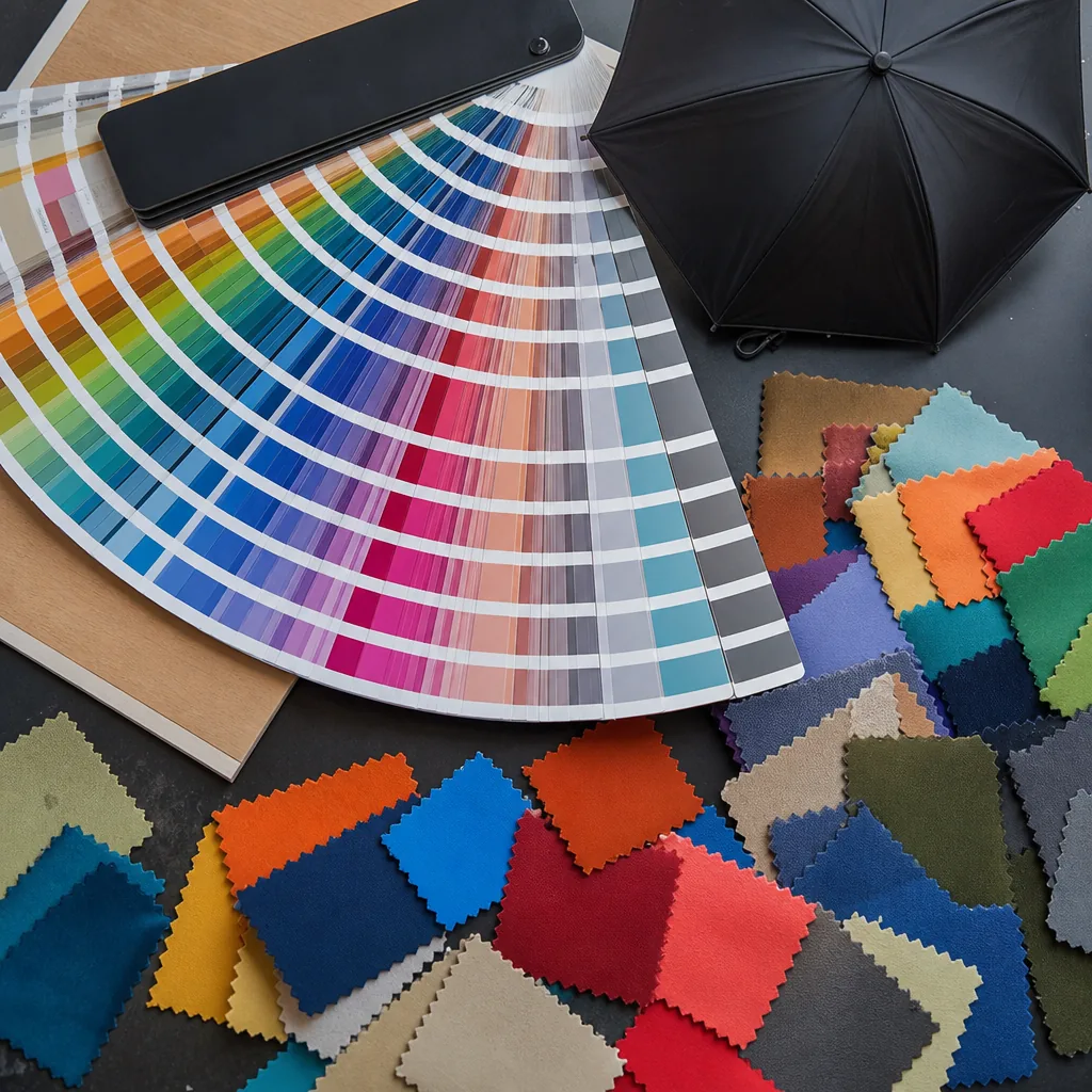
A multi color umbrella logo can look sharp on a sales sample and still fail on the factory floor if the artwork, panel layout, and print method are not matched to the canopy construction. In brand programs, the real challenge is keeping registration tight, contrast clear, and repeatability high across different umbrella sizes, fabrics, and production runs.
When Multi-Color Logos Make Sense
A multi color umbrella logo makes sense when the brand depends on color to stay recognizable: retail labels with strict Pantone standards, sports or event programs with layered marks, or campaigns that use gradients and multiple accent colors as part of the identity. In those cases, the logo is not just decoration; it is part of the brand system, so the logo setup for umbrellas has to preserve exact hues, spacing, and relative size. On larger canopies, especially 23" or 27" panels, a full-color mark can read well if the artwork is clean and the print method can hold the detail without distortion.
A one-color version usually prints cleaner on small panels, thin umbrella ribs, and narrow placement zones near seams or vents. When the artwork is reduced for a compact 21" folding umbrella or a crowded promotional panel, extra colors can blur, trap ink at the edges, or force the logo to be scaled up more than the layout allows. For custom umbrella branding, I usually push buyers to prepare both versions in brand artwork prep: a full-color master for premium retail use and a simplified single-color file for practical production when readability matters more than visual complexity.
Color count directly affects cost and timing because every added color can mean another screen, another pass, and more print registration risk. If the artwork needs tight alignment, small text, or fine outlines, the chance of misregistration rises fast, especially on curved canopy panels where fabric tension shifts during printing. Promotional umbrella logos are often cheaper and faster in one or two colors because the setup is simpler, the reject rate is lower, and the image stays legible from a distance; once you get into three or four colors, the artwork needs to be truly necessary, not just visually busy.
Artwork Preparation and File Requirements
For a clean multi color umbrella logo, suppliers need proper vector artwork first: AI, EPS, or PDF with editable paths, not a flat JPG pulled from a website. Outlined fonts matter because fabric printers and transfer vendors do not want missing typefaces at proof stage. For logo setup for umbrellas, the file should also include named spot colors, ideally Pantone Coated or Uncoated depending on the canopy stock, plus a simple note on whether the art is intended for screen print, heat transfer, sublimation, or woven labels.
Panel placement references are just as important as the art itself. On umbrellas, a logo may need to sit centered on one panel, repeated on alternate panels, or aligned to the seam margin so it does not land across a rib pocket or stitch line. Good brand artwork prep includes panel size, artwork width in millimeters, and a clear callout for front, back, or opposite-panel orientation. That is basic custom umbrella branding work; without it, print registration drifts once the canopy is cut and sewn, especially on curved panels.
The usual failures are predictable: tiny gradients that band on fabric, hairline strokes that disappear after coating, and missing Pantone callouts that force the factory to guess ink matches. Promotional umbrella logos also fail when designers send complex shadows, transparent overlaps, or nested effects that cannot be separated cleanly for print registration. Our standard practice is to reject art that cannot hold a clean edge at actual print size, because once the canopy is tensioned, weak lines and soft fades look worse than they did on screen.
Registration Tolerance on Curved Panels
On a curved canopy, the first thing that breaks people’s expectations is that a clean flat-art proof does not stay clean once it is wrapped around an 8K or 16K panel. Each panel pulls the ink slightly toward the seams, and the distortion gets worse as the panel narrows near the tip. For a multi color umbrella logo, I tell buyers to treat the center of the panel as the controlled zone and the edge zones as the risk zone, because that is where small errors in cut, sew, and tension turn into visible color shift. Good logo setup for umbrellas starts with panel-specific artwork, not a generic round badge dropped onto a template.
For screen print, practical print registration on a standard promotional umbrella panel is usually safest at about ±1.5 to ±2.0 mm between colors, and tighter than that only works when the frame, fabric tension, and squeegee pressure are very stable. Heat transfer is more forgiving on small logos but still needs around ±1.0 to ±1.5 mm allowance because the film can stretch slightly on curved polyester, especially on pongee 190T or 210T. Digital print gives the best gradient control, but it does not eliminate geometric distortion; if the brand artwork prep ignores seam locations, the logo can look centered in file and off-center on the open canopy. For custom umbrella branding, I always separate the artwork by panel and confirm the seam break before sampling.
On 16K umbrellas the panel count gives you more seams and more opportunities for visual drift, so the logo should be simplified if it crosses multiple panels. Thin strokes, reverse text, and small knockout gaps are the first things to fail when the umbrella flexes in wind or the fabric relaxes after sewing. With promotional umbrella logos, the smartest approach is to build the design around a single-panel target, then mirror that across the canopy only if the geometry allows it. ZheBrella’s standard practice is to approve a physical or stitched mockup when the design uses more than two colors, because that is usually the only way to judge whether the print registration will still read correctly after the canopy is sewn and tensioned.
Ink, Fabric, and Contrast Choices
For a multi color umbrella logo, the first thing I check is not the artwork file but the canopy itself. A 190T or 210T pongee weave has a tighter, more consistent surface than cheap open-weave polyester, so the ink sits cleaner and the edges hold better. On dark canopies, especially black, navy, and forest green, a light ink can disappear into the fabric unless the print system uses enough opacity or an underbase. That is why logo setup for umbrellas always starts with the substrate, not the graphic file. If the weave is coarse or the fabric has a heavy sheen, fine text and thin rules will look broken even when the art is technically correct.
Ink density matters as much as color count. In custom umbrella branding, a bright red or white on a pale canopy can print sharply with simple screen layers, but the same art on a dark background usually needs underbase handling, a thicker stroke, or fewer tiny details. This is where print registration becomes critical: every extra color adds another chance for slight shift at the seam or panel edge, and the umbrella frame forces the fabric into a curved, tensioned shape. Promotional umbrella logos that rely on hairline outlines, small gradients, or overlapping type are usually the first to fail in production because the canopy is not a flat sheet and the print area is interrupted by ribs.
Good brand artwork prep means designing for contrast, not just for the screen file. I ask buyers to simplify art for dark canopies, separate spot colors cleanly, and keep essential shapes away from extreme detail that will soften once the fabric stretches over the panels. On light canopies, there is more room for fine marks, but the weave still steals sharpness if the logo depends on tiny counters or ultra-thin letters. The practical rule is simple: the darker the canopy, the more you should reduce complexity and strengthen contrast. That keeps the final logo readable from a distance and avoids wasting time on artwork that cannot survive real umbrella production.
Production Review Before Mass Order
The proofing sequence should start with a clean artwork mockup that separates every ink pass, Pantone reference, and panel position before anyone cuts a canopy. For a multi color umbrella logo, I want brand artwork prep done as vector files with clear stroke weights, overprint notes, and a defined print registration method; otherwise the first sample tells you nothing useful. In umbrella work, the print area moves with seam tension and panel curvature, so logo setup for umbrellas has to show the exact panel count, centerline, and safe margin, not just a pretty flat layout.
Next comes sample confirmation on the actual umbrella size and fabric, because a logo that looks perfect on paper can drift on 190T pongee or on a coated POE canopy. This is where custom umbrella branding should be checked for color split, edge sharpness, and registration between passes if the design uses two or three screens. Promotional umbrella logos with metallic, fluorescent, or spot-match colors often need extra setup time, especially if the factory is switching inks or re-tuning mesh tension, so build in several additional days for special colors and multi-pass printing before you lock the order.
Final approval should happen against a pre-shipment inspection using AQL 2.5, with the sample held next to bulk goods under the same lighting and the same folding sequence. Look at registration drift, ink overlap, bleed at seam crossings, and whether the repeat on every panel still matches the approved sample after packing. For timing, FOB shipments usually move faster because the buyer controls the freight booking, while DDP requires more buffer for export paperwork, consolidation, and last-mile delivery; either way, a realistic mass-order schedule needs to include artwork approval, sample sign-off, production, and inspection before the vessel or truck cutoff.
Frequently Asked Questions
How many logo colors are realistic on an umbrella canopy?
It depends on the print method and artwork size, but fewer colors usually deliver better registration and lower rejection risk. Many buyers keep canopy logos to one to three solid colors for reliable production.
What should buyers ask for before approving a multi-color umbrella order?
They should request a production mockup, color references, and a pre-production sample with the exact fabric and print method. That helps confirm contrast, placement, and registration before bulk production.
How much tolerance should buyers allow for multi-color logo registration on umbrellas?
For screen printed umbrella logos, a registration tolerance of about 1–2 mm is common because fabric panels can shift slightly during printing and sewing. Designs with tight outlines, small gaps, or overlapping colors should be simplified to protect brand consistency.
What artwork files are best for multi-color umbrella logos?
Vector files such as AI, EPS, or editable PDF are preferred, with each logo color separated and labeled by Pantone or PMS code. Raster files should generally be at least 300 dpi at actual print size, but vector artwork gives the factory better control over color separations and scaling.
Does a multi-color logo increase umbrella sampling or production time?
Yes, multi-color printing usually adds setup time because each color needs separate screens, alignment, and proofing. For OEM orders, buyers should allow about 5–10 days for pre-production samples and confirm the print proof before mass production.
Looking to Launch Your Custom Umbrella Line?
ZheBrella is a Zhejiang-based OEM/ODM umbrella manufacturer with 17 years of export experience. Free design, low MOQ from 100 pieces, windproof construction, full-color print.
Get Free Quote Now »People Also Search For
Related Articles
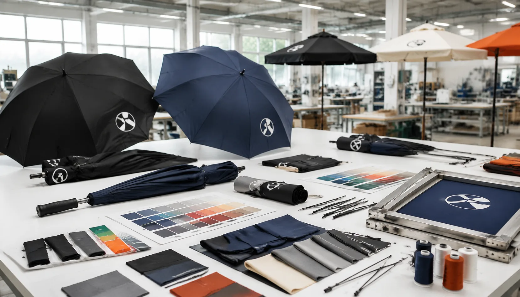
Umbrella Logo Lockups for OEM and Private Label Programs
Learn how to set umbrella logo lockups, spacing, and approvals for OEM orders so brand marks stay clear across canopy, s...
Read More »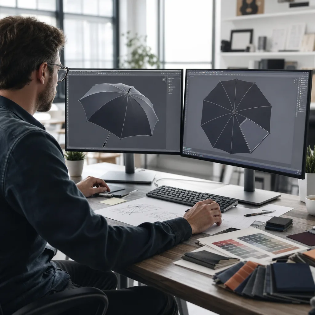
Spot-Color Umbrella Logos for Promotions and Events
Learn how spot-color logo printing balances cost, legibility, and speed for branded umbrellas used in promotions, events...
Read More »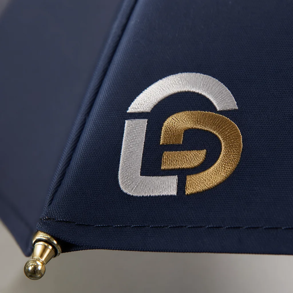
Multi-Logo Umbrella Branding for Corporate and Retail Programs
Plan multi-logo umbrella branding with clear hierarchy, spacing, and approval rules so corporate and retail programs sta...
Read More »