Color Blocking and Trim Branding for Retail Umbrella Lines

Retail umbrella lines fail when the branding looks good on a screen but breaks down on the factory floor. The real challenge is balancing brand recognition, trim details, and color blocking choices that are repeatable in production, cost-controlled, and durable enough to hold up through sewing, heat transfer, and daily use.
How color blocking supports brand recognition
Color blocking works because shoppers read umbrellas at a distance, not in a spreadsheet. A clean solid canopy with one sharp trim line or a two-tone split gives the eye a fast cue, and that matters on a crowded shelf where most umbrellas blur together into black, navy, or plain clear plastic. In practice, umbrella color blocking branding is strongest when the frame, binding, and canopy all support the same visual hierarchy: one main field, one contrasting edge, and no stray decoration fighting the logo. That is why contrast panel umbrellas tend to outperform random multicolor layouts; they look deliberate, which makes the brand feel more organized and easier to remember.
A trim color umbrella design is usually the best place to start when a buyer wants impact without pushing production complexity too far. Binding tape, ferrule caps, and tie straps can carry brand colors with low risk, while full-panel alternation needs tighter cutting control so the seam alignment stays clean. Our standard practice is to reserve high-contrast trim for retail umbrella branding where the product has to sit next to apparel, handbags, or gift items and still read as part of the same collection. Brand color umbrellas are especially effective for fashion retail labels, cosmetics, beverage promos, and premium gifting programs because those buyers already manage strong color systems and want the umbrella to look like a planned extension of the line, not an afterthought.
The styles that benefit most are the ones that sell identity first and weather protection second: sports promotions, campus merch, resort retail, and fashion capsules. Sports programs usually want aggressive contrast, often team colors on alternating sections or a bold border on a 23-inch auto-open style, while fashion retail usually prefers tighter color blocking with matte pongee 190T or 210T and a restrained logo zone. From a factory point of view, umbrella color blocking branding also helps assortment planning, because one canopy platform can support multiple color stories without changing the frame or handle spec. That keeps MOQ under control and lets retailers test different colorways before committing to a larger FOB order.
Choosing canopy, trim, and frame color combinations
For retail umbrella branding, the canopy color is only the starting point; the product looks finished or cheap based on how the trim, ferrule, and shaft relate to it. On the factory floor, I treat umbrella color blocking branding as a full system: the canopy fabric, binding tape, ferrule finish, runner, and shaft color must agree with the brand story. A black 190T pongee canopy with tone-on-tone binding and a matte black shaft reads very different from a bright white canopy with silver trim and a polished steel shaft, even if the frame is the same 8K fiberglass build.
Dark trims usually improve perceived value because they hide handling marks, stitch variation, and minor ink shifts around the edge. That is why black, navy, charcoal, and deep green work well on contrast panel umbrellas and brand color umbrellas sold through retail channels. A dark binding tape around a lighter canopy gives the product a tighter outline, and a dark ferrule finish keeps the top from looking like an afterthought. If the canopy is already busy with panels or full-coverage print, I usually avoid extra bright trim because it competes with the logo instead of supporting it.
Lighter accents make sense when the logo needs more separation from the background, especially on a trim color umbrella design with a dark canopy and a small chest or panel mark. White, silver, or pale gray binding can sharpen a printed mark, but only if the frame finish is controlled; a bright trim on a glossy shaft often looks promotional rather than retail. The cleanest combinations are usually one dominant brand color, one neutral structural color, and one accent used sparingly, which is how we keep retail umbrella branding from looking overdesigned or low-grade.
Production impact of added colors and accents
Every extra color in umbrella canopy work adds a real sourcing problem before it becomes a sewing problem. For `umbrella color blocking branding`, the factory has to match dye lots across panels, binding tape, and sometimes even thread or plastic tips, because a clean retail umbrella branding job looks wrong the moment one panel shifts a half-shade under daylight. With `contrast panel umbrellas`, the cutting room also has to segregate fabric rolls by lot and colorway, then nest panels so the seam sequence stays consistent; that slows throughput more than buyers expect, especially on 8K and 10K frames where one bad roll can contaminate an entire batch.
Trim work is where costs usually jump first. A `trim color umbrella design` with contrast binding, colored canopy edge tape, or custom runner and ferrule parts adds separate procurement lines, more incoming inspection, and more changeover time on the sewing line; if the trim is not a stocked standard, the MOQ often moves from a few hundred pieces to 1,000 or more per color because mills and hardware suppliers will not split their minimums. Lead time usually stretches by 7 to 15 days for custom-colored components, and longer if the buyer wants PMS matching on both fabric and molded parts; that is normal for `brand color umbrellas`, not a sign of a slow factory.
Cost goes up in layers, not as one flat surcharge. Fabric price changes if the order needs multiple dye lots or nonstandard pantone dipping, but the bigger hit is labor: more panel handling, more color checks, and more rejects from seam mismatch or binding wobble. On retail umbrella branding programs, I usually treat each added accent color as its own risk item in the spec sheet and quote it separately, because a two-tone canopy with custom binding can add a meaningful premium over a single-color POE or 190T pongee body. If the buyer wants multiple accents and a low MOQ, the only honest answer is to accept a longer schedule or a higher unit price; you rarely get both low volume and tight color control at the same time.
Logo visibility across colored sections
For umbrella color blocking branding, the cleanest logo placement is on a single uninterrupted panel, not across a seam, vent edge, or contrast stripe. The print should sit in the upper-middle third of the panel where the canopy face reads clearly when open, and it should also remain legible when the umbrella is tied closed. On contrast panel umbrellas, avoid the hinge side and the panel joins near the runner because those areas distort type and make small marks look crooked once the canopy is tensioned. In retail umbrella branding, a centered logo on one dominant color block usually looks sharper than trying to span multiple segments.
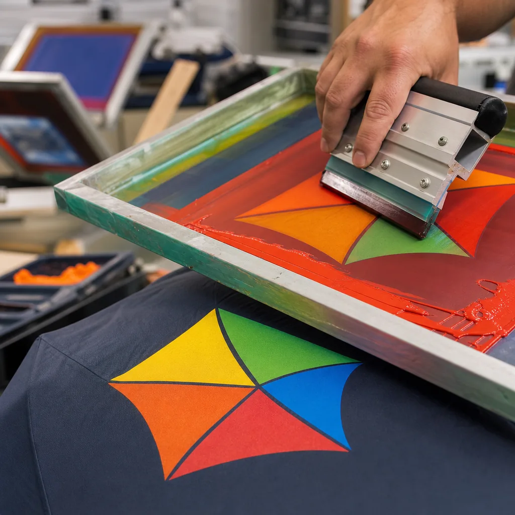
Ink choice matters more than most buyers think. Dark art on light fabric can often run with direct screen print or heat transfer, but light art on navy, black, red, or forest green needs real contrast or it disappears in overcast conditions. Tonal logos work when the goal is subtle brand presence, but they only succeed if the hue shift is obvious enough at arm’s length; otherwise the mark just looks like a stain. For brand color umbrellas, I usually recommend matching the logo to the nearest solid field and keeping it off trim lines, because a trim color umbrella design already has enough visual noise without forcing the logo to compete with it.
A white underbase is necessary whenever the canopy color would swallow the ink, especially on saturated polyester, PU-coated fabric, or deep-tone pongee where fine text is involved. Without that underbase, even a well-mixed Pantone will print dull and low-contrast, and the problem gets worse on curved panels because light falls unevenly across the canopy. If the artwork is simple, a tonal logo can be cleaner than a full opaque hit; if the logo has thin strokes, gradients, or brand-critical color accuracy, use a white underbase and keep it inside one panel field for maximum readability open and closed.
Retail testing and repeat-order consistency
Store samples should be judged like retail inventory, not like a pretty prototype. For umbrella color blocking branding, the first thing I check is whether the canopy panels land within the approved color tolerance under daylight and store lighting, because a shade that looks fine in the sample room can drift hard once it hits production dye lots. Then I inspect seam symmetry, panel alignment at the ribs, and whether the trim color umbrella design holds a clean edge at the binding, tape, and tips; sloppy seam spacing is the fastest way to make contrast panel umbrellas look cheap. Brand teams should also compare the sample against the bulk pre-production lot, not just the golden sample, because the real failure is usually batch-to-batch shift, not a single bad unit.
For retail umbrella branding, the approval file needs to be practical enough for a factory floor to use without interpretation. I want the exact Pantone references, lab dips or physical swatches, panel layout, trim placement, thread color, and a written color tolerance limit for each fabric component, including the canopy, binding, and handle accents. If the line includes brand color umbrellas with multiple SKUs, document which parts may vary and which are locked, otherwise a later reorder will quietly drift. Our standard practice is to freeze the approved palette with photos under neutral light, a signed sample card, and a production note that names the fabric lot, print method, and any exception handling.
Repeat orders should be released only after a simple AQL 2.5 inspection plan is agreed in advance, because that gives both sides a clear pass/fail rule for shade mismatch, seam defects, and trim misalignment. I also recommend keeping a dated approval record with the sample number, bulk carton label, and a short note on where the sample was signed off, so the next run can be matched without guesswork. If the retailer changes stores, seasons, or packaging, re-check the palette before cutting bulk fabric; otherwise umbrella color blocking branding can look consistent online but uneven on the shelf.
Frequently Asked Questions
Does adding trim colors make umbrella production much more expensive?
Usually it adds cost through extra materials and more careful cutting or sewing, especially if the trim is custom dyed. The increase is manageable when the design is standardized and the order volume is stable.
What is the safest branding approach on a multi-color umbrella?
Use one high-contrast logo placement and keep the rest of the design disciplined. Too many competing colors can reduce brand clarity, especially in retail settings where the umbrella is viewed quickly.
Can different umbrella panels use different fabric colors without increasing printing cost?
Yes. Color blocking usually uses dyed fabric panels rather than surface printing, so it may avoid print plate or setup costs. However, it can increase cutting and sewing complexity, especially if the layout uses more than two or three panel colors.
What is the best way to match umbrella trim to a retail brand color?
Provide Pantone TPX/TCX or a physical color standard for the canopy, binding, piping, handle, and sleeve. For most custom umbrella orders, expect a small tolerance between fabric lots, especially on polyester pongee and oxford fabrics.
What MOQ is typical for custom trim or contrast panel umbrellas?
For OEM retail umbrellas, a practical MOQ is often 500 to 1,000 pieces per colorway, depending on fabric stock, trim color, and logo method. Custom-dyed fabric or special hardware colors may require higher MOQs and 30 to 45 days of production time after sample approval.
Looking to Launch Your Custom Umbrella Line?
ZheBrella is a Zhejiang-based OEM/ODM umbrella manufacturer with 17 years of export experience. Free design, low MOQ from 100 pieces, windproof construction, full-color print.
Get Free Quote Now »People Also Search For
Related Articles
Color-Blocking Strategies for Brand-Driven Umbrella Design
Show how color-blocked umbrella layouts strengthen brand recognition while staying production-friendly, with fabric, pri...
Read More »Umbrella Trim Color Decisions for Stronger Brand Recognition
Learn how trim colors, piping, and frame accents shape brand recognition, while balancing MOQ, material choices, and pro...
Read More »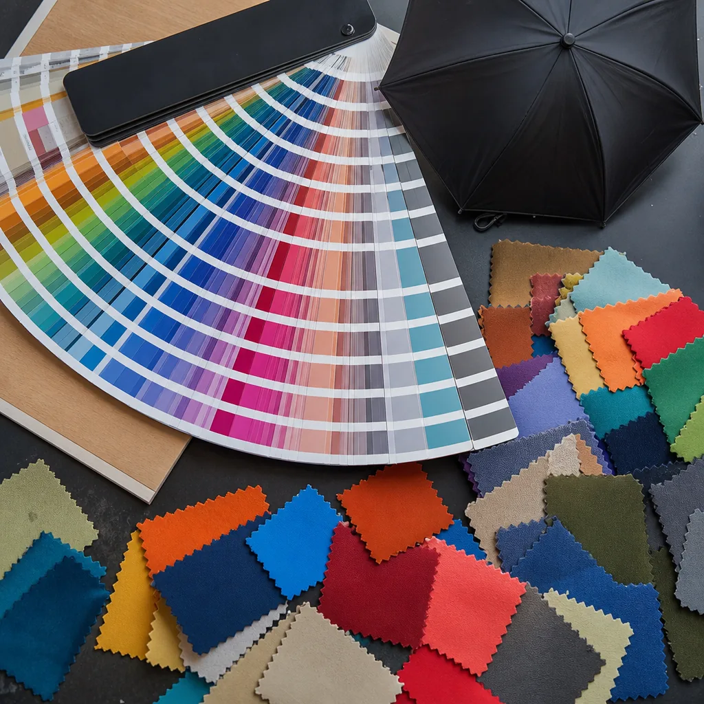
Custom Umbrella Color Blocking for Stronger Brand Recognition
Learn how to use panel blocking, trim choices, and stock color programs to boost brand recognition while controlling MOQ...
Read More »