Color-Blocking Strategies for Brand-Driven Umbrella Design
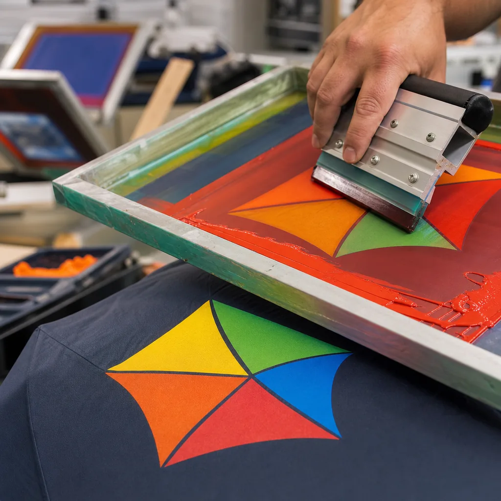
A strong umbrella color blocking strategy has to do more than look sharp on a screen; it needs to hold up across panel cutting, seam alignment, printing, and frame balance on the factory floor. When brands want a distinctive canopy that is easy to recognize from a distance, the real challenge is keeping the layout production-friendly, color-consistent, and stable in wind and rain without driving up scrap or assembly time.
Why color blocking works for branding
Color blocking works because the eye reads shape and contrast faster than it reads a logo. A strong umbrella color blocking strategy uses full panels, alternating gores, or a split top-and-hem treatment to make the product identifiable from 20 to 30 feet away on a retail wall or in a crowd. In practice, the best results come from deciding the branded canopy color layout first, then matching trim rings, ferrules, and shaft finish so the umbrella does not look like a random mix of leftover stock colors. For brands that rely on quick recognition, this beats a single printed logo on a solid canopy because the silhouette itself becomes the brand cue.
At events, contrast trim umbrella design performs well because it stays visible even when the canopy is partly folded, tilted, or backlit. A black-and-white or navy-and-orange layout can hold up in photos, livestreams, and social posts much better than low-contrast artwork, especially when the umbrella is moving through a busy street, trade show aisle, or stadium exit. That matters for retail umbrella brand colors too: shoppers usually register the color block before they notice the product details, so the umbrella needs to communicate the brand in one glance, not after a sales pitch.
The real value is consistency across the line. If the same colorway appears on 21-inch compact models, 23-inch telescopic versions, and 27-inch golf umbrellas, the brand gets repetition without relying on oversized graphics. Good custom umbrella colorway planning also considers ink, fabric dye lot, and seam placement, because a strong panel boundary loses impact if the sewing lines drift or the contrast is too weak under store lighting. For branded promotions, I would rather specify two disciplined colors and one repeatable accent than chase a complicated pattern that looks busy in sample photos and weak on the sales floor.
Choosing colors that print and age well
For an umbrella color blocking strategy, the safest base colors are usually mid-tone navy, charcoal, forest green, and black because they hide minor staining, scuffing, and edge wear better than very light fabrics. In the factory, I see light beige, white, and pale pastels look clean on day one but show dirt at the fold lines, panel corners, and tip caps after a few weeks of real use. If the client wants a branded canopy color layout that still looks controlled after repeated opening and closing, a darker field with one high-contrast accent panel is usually more durable than trying to keep an all-light canopy visually pristine.
Logo visibility changes fast with base color. White or light gray gives the highest contrast for dark logos, but it also exposes every ink defect, registration shift, and seam shadow, so the artwork has to be cleaner. On dark bases, white, silver, or bright yellow prints read better from a distance, but they need stronger ink deposits or an underbase to avoid looking washed out. For retail umbrella brand colors, I usually push buyers toward one main body color and one controlled contrast trim umbrella design detail at the valance, tie strap, or runner, because that keeps the branding readable without turning the product into a patchwork.
Fabric and coating matter as much as the Pantone target. A UPF 50+ umbrella with black coating on the underside will often look deeper and slightly duller on the outside, especially on 190T or 210T pongee, because the coating changes how light passes through the weave. Polyester, pongee, POE, and PVC all age differently: pongee holds dye better and folds cleaner, while cheap PVC can yellow, crack, or show whitening at stress points. For custom umbrella colorway planning, I tell buyers to sample after coating, not before, because the final color shift under UV exposure is what customers will actually notice after months in the field.
Balancing logo contrast with design restraint
The cleanest umbrella color blocking strategy starts with the logo, not the palette. On a 21" or 23" promotional umbrella, one flooded canopy color with a single logo panel usually reads better than trying to use three or four competing blocks. I prefer a branded canopy color layout that gives the logo one quiet field and keeps seams away from the mark area whenever possible. If the artwork sits on a single panel, make that panel slightly darker or lighter than the surrounding gores so the imprint has separation without turning the whole umbrella into a billboard.
Center marks are useful when the brand wants balance rather than a loud retail look. A small center hit works well on 8K or 10K frames with a restrained contrast trim umbrella design, especially when the canopy fabric is pongee 190T or 210T and the trim is used only on the binding, edge tape, or tips. Tone-on-tone is the right choice when the logo is already strong, the customer wants a premium corporate gift, or the retail umbrella brand colors need to feel calm and architectural. In those cases, keep the contrast low and let texture, not color noise, do the work.
High-contrast programs belong in retail or event programs where fast shelf recognition matters more than understatement. That is where custom umbrella colorway planning needs to be stricter: one dominant body color, one accent color, and no more than one secondary detail unless the buyer wants a fashion-first result. On a banded accent, keep the band width controlled so it frames the logo without breaking the silhouette; too much color blocking makes the canopy look cheap and can hurt readability at distance. The practical rule is simple: if the logo must be seen from 20 feet away, use contrast; if it must feel premium in hand, reduce the contrast and keep the layout disciplined.
Frame, panel count, and layout constraints
On a real umbrella, panel count decides where the color story can breathe or get chopped up. An 8K frame gives you eight wider panels, so a logo band, alternating colors, or a clean two-tone split usually lands in a readable way without too many seam interruptions. A 16K structure is a different animal: the panels are narrower, the seams multiply, and any strong block of color starts to look busier because the eye keeps hitting stitch lines and rib breaks. If you are building an umbrella color blocking strategy, the first check is not the artwork — it is the frame geometry, because the same layout that looks disciplined on 8K can feel fragmented on 16K.
Seams matter because they do more than join fabric; they reset the visual rhythm. A bold branded canopy color layout with hard transitions can tolerate a few seams, but a fine contrast trim umbrella design can get lost when the trim lands too close to a rib edge or when the panel taper distorts the line. In production, I always push buyers to think in terms of panel cadence, not just Pantone targets, because retail umbrella brand colors need to stay legible from six feet away, not only in a flat mockup. The practical rule is simple: the more panels, the more you should simplify the color blocks and protect the main brand field from seam-heavy zones.
Double-canopy windproof builds and auto-open models can change the layout enough that you should not approve color placement from a standard umbrella template. A vented double canopy adds a second layer, usually with slightly different panel tension and edge behavior, so a stripe or block that looks centered on paper may drift once the canopy is sewn and opened under load. Auto-open frames also affect how the fabric sits at the tips and runner, which can shift panel angles and distort a planned split. For custom umbrella colorway planning, I treat the mockup as a geometry check first and a color check second; otherwise the finished umbrella can look technically correct in the factory but off-brand in the field.
Approval workflow for colorway programs
Buyers should not approve a colorway off a PDF alone. For any umbrella color blocking strategy, the real sign-off package needs fabric swatches cut from the actual pongee, POE, PVC, or EVA lot, plus digital renderings that show panel boundaries, trim width, logo placement, and how the colors read on a curved canopy. PMS references matter because screen ink, heat-transfer film, and dyed fabric all drift differently, so a branded canopy color layout that looks clean on screen can still land muddy in production if the target chip is vague. I also insist on standard lighting approval, not office lighting: daylight-equivalent viewing is where you catch the ugly surprises in red, navy, gray, and high-contrast combinations.
For contrast trim umbrella design, the sample must prove that the trim line stays straight at the seam, the thread color matches the secondary color, and the handle or ferrule does not introduce an off-note that breaks the set. Retail umbrella brand colors usually fail because teams approve one hero image and never check how the same color behaves on 8K, 10K, or 16K frames, especially with fiberglass ribs and a dark inner coating. Custom umbrella colorway planning should lock the main body, panels, vent layer, binding, and packaging insert together as one system, otherwise the collection looks fragmented once it is split into cartons for export.
Timing is where many launches slip. MOQ determines whether you can test multiple colorways or need to concentrate volume into one or two winners, and sample lead time often adds 7 to 14 days before the first physical approval can even happen. After that, production still needs room for bulk cutting, sewing, printing, and an AQL 2.5 inspection window, so I tell buyers to plan backward from the sales date instead of forward from the PO. If the collection needs revised swatches or a second sample round, build that into the calendar early; one extra approval cycle can push a seasonal retail umbrella brand colors launch past the selling window.
Frequently Asked Questions
Do color-blocked umbrellas cost more to make?
Usually yes, because multiple fabrics or print zones increase cutting and assembly complexity. The premium is often justified for retail lines where brand identity and shelf impact matter.
How should buyers approve brand colors on umbrellas?
Approve the colors on fabric swatches and a physical sample, not just on-screen renders. If exact brand matching matters, specify Pantone targets and confirm them against the chosen canopy fabric before bulk production.
How many canopy colors can you combine in one umbrella style without making production too complex?
Most factories can handle 2 to 4 canopy colors efficiently. Beyond that, cutting, sewing, and color sorting usually increase labor time and raise the risk of shade variation, so 2-color or 3-color layouts are the most production-friendly for large orders.
Can brand colors be matched exactly on umbrella fabric and trim?
Yes, but exact matching depends on the fabric base and dye method. For best results, buyers usually provide Pantone references, and the factory confirms the closest available fabric dye or printed approximation before bulk production.
Does a color-blocked umbrella require a higher MOQ than a single-color umbrella?
Usually yes, because multi-color layouts may require separate fabric lots or additional cutting steps. Many OEM umbrella factories set a similar MOQ for standard styles, but custom color-block designs can need 500 to 1,000 pieces per colorway depending on the materials and construction.
Looking to Launch Your Custom Umbrella Line?
ZheBrella is a Zhejiang-based OEM/ODM umbrella manufacturer with 17 years of export experience. Free design, low MOQ from 100 pieces, windproof construction, full-color print.
Get Free Quote Now »People Also Search For
Related Articles
Color Blocking Strategies for Branded Umbrella Canopies
See how contrast panels, trim colors, and color blocking improve brand recognition while staying manufacturable on custo...
Read More »Umbrella Color Blocking Strategies for Private Label Lines
Build sharper private-label umbrella lines with practical color-blocking rules tied to panel layout, fabric specs, MOQ, ...
Read More »
How Umbrella Color Blocking Improves Brand Visibility
See how panel colors, trims, and contrast blocks improve logo visibility on custom umbrellas while keeping brand colors ...
Read More »