Tone-on-Tone Umbrella Branding for Premium Corporate Gifts
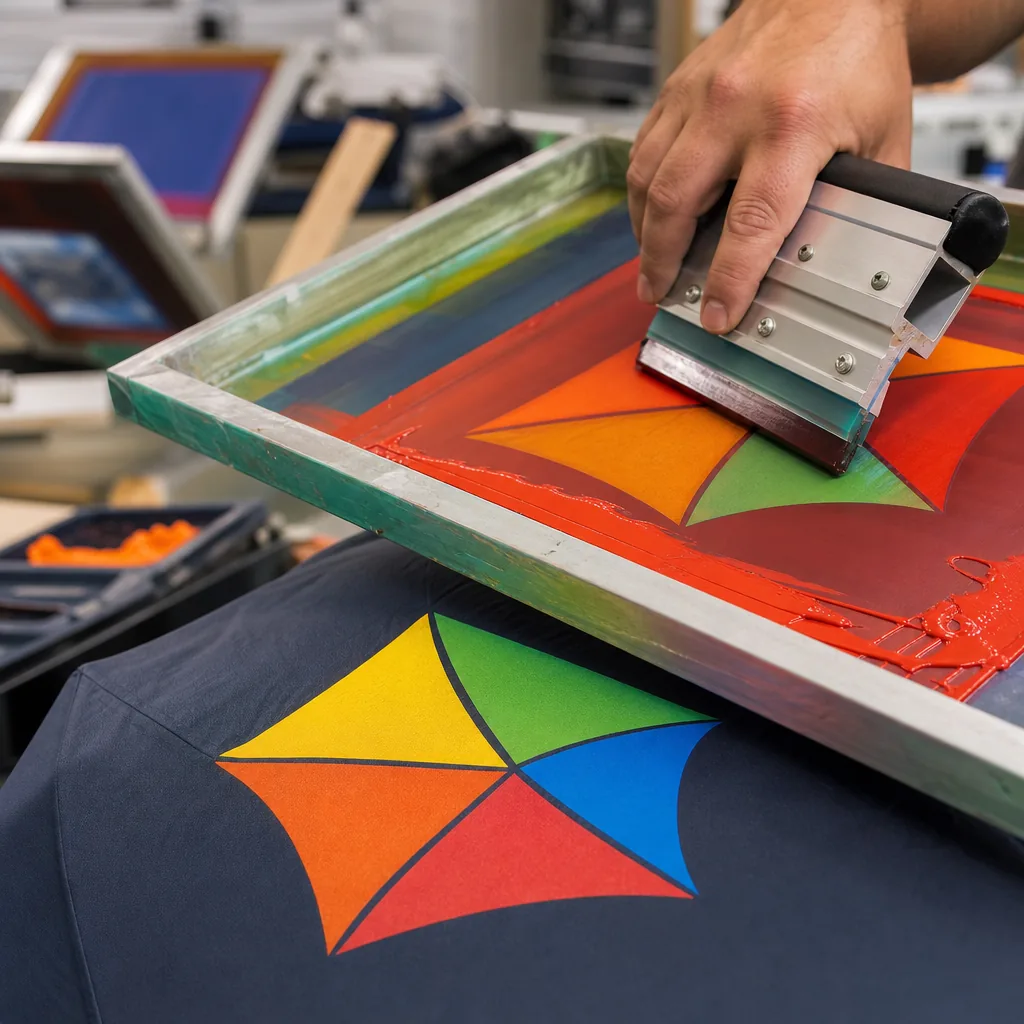
Premium corporate gifts succeed when the branding feels intentional, not loud. In factory production, tone-on-tone umbrella branding depends on the right balance of canopy color, ink density, logo size, and application method so the mark stays subtle, readable, and durable through daily use. Getting that balance right early prevents costly rework and protects the premium impression buyers want.
When Low-Contrast Branding Fits Premium Programs
Tone-on-tone umbrella branding works best when the product itself is supposed to feel expensive, not promotional. In executive gifting, hospitality amenity programs, and higher-end retail programs, low-contrast decoration keeps the umbrella looking like part of the package instead of an ad. On a 23" or 27" fiberglass frame with a 190T or 210T pongee canopy, that usually means matching the logo to the panel color within one or two shades, or using a debossed logo effect on PU, EVA, or a coated handle detail where the mark is visible up close but does not shout from across a room.
The strongest case for tone-on-tone umbrella branding is when the buyer wants the umbrella to feel like a premium accessory rather than a giveaway. For premium corporate gifts, subtle decoration often supports the brand better than high-contrast screen print because it preserves the clean silhouette and avoids fighting with the canopy color, trim tape, or handle finish. I see it used most on black, navy, charcoal, forest green, and beige umbrellas, where low-contrast printing reads as controlled and deliberate instead of cheap or busy.
This approach is not for every brief. If the goal is street visibility, event identification, or fast brand recognition in a crowd, loud contrast wins; if the goal is perceived value, tone-on-tone umbrella branding usually performs better. The same logic applies to branded umbrellas in hotel welcome kits, boardroom gifts, and retail premium lines: fewer visual interruptions, tighter color matching, and decoration placed where the hand naturally finds it. In practice, the result is a cleaner product that feels closer to luxury luggage or apparel branding than to a standard promotional item.
Fabric Color, Ink Tone, and Readability Balance
On pongee 190T and 210T, the cleanest tone-on-tone umbrella branding uses either exact color matching or a controlled near-match: navy ink on navy canopy, charcoal on black, cream on beige, or deep green on forest. That gives a quieter debossed logo effect or low-contrast printing that feels appropriate for premium corporate gifts instead of looking like a promo item. For branded umbrellas, darker-on-darker works best when the fabric has enough surface structure to catch light; lighter-on-lighter works better on smoother panels and usually reads more clearly from a short distance.
The practical limit is visibility, not just taste. Keep logos at least 35 to 40 mm wide for chest-level placement on a closed umbrella panel, and avoid hairline strokes below about 0.3 to 0.4 mm because they fill in fast on 190T and even more on textured 210T. Leave enough spacing inside the mark so letters do not collapse when the canopy flexes; if the design has small counters or tight script, it will disappear once the fabric curves. Tone-on-tone umbrella branding should look restrained, but it still needs a clean silhouette in daylight and under indoor sales lighting.
The safest production rule is to test the art on actual fabric swatches before approving bulk printing. A slightly darker ink than the cloth usually reads better than a perfectly matched shade, especially after coating, stitching, and panel tension change the final appearance. For premium corporate gifts, I would rather see a simple logo with solid spacing than a complicated mark forced into low contrast; on umbrellas, understated works only when the form stays legible at arm’s length.
Decoration Methods That Create a Subtle Finish
For tone-on-tone umbrella branding, screen printing is usually the cleanest starting point, but only if the buyer understands that low-contrast printing is a color-control job, not a graphics trick. On 190T or 210T pongee, a one-shade difference between logo and canopy can look refined from arm’s length and messy if the ink sits too thick or too glossy. Heat transfer gives sharper edges for fine text and small marks, yet it can look too flat if the artwork is oversized or placed across a high-stress panel edge. For premium corporate gifts, I prefer to keep the logo modest in size and match the ink value to the panel color instead of chasing a bright “pop” that defeats the point.
Embroidery is rarely the right choice on the canopy itself, but it works well on straps, sleeves, and tie bands where the fabric can support needle penetration without warping. That matters on branded umbrellas built with auto-open or auto-open-close mechanisms, because the moving shaft and folded stack already create thickness where a canopy print cannot sit cleanly. A debossed logo effect is not literal embossing on the umbrella cloth; it is usually achieved with matte-on-matte contrast, flock-like textures, or a molded sleeve detail that reads like relief without adding bulk. In practice, that is the closest route to a restrained corporate look when the buyer wants something more understated than conventional promotional printing.
Exact placement is where the factory reality starts to matter. On 8K canopies, the panel width is forgiving enough for centered marks, but on 16K frames the narrower panels, seam positions, and vent cuts can force the logo to shift off the ideal midpoint. If the artwork crosses a seam, the result can break the line of a serif font or distort a thin icon, especially near the crown where panel tension changes as the umbrella opens. Our standard practice is to map the decoration zone before sampling, because tone-on-tone umbrella branding only works when the print method, panel count, and mechanism geometry are agreed together rather than treated as separate decisions.
Quality Control for Premium Appearance
For tone-on-tone umbrella branding, the first sample check is visual discipline: edge bleed, sheen variation, color drift, and logo placement consistency. On a matte POE or 190T pongee canopy, a debossed logo effect can look sharp if the film or ink edge stays tight; on a satin-finished 210T fabric, the same artwork can read sloppy fast if the gloss catches differently panel to panel. Buyers should inspect the sample under daylight and warehouse light, because low-contrast printing often looks acceptable in one setting and weak in another. For premium corporate gifts, the goal is not just that the logo is present, but that it sits where the artwork proof says it should and repeats the same on every panel.
AQL 2.5 is the inspection basis I would use for branded umbrellas going into production, because it is strict enough to catch obvious cosmetic drift without turning every lot into a perfection contest. Check multiple units from the same sample set and compare the logo to the seam line, vent line, and tip position; a 3 to 5 mm shift is visible on a clean canopy, especially with dark-on-dark artwork. Frame type also matters: fiberglass ribs flex differently from steel, and a 10K or 16K frame can hold the canopy flatter than a light 8K build, which changes how the print reads once the umbrella is opened.
Canopy tension is the part buyers often miss. A loose stretch will make tone-on-tone umbrella branding look hazy and can expose waviness at the hem, while an over-tight canopy can distort circles, thin out letter strokes, and create false alignment issues near the tips. That is why sample approval should be done on the exact frame size and mechanism planned for production, whether manual, auto-open, or auto-open-close. If the sample passes on one build but not another, the problem is usually the construction, not the artwork, and that matters when the order is meant for premium corporate gifts rather than commodity giveaways.
Ordering Strategy for Corporate and Retail Buyers
MOQ is where most branded gift programs get mispriced. For tone-on-tone umbrella branding, the factory setup cost is real: screen mesh, ink matching, heat-transfer die cuts, and packaging labels all add up, so a tiny run usually costs more per piece than buyers expect. In practice, 300 to 500 pieces is a workable starting point for premium corporate gifts, while 1,000 pieces or more gives you better unit economics on branded umbrellas, especially if you want a debossed logo effect or low-contrast printing on 190T or 210T pongee. If the design has Pantone-sensitive gray-on-gray artwork, ask for a production swatch before approving the full order, because what looks clean on screen can disappear on a dark canopy.
Sample timing should be treated as part of the schedule, not an extra. A first pre-production sample typically takes 5 to 7 days if the frame and canopy materials are standard; custom ribs, special coatings, or unusual handle parts can push that to 10 days. For tone-on-tone umbrella branding, always ask for a second sample in both daylight and indoor lighting when the logo is meant to stay subtle, because the contrast can shift sharply under LED office lights versus natural daylight. That second check is worth the delay: it catches weak visibility, over-dark ink, and bad registration before the order hits the sewing line.
FOB is usually the cleaner choice if the buyer already has freight forwarding and import clearance under control, because it keeps the comparison between suppliers honest. DDP is useful for corporate buyers who need landed cost certainty, but it hides freight volatility, destination handling, and duty assumptions that can change the real margin on premium corporate gifts. Standard lead time for branded umbrellas is 20 to 30 days after sample approval for common 8K or 16K steel/fiberglass structures, and 35 to 45 days if the order includes custom packaging or mixed sizes. The best practice is to lock artwork, color standard, and Incoterm before deposit; changing any of those after approval usually costs more than the printing itself.
Frequently Asked Questions
Does tone-on-tone branding reduce logo visibility too much?
Not if the contrast is planned correctly. A slightly darker or lighter shade usually keeps the logo readable while preserving a premium, understated look.
Which umbrella styles work best for this branding approach?
Classic straight-handle and compact auto-open umbrellas often work well because the branding can stay clean and centered. Very busy constructions or highly textured fabrics make subtle logos harder to control.
What fabric works best for tone-on-tone umbrella branding?
Pongee fabric is the most common choice for premium corporate umbrellas because it has a smooth surface and accepts low-contrast screen or heat-transfer printing well. For a more luxury look, 190T or 210T pongee with a matte finish usually gives better results than shiny polyester.
How large should a subtle logo be on a corporate gift umbrella?
For tone-on-tone branding, many buyers choose a logo width of 8 to 15 cm on one panel to keep the mark visible without looking promotional. Larger logos can work, but they usually need very low-contrast ink or placement near the lower panel edge.
Can tone-on-tone umbrella samples be made before bulk production?
Yes, a pre-production sample is recommended because small color differences between fabric and ink affect visibility. Sampling usually takes 5 to 10 days after artwork approval, while bulk production often takes 30 to 45 days depending on quantity and frame type.
Looking to Launch Your Custom Umbrella Line?
ZheBrella is a Zhejiang-based OEM/ODM umbrella manufacturer with 17 years of export experience. Free design, low MOQ from 100 pieces, windproof construction, full-color print.
Get Free Quote Now »People Also Search For
Related Articles
Tone-on-Tone Umbrella Branding for Premium Corporate Programs
Use tone-on-tone umbrella branding to create subtle premium gifts with controlled fabric sheen, logo contrast, frame spe...
Read More »Tone-on-Tone Umbrella Branding for Premium Corporate Lines
Use tone-on-tone printing to create premium umbrellas with subtle logos, precise contrast control, and repeatable brand ...
Read More »
Metallic Ink Logos for Premium Branded Umbrella Runs
Compare metallic, pearl, and silicone ink effects for umbrella logos, including fabric limits, durability tests, MOQ, le...
Read More »