Tone-on-Tone Umbrella Branding for Premium Corporate Programs
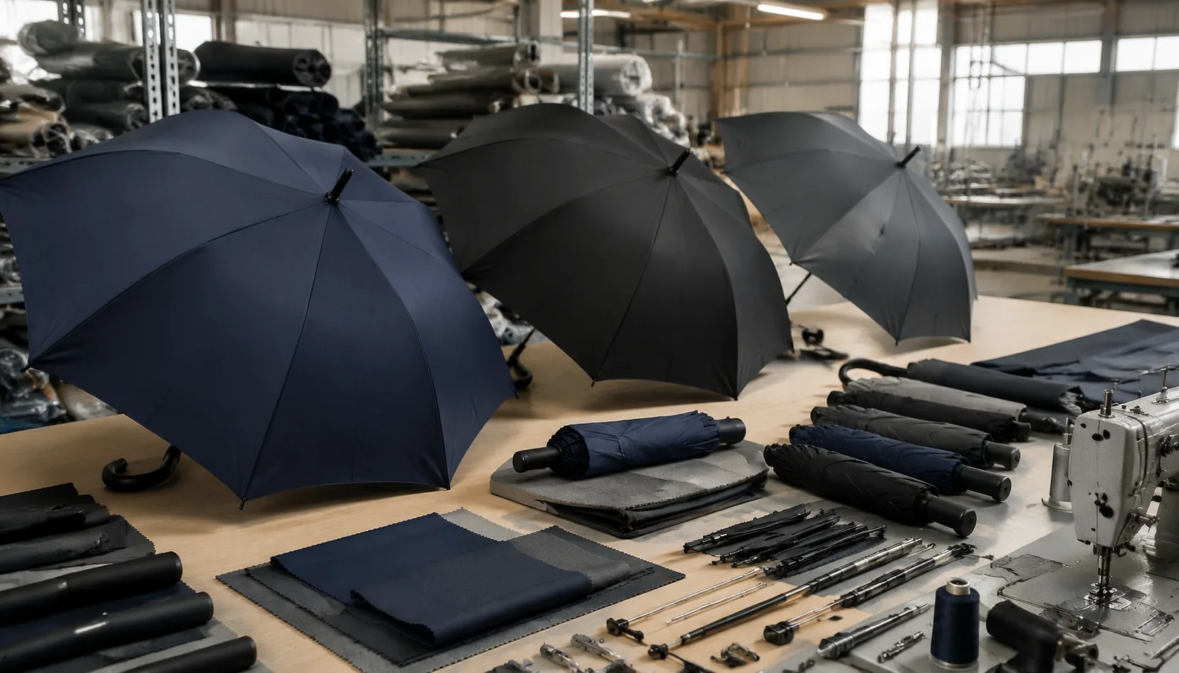
Premium corporate buyers often want umbrellas that feel branded without shouting, but subtle logos expose every mismatch in fabric sheen, ink depth, and panel alignment. On our Songxia factory floor, tone on tone umbrellas are controlled from pongee lot selection and screen tension to frame stiffness and final light-box checks, because a half-shade error can turn quiet luxury into a rejectable bulk order.
Why Subtle Branding Appeals to Premium Buyers
Banks, hotels, automotive brands, and executive gift programs usually want the umbrella to behave like a quiet accessory, not a billboard. That is why tone on tone umbrellas work so well for premium use: the brand is visible when someone is already holding the product, but it does not fight with a suit, lobby uniform, or vehicle interior. In practice, that means low-contrast decoration on 190T or 210T pongee, matte black frames, and restrained branding that reads as part of the object rather than something pasted onto it. For daily carry, that matters more than people admit. A guest or customer is far more likely to keep a premium branded umbrella in rotation if it looks appropriate in meetings, valet drop-off, or a hotel entrance, instead of feeling like leftover event merchandise.
Low-contrast corporate umbrella branding also holds up better for industries that care about reputation. A bank gift or automotive handover umbrella cannot look loud or temporary, because the product is supposed to reinforce trust, finish quality, and attention to detail. Subtle umbrella logo printing gives that effect without turning the canopy into a sales message. On darker canopies, a slightly glossier or slightly darker ink, heat-transfer film, or tonal embroidery can read clearly enough while still staying controlled. That is a different decision from high-visibility promotional umbrellas, where the goal is immediate recognition across a parking lot or trade-show crowd. Premium buyers usually care less about maximum logo size and more about whether the umbrella still looks expensive after the first rainstorm and after six months in a car trunk or lobby closet.
The strongest programs treat the umbrella as part of the brand environment, not a standalone advertisement. Luxury promotional umbrellas for executive gifting often sit alongside leather goods, welcome kits, or concierge items, so the decoration has to match the rest of the package in color temperature and visual weight. Tone on tone umbrellas also age better in mixed-use settings: one design can work for boardroom visitors, hotel VIPs, and dealership customers without looking like it belongs to a one-off campaign. ZheBrella’s standard practice is to test decoration against the actual canopy base color under indoor light and daylight, because the contrast that looks refined in a sample room can disappear outside, or become too sharp under office LEDs. That practical check is what separates polished corporate umbrella branding from generic giveaways that only work in photos.
Fabric and Color Pairings That Keep Logos Legible
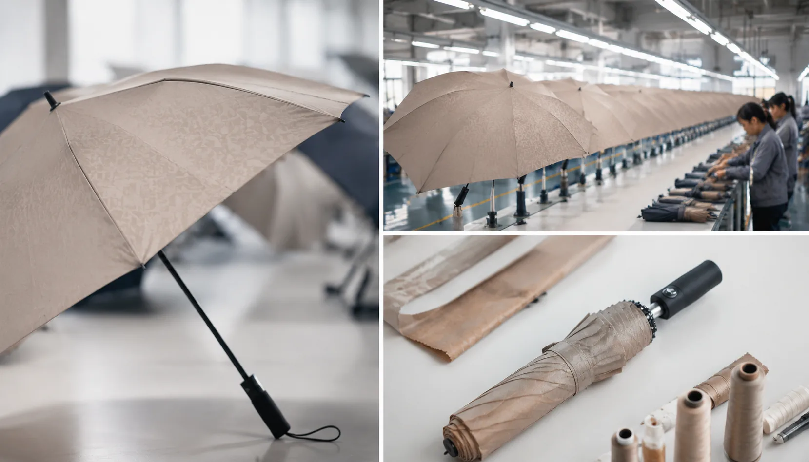
For tone on tone umbrellas, the first decision is fabric base, not the artwork file. 190T pongee gives a slightly lighter hand and enough body for clean screen printing, while 210T pongee is denser, flatter, and usually holds a sharper edge on subtle umbrella logo printing because the weave telegraphs less through the ink. On premium branded umbrellas, that difference matters more than people expect: a thin white logo can look crisp on 210T and a little nervous on 190T if the canopy is stretched hard. For corporate umbrella branding, I usually push buyers toward 210T when they want a polished, controlled look, especially on 23" and 27" frames where panels sit under more tension.
Finish changes the color story as much as the Pantone number does. Matte pongee absorbs light and keeps dark-on-dark combinations readable, which is why charcoal on black or navy on midnight blue works better than clients assume. Glossy or lightly coated fabric throws reflections and can make the same ink feel one shade lighter or warmer. That is also why light-on-light branding needs caution: ivory on champagne can disappear under showroom lighting if the canopy has any sheen. With luxury promotional umbrellas, I prefer simple pairings and a small logo scale, because a low-contrast mark reads as intentional only when the fabric surface is controlled and the print is precise.
Pantone references are still useful, but they are not the whole answer. Fabric sheen, resin coating, and even curing temperature change perceived color, so a matched swatch can look different once it is sewn onto a curved panel. Our standard practice is to check the logo against the actual canopy cloth under daylight and indoor LED before approving production, because that is where tone on tone umbrellas either look refined or muddy. If the buyer wants the safest result, I recommend one-step darker artwork on matte fabric, or one-step lighter artwork on a smoother-coated canopy, rather than chasing exact tone matches that only work on paper.
Decoration Methods for Low-Contrast Effects
Tonal screen print is the cleanest low-contrast method when the buyer wants the logo to sit inside the canopy rather than shout from it. On 190T or 210T pongee, I normally keep positive lines at 0.35 mm minimum and reversed-out gaps at 0.5 mm, because fine serif marks close up once the ink hits water-repellent coating. For tone on tone umbrellas, the ink should be only one or two Delta E steps away from the dyed fabric; black-on-charcoal or navy-on-royal often looks premium, while gray-on-silver can disappear under indoor lighting. The main production risk is uneven absorption on Teflon-coated fabric, so strike-off approval under both daylight and office LED light is not optional for premium branded umbrellas.
Heat transfer gives sharper edges than screen print and works well for subtle umbrella logo printing on complex logos, gradients, or small text down to about 0.25 mm line weight. The tradeoff is hand feel: a matte PU transfer can look elegant on 210T pongee, but a glossy film on coated polyester looks like a sticker, especially on luxury promotional umbrellas. Low-temperature transfers also need peel and flex testing because umbrella panels are folded hard along rib lines; we test after 20 open-close cycles and a wet rub. Sublimation is less useful for true tone-on-tone because the dye penetrates the cloth and often loses contrast on dark canopies.
For corporate umbrella branding that needs restraint, woven patches, strap labels, and handle medallions are often better than adding another canopy mark. Woven patches need at least 0.4 mm yarn detail and usually look best on sleeves, not canopy panels, because the sewing border can pucker lightweight pongee. Strap labels are practical at 15–20 mm wide, with jacquard or satin weave holding small logotypes better than printed ribbon. Metal or epoxy handle medallions give the most executive feel on 23-inch and 27-inch auto-open models, but the recess tolerance should be controlled within ±0.2 mm or the badge will sit proud and catch fingers during use.
Product Specs That Reinforce a Premium Feel
For premium branded umbrellas, the frame matters before the logo does. I would not build a high-end corporate gift on thin black steel ribs unless the budget forces it; fiberglass ribs recover better after gust loading, reduce permanent bending, and give the product a quieter, more controlled feel when opening. A 16K frame is the better choice for tone on tone umbrellas because the extra ribs create a rounder canopy with fewer flat panels, so a low-contrast logo sits cleaner across 190T or 210T pongee. For executive gifts, 23" is the practical walking size, while 27" and 30" work better for golf, hospitality, and VIP outdoor events. The rib count also affects inspection: on 16K frames we check symmetry more tightly because one short rib or loose tip makes the umbrella look cheap immediately, even if the canopy fabric and printing are correct.
Handles should match the positioning of the program, not just the catalog photo. EVA handles are suitable for luxury promotional umbrellas when the buyer wants a soft, matte grip with lighter weight and good wet-hand control, especially on 27" golf models. Wood handles belong on straight umbrellas and executive 23" models where the buyer wants a warmer retail look; stained beech or maple is more stable than very cheap mixed wood, which can show grain cracks after humidity changes. For corporate umbrella branding, the auto-open mechanism must feel smooth, not violent. A clean spring action, centered runner, and tight shaft tolerance are more important than adding decorative hardware. Our standard practice at ZheBrella is to cycle-test auto-open samples before approval, because a premium umbrella that snaps open unevenly will undermine subtle umbrella logo printing faster than any small color variation.
A double-canopy vented windproof design is worth the extra cost when the umbrella is expected to justify a higher retail price, board-level gifting, or long outdoor use. The second canopy layer lets wind escape through the vent gap, so a fiberglass 8K, 10K, or 16K frame can survive stronger gusts without inverting; properly built golf umbrellas can be rated around 50+ mph in wind-tunnel testing, though actual field performance depends on user angle and shaft strength. The tradeoff is weight, sewing complexity, and higher AQL scrutiny because vent alignment, seam tension, and panel matching all become visible. For tone on tone umbrellas, the double canopy also gives the product more depth: matte black logo on black pongee, charcoal on navy, or gloss heat-transfer on dark gray looks intentional rather than under-printed when the frame, handle, and opening action all support the premium position.
Approvals, Tolerances, and Repeat Order Control
For premium programs, approvals are not paperwork; they are the only way to keep tone on tone umbrellas from drifting into obvious mismatches. The first gate should be a strike-off sample that shows panel color, logo placement, ink density, and edge quality on the actual canopy fabric, not a PDF mockup. That sample needs a signed color standard tied to Pantone, fabric lot, and print method, because even small shifts in 190T or 210T pongee show up fast on dark or mid-tone bases. On premium branded umbrellas, I always insist that procurement signs off on the physical strike-off before mass cutting starts, especially when the logo is meant to stay quiet rather than read like a billboard.
Tolerance control matters more than buyers usually expect in corporate umbrella branding. A subtle mark can look clean at sample stage and then fail in production if the logo is allowed to wander, the stitch tension changes, or the panel seam distorts the print zone. Our standard practice at ZheBrella is to lock a reference master and define acceptable variance for color, placement, and opacity before the order is released. For luxury promotional umbrellas, I would not skip batch records: each carton should be traceable to fabric lot, print run, assembly line, and inspection date. That is the only practical way to answer a complaint later and to protect repeat orders from “same PO, different result.”
Inspection and repeatability should be written into the order terms, not argued after shipment. AQL 2.5 is the right baseline for canopy print, frame function, and appearance on bulk runs, with extra attention to color consistency on the first and last cartons of each batch. Typical MOQs depend on decoration method: screen print usually starts around 300 to 500 pieces, heat transfer or sublimation can be lower on some programs, and more complex multi-panel work often needs a higher threshold to keep setup waste under control. Bulk lead time is typically 30 to 45 days after artwork approval, but only if the color standard, strike-off, and batch records are already signed off and the customer is not changing logo files midstream.
Frequently Asked Questions
How much contrast is needed for tone-on-tone umbrella logos?
Most buyers need at least a slight gloss, texture, or shade difference so the logo is visible at 1-2 meters. A sample panel is the safest way to approve the effect.
Can tone-on-tone branding be repeated accurately in reorder programs?
Yes, if the factory keeps approved fabric swatches, ink formulas, print screens, and signed samples. Reorders should still allow normal fabric and coating tolerance checks.
What logo contrast works best for tone-on-tone umbrella branding?
For a premium look, most buyers keep the logo contrast within about 5% to 15% of the canopy color value. That is usually enough for visibility in daylight without making the umbrella look heavily advertised.
Which canopy fabrics hold tone-on-tone printing most consistently?
Polyester pongee and high-density polyester are the most common choices because they accept color-matched printing and dye lots more consistently. If sheen control matters, ask for a matte or semi-matte finish and approve a lab dip before production.
What QC checks matter most for repeat orders?
Focus on canopy color tolerance, logo placement tolerance, and print visibility under indoor and outdoor light. For repeat programs, many buyers also lock frame spec, fabric lot, and pantone references to reduce batch variation.
Looking to Launch Your Custom Umbrella Line?
ZheBrella is a Zhejiang-based OEM/ODM umbrella manufacturer with 17 years of export experience. Free design, low MOQ from 100 pieces, windproof construction, full-color print.
Get Free Quote Now »People Also Search For
Related Articles
Tone-on-Tone Umbrella Branding for Subtle Retail Programs
Create understated umbrella branding with tone-on-tone logos, matched trims, and controlled contrast for premium retail ...
Read More »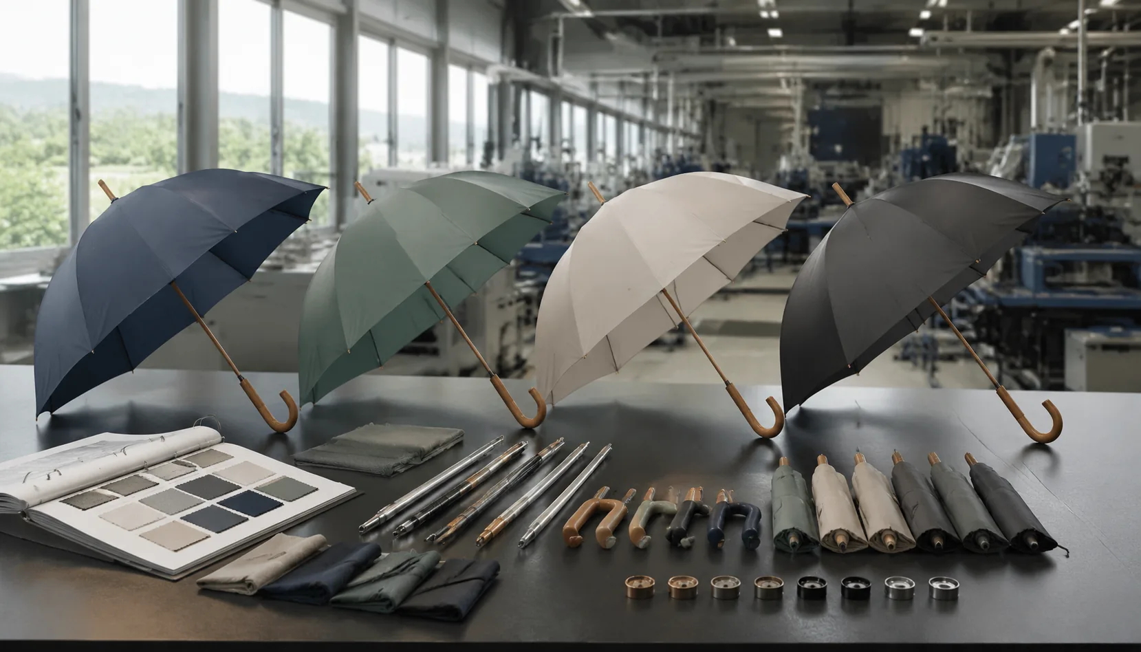
Tonal Umbrella Branding for Premium Corporate Programs
Use tone-on-tone umbrella branding to create premium corporate gifts with controlled contrast, durable inks, refined mat...
Read More »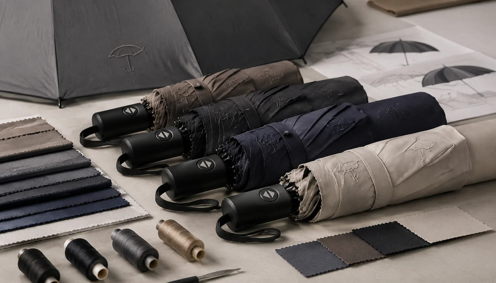
Tone-on-Tone Umbrella Logos for Premium Retail Branding
Use tonal logo printing to create premium umbrellas with controlled contrast, fabric choices, QC checks, and repeatable ...
Read More »