Tone-on-Tone Umbrella Branding for Premium Retail Lines
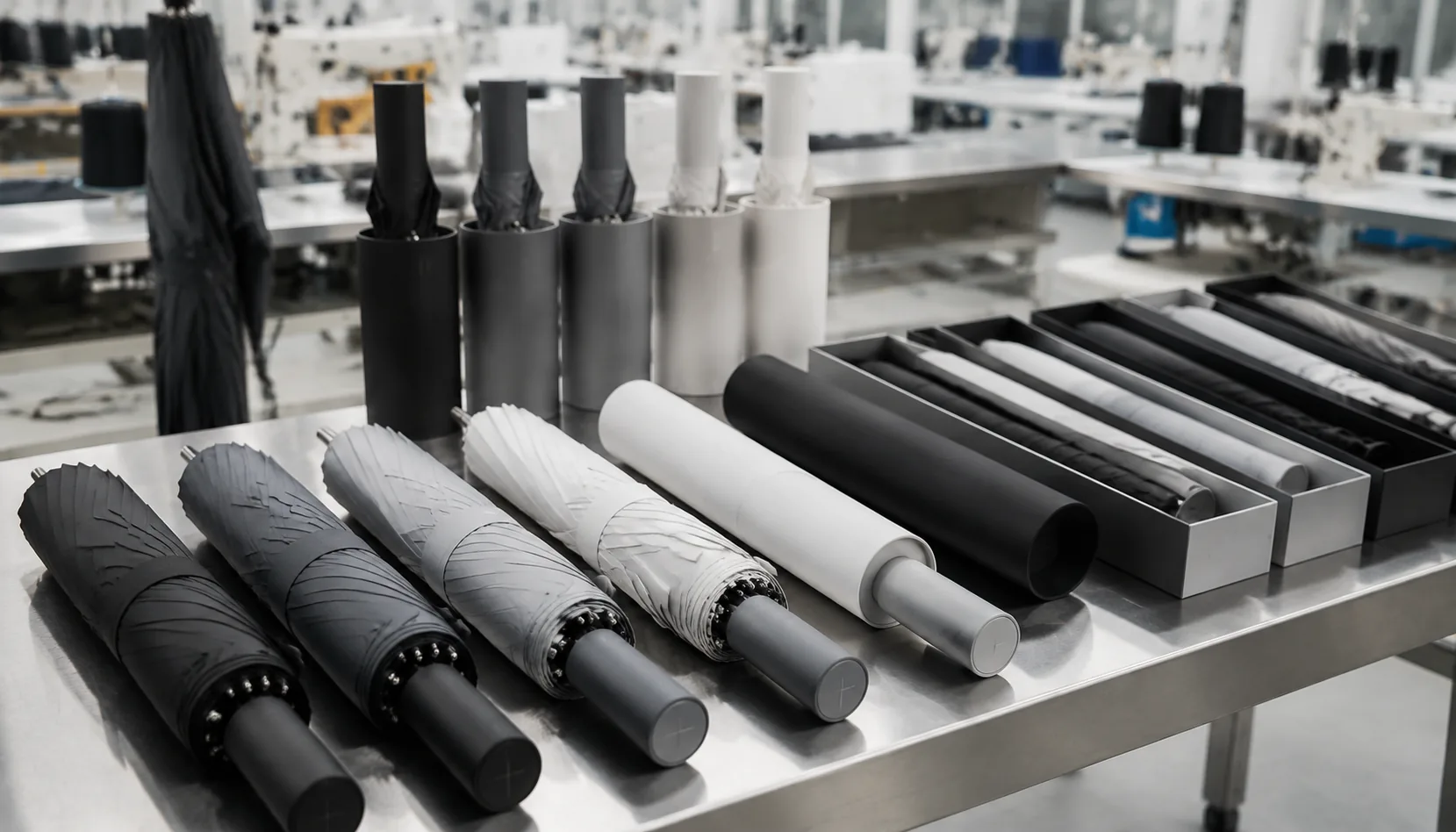
Premium retail buyers often want branding that feels quiet up close but still reads cleanly on shelf, and that balance is easy to miss if logo contrast is judged only on a screen. With tone on tone umbrellas, we control the result through fabric dye lots, panel direction, ink or heat-transfer finish, and light-box sampling before bulk cutting. On the factory floor, the real work is turning that subtle look into repeatable QC specs every shipment.
Why Tonal Branding Works for Premium Buyers
Premium buyers choose tone on tone umbrellas because the branding does not fight the product. A department store, five-star hotel, private bank, or luxury gift program usually wants recognition at arm’s length, not a billboard above the customer’s head. On a 23" auto-open stick umbrella in black 190T pongee, a charcoal logo printed 5–8% lighter than the canopy reads as intentional and expensive. On navy, forest green, burgundy, or warm gray, the same approach keeps the umbrella retail-ready instead of looking like a giveaway. I see the strongest results when the frame is also restrained: black electroplated steel shaft, fiberglass ribs for wind recovery, matching sleeve, and a handle without unnecessary chrome. The logo becomes one detail in a controlled specification, not the whole story.
Matte, gloss, and near-match effects behave differently, so the artwork should be chosen before sampling. Matte tonal logo printing works well on 190T or 210T pongee with a soft hand feel, especially for finance brands and executive gifts where subtle umbrella branding matters more than distance visibility. Gloss-on-matte printing is sharper under hotel lobby lighting and rain, but it exposes uneven ink deposit if the screen mesh, squeegee pressure, or curing temperature is poorly controlled. For private label umbrellas, we usually test a 1-panel logo, a sleeve logo, and a small handle badge because each surface catches light differently. A logo that looks invisible on a flat strike-off may become readable once the canopy is stretched over 8K fiberglass ribs.
The reason premium branded umbrellas can carry quiet logos is that buyers judge the full build: canopy tension, rib symmetry, coating, stitch density, and how cleanly the umbrella closes. A tonal logo will not save a weak 21" folding frame with loose tips or a canopy that wrinkles after packing. For retail and hospitality programs, I prefer 23" or 27" sizes, 8K or 10K fiberglass construction, water-repellent coating, and AQL 2.5 inspection focused on print alignment, color deviation, seam puckering, and open-close function. Tone on tone umbrellas also reduce approval risk across regions because the branding feels less loud in-store, in guest rooms, and in corporate gifting. The safest production route is to approve physical lab dips and printed strike-offs under daylight and warm indoor light before bulk cutting begins.
Choosing Canopy Fabric and Color Depth
The practical test is not whether the logo is visible on a flat fabric swatch; it is whether it stays legible on a curved canopy with ribs underneath. A 21" compact umbrella with 8K steel ribs creates tighter panel curvature than a 30" golf umbrella with fiberglass ribs, so the same tonal logo can look more broken on the smaller frame. Double-canopy vented windproof styles add another issue: the top layer moves slightly in wind, and high-gloss tonal ink may flash unevenly panel to panel. Our standard practice at ZheBrella is to check tonal contrast after cutting, sewing, and one open-close cycle, then inspect under daylight and warehouse lighting before confirming bulk production. For tone on tone umbrellas, I prefer a Delta E difference that is visible but restrained, plus an AQL 2.5 check for print edge, panel shade, and coating stains, because premium retail customers notice inconsistency faster than they notice loud branding.
Print Methods for Subtle Logo Contrast
Low-contrast screen printing is still the most reliable way to make tone on tone umbrellas look expensive instead of under-printed. On 190T or 210T pongee, I usually specify ink within 5–12% shade difference from the canopy color: charcoal on black, navy on dark blue, warm gray on beige. Anything closer than 3% often disappears after Teflon water-repellent finishing; anything above 15% starts reading like normal promotional printing. For subtle umbrella branding, avoid hairline artwork. On woven pongee, keep positive lines at 0.35 mm or thicker, reversed lines at 0.5 mm, and small text above 6 pt if the buyer expects repeatable AQL 2.5 inspection results across 1,000+ pieces.
Heat transfer gives cleaner edges for tonal logo printing, especially on complex emblems, but it can look too “sticker-like” if the film hand-feel is heavy. Matte PU transfer works well for premium branded umbrellas where the logo sits on one or two panels and the buyer wants sharp geometry. I recommend a minimum logo height of 25–30 mm for crest marks and 40–50 mm for wordmarks, because umbrella panels are curved, tensioned, and interrupted by seams. Rubberized ink is better when the brand wants a soft raised effect, but the deposit must stay thin enough to fold without cracking; thick rubber logos near rib tips become failure points after 300–500 open-close cycles.
Glossy-on-matte effects are the best option when a retail line wants private label umbrellas with branding visible only under angled light. A gloss clear screen print over matte pongee, or a matte logo over a satin canopy, creates contrast without changing color. Alignment matters more than most designers expect: on 8K umbrellas, each panel is wider, so a centered logo has more visual breathing room; on 16K frames, narrower panels make multi-panel artwork harder to register because every seam adds tolerance stack-up. Our standard practice at ZheBrella is to keep logo placement at least 20 mm from seams and 35 mm from the bottom hem, then approve a pre-production sample under both indoor light and outdoor shade before bulk cutting.
Matching Frame and Trim to the Brand System
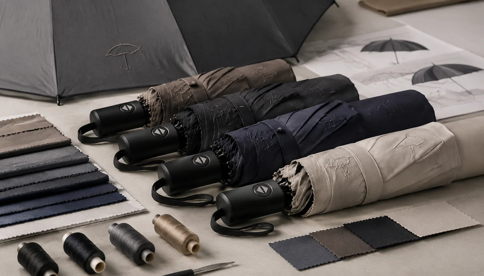
The fastest way to make private label umbrellas look expensive is not the logo; it is the color discipline across every visible component. For tone on tone umbrellas, we normally start by matching the 190T or 210T pongee canopy to the brand’s Pantone target, then pull the strap, snap button, runner insert, rib tips, ferrule, and sleeve piping into the same color family. A navy canopy with black plastic tips and a silver ferrule often looks like a stock umbrella with decoration added later. A navy canopy with dark navy tips, gunmetal ferrule, woven navy strap, and a low-contrast tonal logo printing pass reads as intentional retail product. Subtle umbrella branding works best when the buyer approves a full material board, not just a canopy swatch, because molded plastics, coated metal, EVA, and wood all absorb color differently under store lighting.
Frame color matters as much as canopy color, especially on premium branded umbrellas where the inside view is part of the customer experience. Steel ribs are economical and give good rigidity on 21 inch and 23 inch compact models, but black-coated steel can chip at the hinge points after repeated open-close cycling if the coating is thin. Fiberglass ribs cost more, but they flex better in gusts and suit 27 inch and 30 inch golf umbrellas, especially 8K or 10K layouts with double-canopy venting rated around 50+ mph in controlled wind tests. For a premium private-label look, I prefer black or color-matched fiberglass ribs with a black shaft, because the frame visually disappears under the canopy. Auto-open mechanisms add convenience for retail and corporate gifting, but the spring housing, button, and runner should be specified in matching matte black, nickel, or brand-color plastic rather than whatever the frame vendor has in stock.
Handle choice should follow the brand system, not just the target price. A straight or crook wood handle supports heritage, outdoor, hotel, and luxury department-store positioning, but only if the grain, stain color, and clear coat are controlled; cheap glossy varnish makes even good pongee look promotional. Matte plastic handles are better for modern fashion, tech, and minimalist brands because they accept molded color more consistently and pair well with tonal logo printing on the strap or sleeve. Rubberized handles feel practical but can look too sporty unless the line is built around performance. At ZheBrella, our standard practice for tone on tone umbrellas is to confirm canopy fabric, handle finish, ferrule, tips, strap, sleeve, and print color in one pre-production sample before bulk cutting, then inspect color consistency under AQL 2.5 so the final shipment looks like one coordinated product, not assembled leftovers.
Approval Standards for Repeat Orders
Repeat orders for tone on tone umbrellas fail when the first approval is treated like a photo instead of a controlled specification. I recommend a one-page brand spec sheet tied to every PO: canopy fabric such as 190T or 210T pongee with finished weight tolerance of ±5 gsm, rib/frame description such as 8K fiberglass shaft or 10K steel/fiberglass hybrid, exact umbrella size like 23" auto-open or 27" golf, and handle material with color reference. For subtle umbrella branding, do not approve only “black logo on black canopy.” Define the canopy Pantone, the ink or heat-transfer film Pantone, and the allowed tonal contrast, usually 5–12 Delta E for visible-but-quiet retail branding. Tonal logo printing also needs a finish callout: matte rubber ink, gloss ink, low-sheen transfer, or woven label, because gloss difference often shows more than color difference under store lighting.
Print position tolerance should be written before mass production, not argued at final inspection. For premium branded umbrellas, our standard practice is ±5 mm from approved logo center on compact 21" and 23" panels, ±8 mm on 27" and 30" golf umbrellas, and maximum 2 mm skew across the logo baseline. The spec should include artwork size, panel number, distance from seam or bottom hem, and whether printing is allowed over a double-canopy vent area. For AQL 2.5 inspection, classify logo misplacement, obvious tonal mismatch, broken print edges, oil stains, bent ribs, weak auto-open function, and canopy puckering as major defects. Minor defects can include light thread tails under 5 mm or barely visible shade variation inside the approved Delta E band. Keep sealed pre-production samples, two signed golden samples, and one carton sample from each replenishment batch for dispute control.
Replenishment programs for private label umbrellas should also lock the commercial side of the approval standard. If the MOQ is 500 pieces per SKU/color, plan fabric dyeing and print setup in multiples that match carton quantity, often 24 or 36 pieces per carton, so repeat orders do not create leftover panels or shade-lot mixing. For tone on tone umbrellas, never mix canopy lots across a single retail delivery unless the buyer signs off, because small dye differences make tonal contrast look inconsistent. FOB/DDP documentation should carry the same item code, Pantone references, HS code, carton marks, packing ratio, and approved sample date used on the PO. For DDP replenishment, add destination labeling, Amazon or retailer carton requirements if needed, and a photo record before loading. A clean repeat-order file usually cuts approval time from 10–14 days to 3–5 days.
Frequently Asked Questions
How visible should a tone-on-tone umbrella logo be?
Most premium programs target a logo that is visible at 3 to 6 feet but not high contrast across a room. The exact effect should be approved using a physical sample, not only a digital mockup.
Does tone-on-tone branding cost more than standard printing?
The print cost is often similar, but sampling may take longer because contrast is more sensitive. MOQ can also rise if the project requires custom-dyed fabric or a nonstandard trim package.
What logo contrast level works best for tone-on-tone umbrella branding?
For premium retail programs, buyers usually target a contrast that is visible up close but understated at 3-5 feet. In production, we often match the logo within one to two Pantone steps of the canopy color to keep the look refined and consistent.
Can you provide sample umbrellas before full production?
Yes. Most OEM/ODM programs start with a pre-production sample for logo placement, color match, and fabric confirmation. Typical sampling takes 7-15 days depending on print method, canopy material, and whether a custom panel color is required.
How do you keep the branding consistent across repeat orders?
Use a fixed QC spec for Pantone references, logo size, print location, and fabric lot approval. For repeat retail orders, many buyers also lock the same panel template and accept only a small shade tolerance between production runs.
Looking to Launch Your Custom Umbrella Line?
ZheBrella is a Zhejiang-based OEM/ODM umbrella manufacturer with 17 years of export experience. Free design, low MOQ from 100 pieces, windproof construction, full-color print.
Get Free Quote Now »People Also Search For
Related Articles
Tone-on-Tone Umbrella Logos for Premium Retail Branding
Use tonal logo printing to create premium umbrellas with controlled contrast, fabric choices, QC checks, and repeatable ...
Read More »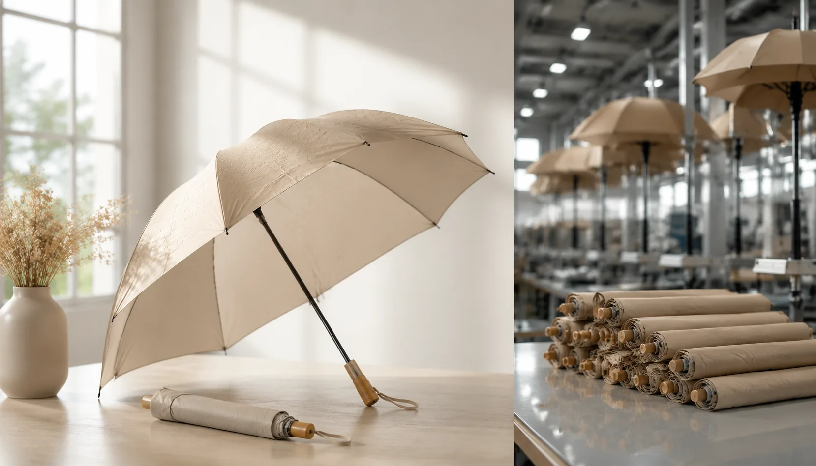
Tone-on-Tone Umbrella Branding for Premium Private Labels
Build premium private-label umbrellas with tonal logos, matte finishes, and controlled contrast across 190T or 210T pong...
Read More »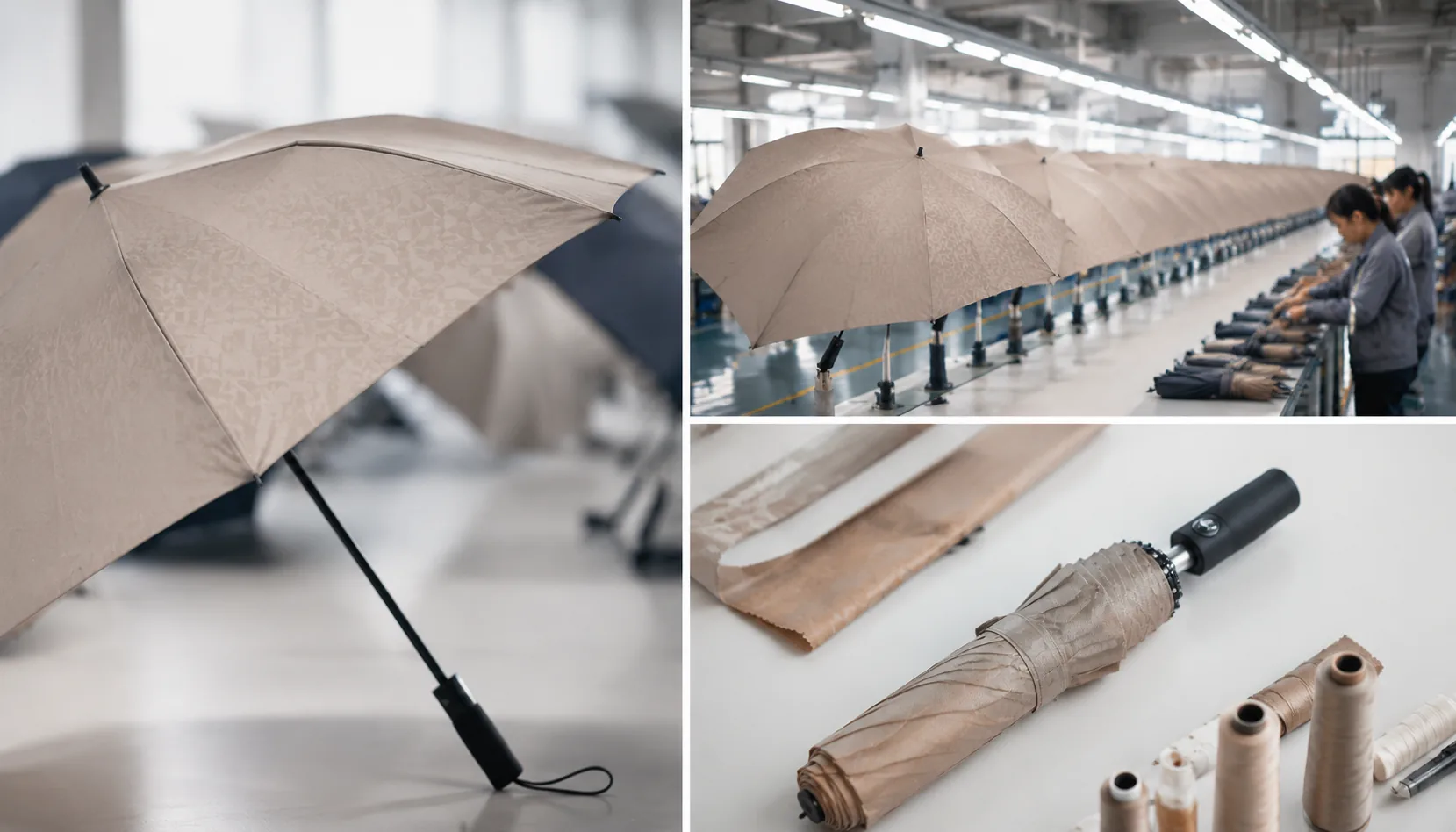
Tone-on-Tone Umbrella Branding for Subtle Retail Programs
Create understated umbrella branding with tone-on-tone logos, matched trims, and controlled contrast for premium retail ...
Read More »