Tone-on-Tone Umbrella Logos for Premium Retail Branding
Premium retail buyers often want a logo that feels expensive without shouting, but tonal printing can quickly turn into invisible branding, muddy edges, or shade drift between production lots. On our Songxia factory floor, tone on tone umbrella logos start with fabric selection, ink/heat-transfer matching, and controlled contrast checks under real light, not just a screen proof. The goal is a repeatable private-label spec that looks subtle at first glance and consistent across every carton.
Why Buyers Choose Subtle Tonal Branding
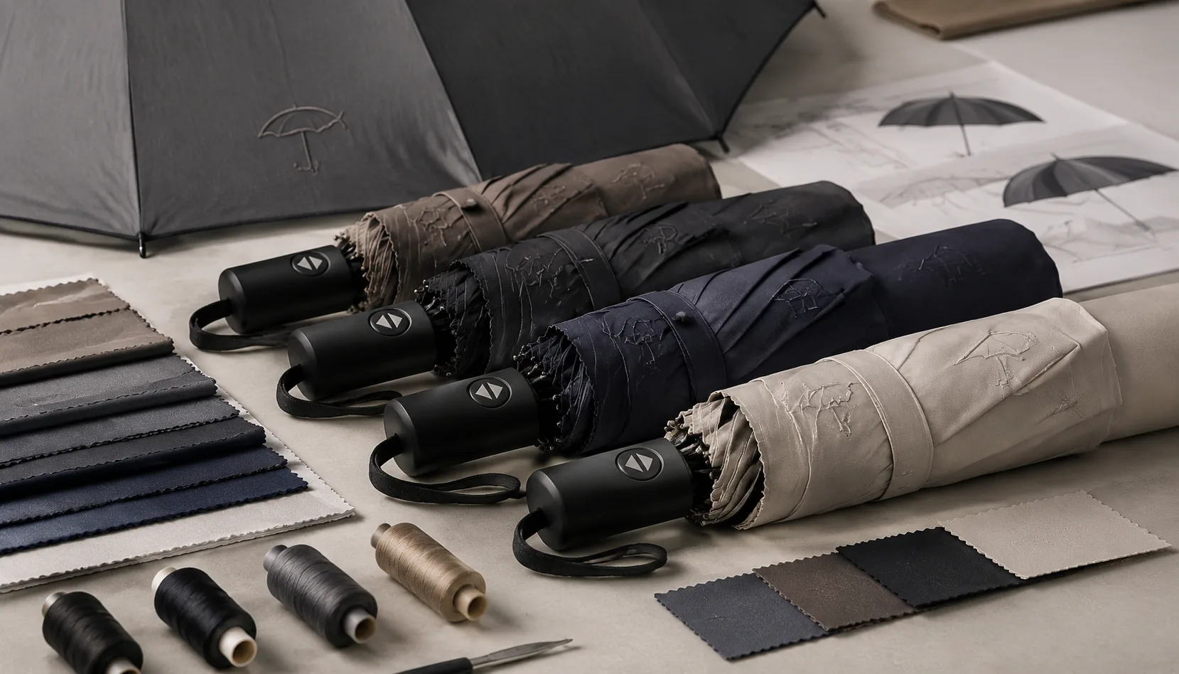
Buyers choose tone on tone umbrella logos when the umbrella has to feel like part of a premium product line, not a giveaway. Fashion retailers usually want the logo visible at arm’s length but not shouting across the street; hotels want guests carrying the property name without turning the lobby into an ad wall; financial services and executive gift programs want restraint because the recipient may be a managing director, board member, or VIP client. On a 23" or 27" stick umbrella with 190T or 210T pongee, a tonal mark printed one or two shades darker than the canopy gives enough identification while keeping the handle, frame, and fabric as the main impression. For private label umbrellas, this approach also protects resale value because the product can sit beside leather goods, travel accessories, or apparel without looking like event merchandise.
Tonal logo printing is technically different from high-contrast promotional printing. A white logo on navy pongee or a red logo on black PVC is judged by visibility first; a tone-on-tone mark is judged by edge control, ink density, and how it looks under daylight, hotel lobby lighting, and rain-darkened fabric. On the factory floor, we normally test tonal screen ink or heat-transfer film against the actual bulk fabric, not just a Pantone chip, because 210T pongee with Teflon coating can shift the perceived color after finishing. For subtle umbrella branding, I prefer a 5–15% shade difference for fashion and hospitality, and 15–25% for banks or insurance groups that still need brand recognition in photos. Anything stronger starts behaving like a conventional contrast logo.
The best results come when the logo method matches the umbrella construction. A compact 21" auto-open-close umbrella with 8K fiberglass ribs has limited panel space, so a small tonal logo near the lower canopy edge usually looks cleaner than a large center print. A 27" or 30" golf umbrella, especially 8K or 16K with a double-canopy vented windproof frame rated around 50+ mph, can carry a larger shadow logo without becoming loud. For premium branded umbrellas, we also check logo placement after sewing because panel stretch, seam allowance, and rib alignment can move a mark by 3–5 mm. Our standard practice at ZheBrella is to confirm a pre-production sample before bulk production, then inspect print registration, rub resistance, coating marks, and canopy symmetry under AQL 2.5 before FOB or DDP shipment.
Matching Ink, Fabric, and Canopy Texture
Tone on tone umbrella logos live or die by surface contrast, not color contrast. On 190T pongee, the weave is slightly more open and the hand-feel is lighter, so a matte black logo on black fabric can disappear unless the ink has enough body to sit cleanly on the yarns. Satin ink on 190T catches more light, but it can look too promotional if the logo area becomes shiny like a sticker. On 210T pongee, the denser weave gives a smoother print bed, which is why premium branded umbrellas often use 210T for black-on-black, navy-on-navy, and gray-on-charcoal work. The logo edge holds better, especially on fine serif marks or small registered symbols, but the higher fabric density also makes ink laydown more sensitive to mesh count, squeegee pressure, and curing temperature.
Controlled ink selection matters because black, navy, and charcoal are not single colors on the production floor. A black 190T pongee from one dye lot may lean blue, while a black 210T with Teflon water-repellent treatment may look warmer after heat setting. For tonal logo printing, we usually make drawdowns under D65 daylight and store-light conditions because retail buyers judge umbrellas under LED shelves, not just in a sample room. A navy-on-navy logo can be built with a slightly glossier clear-base ink, a half-tone pigment adjustment, or a rubberized matte ink depending on whether the buyer wants subtle umbrella branding or a visible luxury mark from two meters away. Gray-on-charcoal is harder than black-on-black because small hue shifts turn the logo greenish or purple after curing.
Water-repellent coating changes the whole equation because it reduces absorption and can make ink bead, crawl, or cure with weak adhesion if the pretreatment is ignored. Fresh Teflon-coated pongee often needs a compatible catalyst or adjusted binder system; otherwise, the logo passes the first visual check but fails after wet rub or folding tests. Our standard practice at ZheBrella is to test tonal samples after 24 hours of curing, then run cross-hatch adhesion, wet rub, and folding abrasion before approving bulk production for private label umbrellas. For 210T pongee, heat-transfer tonal films can give a clean satin-on-matte effect, but they add hand-feel and may crack if the canopy is packed tightly around 8K or 10K ribs. Screen printing remains the safest choice when the buyer wants a soft retail finish, provided the ink, fabric coating, and canopy texture are matched before mass cutting.
Logo Methods for Low-Contrast Effects
For tone on tone umbrella logos, the safest low-contrast method is still screen printing with a controlled ink formula, not simply choosing “black on black” and hoping it looks premium. On 190T or 210T pongee, we usually specify ink within 5–12% shade difference from the canopy, then adjust gloss level so the logo appears only when light hits the panel. Matte ink on a satin pongee reads more quietly than glossy ink; glossy ink can look cheap if the buyer expected subtle umbrella branding. Heat transfer works when the logo has fine edges, gradients, or very small lettering, but the film must be thin and soft enough to avoid a sticker feel after folding. For premium branded umbrellas, I avoid oversized heat transfers on compact 21" models because repeated creasing around the fold lines can expose the logo edge faster than a screen print.
Rubberized ink is the better choice when the buyer wants tonal logo printing with a soft raised touch, especially on 23" or 27" straight umbrellas where the panel has enough flat area to show texture. It adds a 0.2–0.5 mm tactile lift depending on pass count, but it needs clean curing; under-cured rubber ink blocks during packing, while over-cured ink can crack after cold flex testing. On double-canopy vented windproof styles, logo placement must stay away from the vent overlap or the mark disappears in the shadow line. Panel construction matters more than many artwork files admit: an 8K umbrella gives wider individual panels, so a 120–160 mm logo can sit centered without seam interruption, while 16K construction creates narrower slices and more seam lines, forcing either a smaller logo or a multi-panel layout with careful registration.
Low-contrast branding does not have to live only on the canopy. Debossed handle marks are clean for private label umbrellas, especially on EVA foam, rubber-coated ABS, PU leather wrap, or natural wood handles; the mark survives rain, folding, and AQL 2.5 inspection better than a weak canopy print placed in a bad position. Woven tabs are another quiet option: a small tonal label at the strap or sleeve seam can carry the brand without disturbing the canopy surface. Our standard practice at ZheBrella is to check logo width against rib count before sampling, because an 8K frame creates strong visual quadrants and a 16K frame creates a more segmented luxury look. If the tonal mark crosses a seam, the eye reads it as misaligned even when sewing tolerance is acceptable, so premium work usually means smaller, better-positioned marks rather than simply making the logo darker.
Approval Standards for Tonal Visibility
For tone on tone umbrella logos, the approval standard should start with a hard contrast target, not a subjective “looks fine” note. Define minimum visibility under three real conditions: full daylight outdoors, common indoor retail lighting around 3000K to 4000K, and product photography with diffused studio light. A mark that reads cleanly on a white monitor can disappear on a wet canopy or under sodium-heavy store lighting, so the approved sample has to prove legibility at arm’s length and from a normal e-commerce viewing distance. For subtle umbrella branding, I tell buyers to lock the contrast window before mass production, especially on premium branded umbrellas where the logo is supposed to feel restrained, not loud.
Use measurable color references instead of verbal descriptions. A LAB target or Pantone reference gives the factory a fixed point for tonal logo printing, and it avoids the usual argument over whether a gray is “too close” to the canopy. On private label umbrellas, the sign-off sample should show the logo on the exact production fabric, coating, and print method, because the same ink reads differently on 190T pongee, 210T pongee, POE, or matte PVC. Have both sides sign the sample with date, fabric code, print code, and acceptable viewing conditions. That signed master is the only thing worth comparing against on the line.
For production control, AQL 2.5 is the right floor for checking print consistency, but the inspection has to focus on visibility defects, not just obvious smears or registration errors. Inspect random units for color drift, washed-out edges, missed strokes, and gloss differences that change how the logo appears when the canopy is opened and flexed. On tone on tone umbrella logos, the failure mode is often inconsistency between panels, not a single bad print, so the check sheet should include panel-to-panel match, placement tolerance, and whether the mark still reads in a quick photograph. If the sample cannot survive that review, the batch should not ship, even if the print technically passed basic dimensional checks.
Building a Repeatable Premium Spec
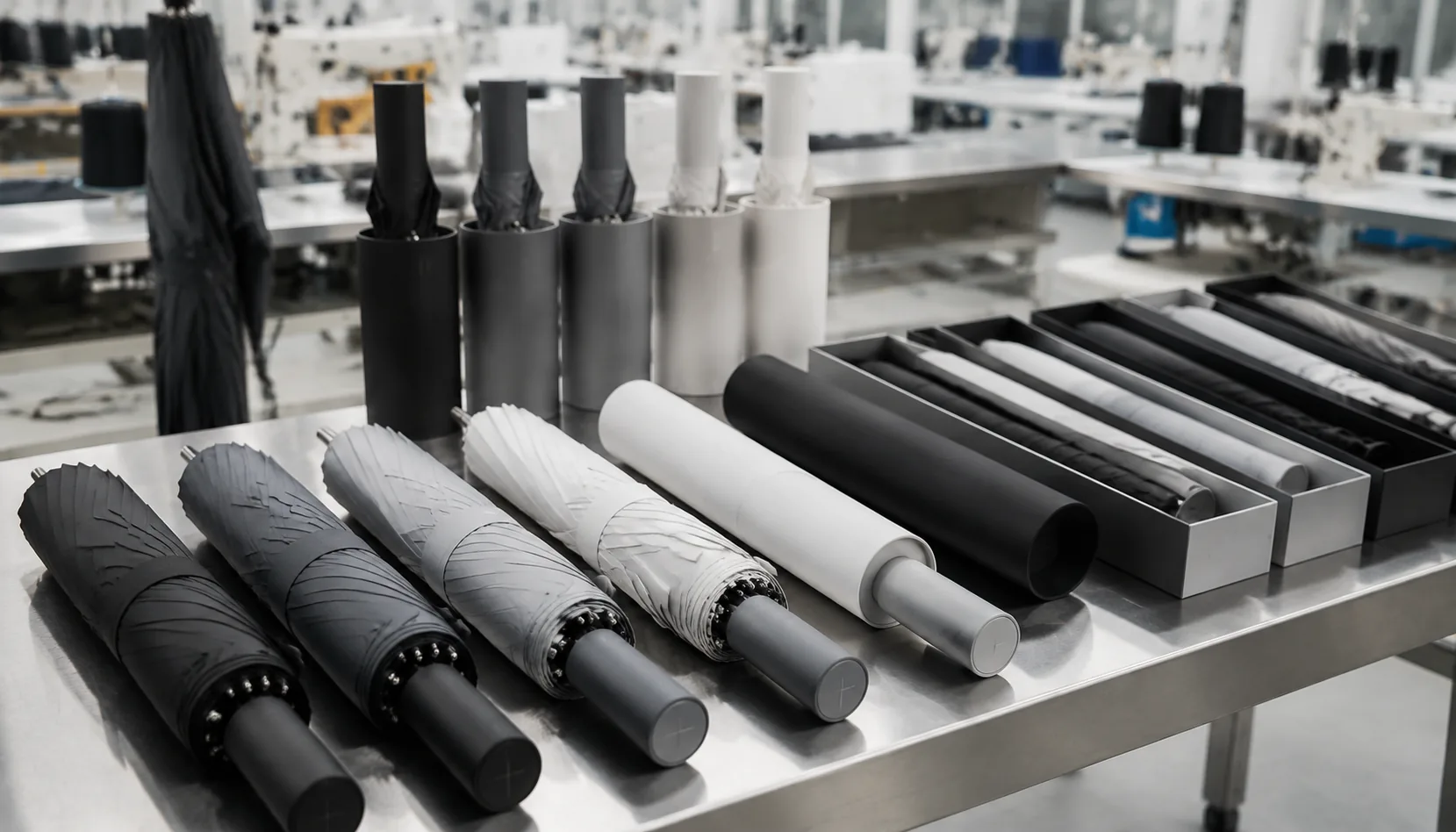
A repeatable premium spec starts by locking the parts that shoppers can feel in the first five seconds: 210T pongee canopy, fiberglass ribs, a clean auto-open shaft, and a handle that does not rattle when opened hard. For retail programs, I usually avoid thin 190T unless the target price is aggressive; 210T gives better drape, tighter color consistency, and a smoother surface for tonal logo printing. An 8K frame is acceptable for compact and standard 23" models, but 10K fiberglass ribs give a better premium hand-feel without jumping into the cost and weight of 16K construction. For tone on tone umbrella logos, the canopy color and ink or heat-transfer film should be approved under D65 light, not only under warm office lighting, because charcoal-on-black and navy-on-navy can shift badly between lab dip and bulk fabric.
The windproof build should be specified clearly, not just called “storm resistant.” A double-canopy vented design with fiberglass ribs and a steel or aluminum shaft can survive 50+ mph wind-tunnel testing when the rib joints and runner are properly matched. For premium branded umbrellas, the sleeve matters almost as much as the umbrella: add the same subtle umbrella branding on the sleeve, align the logo direction with the folded canopy, and use a woven label or small tonal print if the retail shelf presentation needs to stay quiet. Our standard practice at ZheBrella is to approve one sealed pre-production sample before bulk cutting, then inspect under AQL 2.5 for canopy stains, print placement, rib tension, open-close function, and sleeve fit.
MOQ and lead time should be written into the spec before quoting, because private label umbrellas fail when buyers compare samples without comparing production conditions. A practical MOQ is often 500 pieces per color for stock fabric and 1,000–3,000 pieces for custom-dyed pongee or matched sleeve fabric. Normal lead time is about 25–35 days after artwork and deposit approval, or 40–50 days if custom fabric dyeing, Teflon coating, UV UPF 50+ treatment, or retail packaging is required. FOB pricing lets retail buyers compare the factory cost at Ningbo or Shanghai port, while DDP pricing shows the landed cost after ocean freight, duty, customs clearance, and local delivery. For tone on tone umbrella logos, DDP is usually the cleaner comparison because the decoration cost is small, but freight, duty category, and carton size can change margin more than the logo method itself.
Frequently Asked Questions
Will a tone-on-tone logo be visible in product photos?
Yes, but the photography brief should include angled light and close-up shots. Buyers should approve a sample photo set because tonal logos can look different under studio light, daylight, and e-commerce compression.
Is tonal branding more expensive than standard one-color printing?
The print process may be similar, but extra sampling is often needed to lock contrast and finish. Cost can rise if the program uses specialty ink, 210T fabric, or multiple branded components.
What logo colors work best for tone-on-tone umbrella branding?
Most buyers use a logo shade within 10 to 20 percent of the canopy color to keep the mark visible but refined. Dark-on-dark or light-on-light combinations are common for premium retail lines because they preserve a clean look under store lighting.
Which umbrella panels are best for subtle logo placement?
The most consistent results usually come from smooth polyester, pongee, or recycled PET canopies with a matte finish. Panels with fewer seams and less texture help the tonal print stay even across repeat production.
How do you control QC for repeat private-label orders?
Factories typically lock the artwork file, Pantone reference, print position, and contrast target before mass production. Buyers should also approve a pre-production sample and set an acceptable tolerance for logo shift, color deviation, and print clarity.
Looking to Launch Your Custom Umbrella Line?
ZheBrella is a Zhejiang-based OEM/ODM umbrella manufacturer with 17 years of export experience. Free design, low MOQ from 100 pieces, windproof construction, full-color print.
Get Free Quote Now »People Also Search For
Related Articles
Tone-on-Tone Umbrella Branding for Premium Retail Lines
Use tone-on-tone umbrella branding to create premium retail programs with controlled logo contrast, fabric choices, samp...
Read More »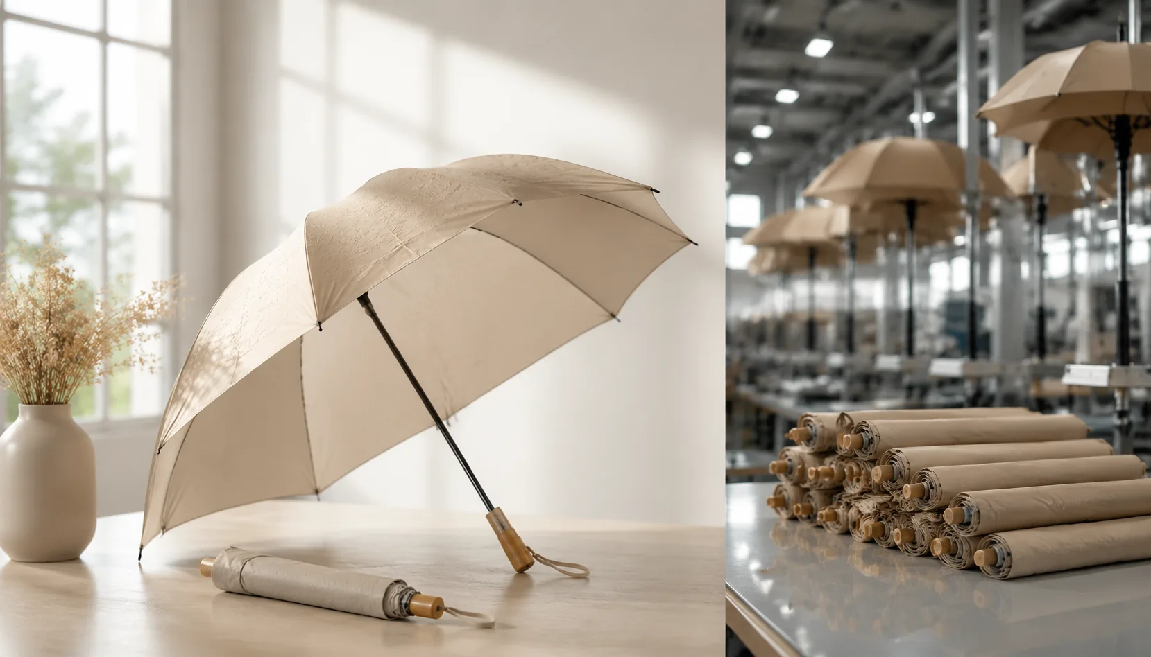
Tone-on-Tone Umbrella Branding for Premium Private Labels
Build premium private-label umbrellas with tonal logos, matte finishes, and controlled contrast across 190T or 210T pong...
Read More »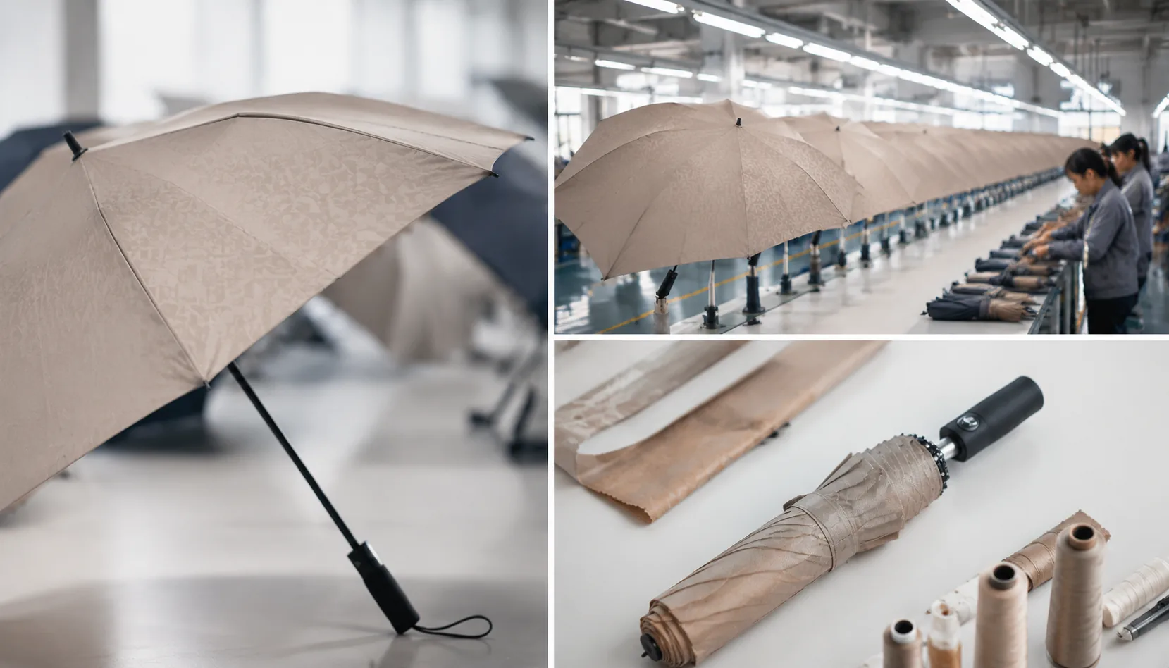
Tone-on-Tone Umbrella Branding for Subtle Retail Programs
Create understated umbrella branding with tone-on-tone logos, matched trims, and controlled contrast for premium retail ...
Read More »