Tone-on-Tone Umbrella Branding for Premium Corporate Lines
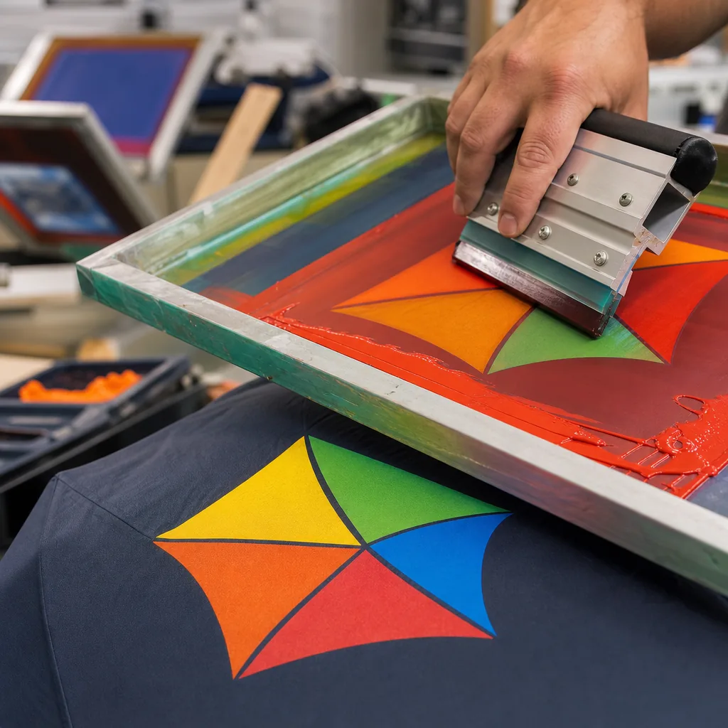
For premium corporate umbrella programs, the challenge is not putting a logo on the canopy; it is keeping the branding visible, restrained, and consistent across thousands of units. Tone-on-tone umbrella branding solves that balance when the artwork, fabric base, ink density, and cure conditions are matched with factory-level control, so the mark reads as intentional rather than loud.
When subtle branding outperforms high-contrast logos
Tone-on-tone umbrella branding works best when the umbrella itself is positioned as a premium object, not a disposable handout. In executive gifting, hotel amenity programs, and curated retail programs, buyers usually want the mark present without turning the canopy into a billboard. A low-contrast canopy print on 190T or 210T pongee, especially with a matte finish, reads as more deliberate than a bright logo block on black, navy, charcoal, or forest-green panels. The brand stays visible at arm’s length, but the umbrella still looks like a finished product. That matters when the piece is meant to sit in a boardroom, a suite, or on a retail counter beside higher-value goods.
For corporate gift umbrellas, the business case is practical: subtle branded umbrellas travel across more settings without visual friction. A premium umbrella logo print in dark navy on navy, silver-gray on graphite, or white on warm gray can remain legible at arm’s length while preserving panel layout, shaft finish, and frame details. The approach fits 23-inch and 27-inch golf umbrellas, auto-open-close styles, and vented double-canopy builds with fiberglass ribs, which already signal higher quality. Compared with a high-contrast block, tone-on-tone umbrella branding is less likely to feel promotional, so it helps protect perceived value in executive gifting and hotel retail.
The tradeoff is margin and risk. Bright decoration can work for trade-show handouts, but premium umbrella programs need the product to hold its value across channels. A fabric-matched or near-matched print on 190T or 210T pongee, paired with fiberglass ribs, UPF 50+ coating, and AQL 2.5 inspection, gives buyers a restrained result without losing visibility. That is the balance premium buyers want: the mark should be readable when someone picks up the umbrella or sees it in motion, but it should not overpower the object from across the room. For branded hotel stock and executive corporate gift umbrellas, that restraint is often what makes the piece feel worth keeping instead of discarding.
Choose canopy and ink combinations for controlled contrast
On 190T and 210T pongee canopies, tone-on-tone umbrella branding works best when the logo ink is one step away in value and one step away in finish. A charcoal print on navy usually stays clean on 210T because the tighter weave gives a sharper edge than 190T, while the same combination can look softer on 190T once the fabric shifts under hand tension or light rain. Dark-on-dark pairings are the safer choice for premium umbrella logo print when the buyer wants restrained corporate gift umbrellas, but they still need to be checked at 1 to 2 meters, not just on a flat swatch. Under warm indoor LEDs, the contrast can compress as the canopy coating throws back more yellow light; outdoors, the same mark often separates better once glare drops and the weave reads more clearly.
Matte ink gives the most controlled low-contrast canopy print because it absorbs light instead of bouncing it back, which helps subtle branded umbrellas look deliberate rather than washed out. Glossy ink can rescue a dark-on-dark design on black, navy, or charcoal fabric, but it also makes the mark angle-sensitive and more vulnerable to mixed lighting. Fabric sheen changes the result as much as color choice: a satin 210T canopy usually shows more specular reflection than a flatter 190T cloth, so a cool gray logo may read as lighter indoors and nearly disappear outdoors at certain angles. In practice, the most dependable tone-on-tone umbrella branding uses a measured contrast shift, such as matte black on charcoal or silver ink on slate, so the logo stays visible without turning the umbrella into high-contrast advertising.
For buyers comparing options, the decision comes down to readability risk, not just aesthetics. If the umbrellas will be handed out in offices, hotels, or trade show venues, ask for both indoor and outdoor strike-offs on the actual 190T or 210T canopy, because color temperature can move the perceived contrast more than the art file does. Warm light favors darker inks with more sheen; cool daylight favors flatter inks with tighter edges. A low-contrast canopy print that looks refined on the screen can fail once the fabric is wet, folded, or viewed in motion, so the sample should be judged in the same conditions the final order will face. That is the practical test for tone-on-tone umbrella branding: controlled contrast, clear brand reading, and no accidental loss of definition.
Use print methods that preserve fine details
For tone-on-tone umbrella branding, screen printing is the most controlled method when the artwork is simple and the objective is a low-contrast canopy print on pongee 190T or 210T. On navy, charcoal, or black panels, a one- or two-color screen print can stay sharp if the file is built for the process: hold linework at 0.3 to 0.4 mm minimum, keep text above about 6 pt, and avoid dense knockouts that will close up as the canopy flexes. That approach works well for subtle branded umbrellas because the mark is read through placement and sheen, not high contrast. For premium umbrella logo print work, keep the imprint on a single panel, limit ink opacity so the surface still reads as fabric, and size the art to the panel so it does not cross seams or high-movement zones.
Digital printing is the better choice when the design relies on gradients, tonal shifts, or fine multicolor detail that screen printing would flatten. It gives a more faithful low-contrast canopy print, but the artwork still has to survive repeated opening and closing: reversed microtext, thin outlines, and soft edge fades can break down if they sit where the canopy bends. Transfer printing is the practical option for small complicated logos, layered legal marks, and tight registration that would be expensive to separate into screens; a well-matched heat-transfer or film-transfer application can hold about 0.2 to 0.3 mm linework when the placement avoids hinge points and seam stress. On auto-open and auto-open-close models, the first few dozen cycles put real strain on delicate decoration, so keep fine details away from rib joints and center folds, especially on corporate gift umbrellas that are meant for regular use.
Specify finishes that support a premium look
For tone-on-tone umbrella branding, the finish carries more weight than logo size. Specify a soft-hand ink or transfer system with a low-gloss cure and keep the premium umbrella logo print on one or two panels only, ideally away from the main viewing angle. On 190T or 210T pongee, that approach reads cleanly on black, navy, charcoal, deep green, or burgundy canopies when the mark sits just one or two shades off the base fabric. That is the difference between subtle branded umbrellas and a promo item that looks loud. For corporate gift umbrellas, the buyer usually gets the best result from restrained placement, simple artwork, and a print method that keeps the surface matte rather than shiny.
The frame matters as much as the ink. Fiberglass ribs and windproof frames flex the canopy more than steel, so a low-contrast canopy print needs enough elongation to survive repeated opening and closing without whitening or cracking. On 8K, 10K, or 16K constructions, the highest stress points are the rib tips, seams, and panel edges, especially on vented double-canopy styles made for gusts. Keep decoration away from those areas and confirm the cure profile before production so the print bonds without becoming brittle. A soft-hand system that moves with the fabric is the safer choice for premium corporate lines, because it protects appearance across daily use and reduces reject risk in bulk runs.
Build approval standards for luxury and corporate buyers
For tone-on-tone umbrella branding, the approval package should include four items: the fabric swatch, the print strike-off, the Pantone tolerance, and the inspection criteria. Start with the base cloth, because 190T or 210T pongee, POE, and PVC all change how a low-contrast canopy print reads under daylight and indoor light. A swatch alone is not enough; buyers should confirm the panel count, canopy size, and frame spec before decoration, especially on 21" or 23" compact auto-open umbrellas versus 27" or 30" golf frames. Fiberglass ribs usually hold shape better in premium programs, while steel ribs can reduce cost but add weight. For subtle branded umbrellas, the key decision is whether the logo stays visible without turning muddy, shiny, or too bright against the cloth.
Pantone tolerance should be written into the approval sheet, not left to visual judgment on the factory floor. For premium umbrella logo print work, the usual control is tighter on hue than on saturation, because the target is controlled visibility, not high-contrast promotion. Buyers should approve one strike-off at production scale, then ask for a second sample after the actual curing, heat transfer, or sublimation cycle so the finish, sharpness, and hand feel match bulk output. MOQ should be confirmed before sampling, since a 300 to 500 piece run often needs a shorter approval loop and each revision can add 5 to 10 days before bulk starts. For corporate gift umbrellas, lock FOB or DDP delivery terms early so freight, duty, and customs timing are clear before release.
Frequently Asked Questions
Is tone-on-tone branding readable enough for event or retail use?
Yes, if the contrast is designed correctly and the logo is placed where light hits the canopy clearly. It works best for premium buyers who want understated branding rather than high-visibility promotions.
Which canopy fabrics work best for subtle logo printing?
Pongee 210T usually gives a smoother surface and cleaner print edges than lower-density fabrics. For darker premium umbrellas, it helps maintain a refined look without making the branding too loud.
What contrast level works best for tone-on-tone umbrella logos without losing visibility?
For most polyester and pongee canopies, buyers typically target a 5% to 15% visual contrast difference between the logo ink and base fabric. Below that range, logos can disappear in low light; above it, the result often looks like a standard promotional print rather than a premium subtle finish.
Can tone-on-tone branding stay consistent across repeat orders for a corporate program?
Yes, if the factory records Pantone references, ink mix ratios, fabric lot details, and print placement tolerances from the first production run. For ongoing programs, many B2B buyers approve a sealed sample and allow a color variance tolerance before mass production starts.
Does low-contrast canopy printing affect MOQ or lead time compared with regular logo umbrellas?
Usually yes, slightly. Because tone-on-tone work often requires extra strike-offs and approval rounds, MOQ commonly starts around 300 to 500 pieces per style, and lead time can run 5 to 10 days longer than basic high-contrast screen printing.
Looking to Launch Your Custom Umbrella Line?
ZheBrella is a Zhejiang-based OEM/ODM umbrella manufacturer with 17 years of export experience. Free design, low MOQ from 100 pieces, windproof construction, full-color print.
Get Free Quote Now »People Also Search For
Related Articles
Tone-on-Tone Umbrella Branding for Premium Corporate Gifts
Learn how tone-on-tone umbrella branding creates a premium look, with fabric, ink, and logo-size choices that keep the m...
Read More »
Tone-on-Tone Umbrella Branding for Premium Corporate Programs
Use tone-on-tone umbrella branding to create subtle premium gifts with controlled fabric sheen, logo contrast, frame spe...
Read More »
Tone-on-Tone Umbrella Branding for Premium Retail Programs
Plan subtle umbrella branding with tone-on-tone logos, 190T or 210T pongee, controlled color tolerance, sampling steps, ...
Read More »