Umbrella Canopy Color Trends and Design Direction
Buying umbrellas is not just a color choice; it is a production decision that affects sell-through, brand recognition, and order consistency. The challenge with umbrella color trends is matching what looks current in the market with what can be repeated across batches, panels, and seasons without shade drift or print mismatch. From the factory floor, the best canopy programs start with controlled color ranges, tested fabric bases, and a clear plan for how trend colors support the brand rather than fight it.
Why color drives umbrella appeal
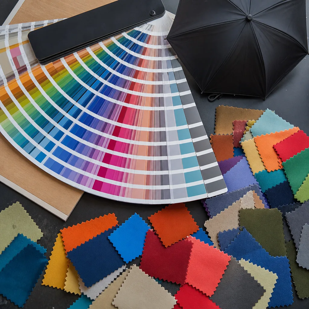
Color is the first thing buyers react to because it changes the product silhouette before they notice rib count, coating, or handle style. In umbrella color trends, the canopy does most of the visual work: a solid black 23" auto-open umbrella reads as corporate and practical, while a bright POE bubble canopy signals retail or event use immediately. On the factory floor, color also affects how a design is judged under daylight, warehouse LEDs, and print inspection lights, so the same shade can look stronger on 190T pongee than on PVC or EVA. That is why umbrella canopy design starts with color chips, not artwork. Buyers usually decide faster when they can compare trending umbrella colors against their target channel, because color communicates seasonality, price tier, and audience in one glance.
The current umbrella color trends are moving toward restrained neutrals with one controlled accent rather than loud full-surface prints. Charcoal, navy, olive, sand, and off-white still sell well because they photograph cleanly and work across retail, corporate gifting, and hospitality. For premium lines, matte-looking pongee with a black frame gives a more technical feel than glossy fabric, especially on 10K or 16K windproof styles with fiberglass ribs. At the same time, a smaller group of buyers wants sharper umbrella design ideas: two-tone panels, matching tips and ferrules, or a contrast inside canopy that reveals itself only when the umbrella opens. That approach keeps the outside professional while giving the inside enough personality for social media and unboxing.
Color choice also affects production risk and commercial performance, so it should be treated as part of specification control, not decoration. Dark shades usually hide minor sewing variation and are safer for large FOB orders, while light colors demand tighter AQL 2.5 inspection because stains, oil marks, and seam shadowing show faster. Our standard practice is to confirm swatches under the exact fabric base before cutting, because the same pigment can read differently on 190T versus 210T pongee, and UV coating can shift the final tone slightly. For buyers developing umbrella canopy design around seasonal launches, the practical rule is simple: choose a base color that fits the sales channel, then use one accent element to make the product identifiable without making the inventory harder to sell.
Balancing trends with brand colors
The practical way to handle umbrella color trends is to treat them as accents, not a full reset of your brand system. If your core identity depends on black, navy, red, or a specific Pantone, keep that base on the canopy, handle, or trim and let the seasonal color move into the lining, tip sleeve, tie strap, or logo panel. That approach keeps the product recognizable while still making the assortment feel current. In umbrella canopy design, buyers usually see more value in a controlled update than in a sudden jump to a loud fashion color that fights the rest of the line. The strongest umbrella color trends right now are muted earth tones, smoke blue, olive, sandstone, and high-contrast two-tone combinations, but they work best when the brand architecture stays stable.
For branded programs, build the assortment around a color ladder: one permanent core, one seasonal neutral, and one trend-forward option. That gives sales teams something easy to explain and gives procurement a cleaner SKU strategy. If you are managing private-label or retail umbrella design ideas, ask whether the new shade supports the logo color, packaging, and hangtag system before you approve it. A canopy can look good on a screen and fail in production if the ink density, fabric dye lot, or seam tape color shifts too far from the master reference. On pongee 190T or 210T, the same dye can read warmer or cooler depending on weave and coating, so lab dips and physical strike-offs matter more than mood boards.
My standard advice is to test trending umbrella colors in a limited run first, then compare sell-through against your core colors before expanding the order. That is especially important on 8K or 10K compact frames, where the canopy panel shape makes bright colors read louder than they do on a golf umbrella. If the brand is conservative, use trend color only on interior vents, edge binding, or a secondary panel so the umbrella color trends feel intentional instead of forced. For promotional programs, I would rather see a clean branded black canopy with one current accent than a fully trend-driven canopy that ages badly in six months. The goal is not to chase every color cycle; it is to keep the line fresh without confusing the customer about who the product is for.
Solid, panel, and patterned canopies
Solid canopies are still the cleanest answer when the buyer wants the logo to read at distance and the color has to match a brand book exactly. In current umbrella color trends, the strongest sellers are low-saturation navy, charcoal, stone, forest green, and deep burgundy, because they hide scuffs better than bright shades and look more expensive under retail lighting. On 190T or 210T pongee, a solid dye lot gives the most even hand feel and the least visual noise, which matters for corporate gifts, hotel stock, and commuter umbrellas. If the spec includes UV coating or a black interior, I usually push for darker outer panels because they keep the frame silhouette sharp and make the canopy look tighter when opened.
Panel-driven umbrella canopy design is where most of the practical variation happens. A two-tone or four-panel layout can separate canopy crown, mid-panel, and edge binding so the umbrella reads from a distance without needing a full print. This is also where trending umbrella colors are moving: sand with black, slate with lime trim, navy with gray vents, and white with a contrasting inside for event use. On 8K and 10K frames, panel alignment is simple; on 16K windproof builds, the seam placement needs more discipline because a crooked seam shows immediately across the ribs. ZheBrella’s standard practice is to test panel color under both daylight and indoor LED, because some pigments look flat in warehouse light and much richer in retail conditions.
Patterned canopies are useful when the product needs motion and personality, but the pattern has to match the construction method. Large plaids, pinstripes, jacquard-inspired repeats, and gradient fades work best when the print lands cleanly across the panel seam and does not distort at the tip. For promotional programs, umbrella design ideas that combine a solid field with a printed border or scattered micro-pattern usually age better than full-surface novelty prints, because they stay usable after the campaign ends. If the umbrella is a POE or PVC clear style, patterning is different: you are designing for transparency, edge color, and printed accents rather than full opacity. That is where umbrella color trends become less about fashion and more about visibility, contrast, and how the product photographs for e-commerce and catalog use.
Seasonal and market color preferences
Color demand is not uniform, and the first mistake buyers make is treating umbrella color trends as a single global signal. In North America and much of Europe, black, navy, charcoal, and deep forest green still move fastest because they read as practical and low-risk for corporate programs, golf, and commuter umbrellas. By contrast, Latin America and parts of Southeast Asia usually tolerate stronger saturation, so red, royal blue, orange, and two-tone combinations perform better in promotions and retail. For ZheBrella, the most stable orders are still 23" and 27" auto-open styles in solid dark shades, but the fastest color changes come from retail accounts that refresh every season. Those buyers usually want umbrella canopy design that looks clean from a distance and still prints well with screen or heat-transfer logos.
Season matters as much as region. Spring buyers lean into light pastels, soft beige, sage, sky blue, and transparent or translucent POE for rainwear and gift sets. Summer shifts toward higher-visibility colors and UV-focused builds, especially 190T or 210T pongee with UPF 50+ coatings, where white, sand, and bright blues help the product feel cooler and more seasonal. Fall and winter usually pull demand back toward earth tones, burgundy, olive, rust, and matte black, especially for retail chains that want a more subdued shelf story. The same umbrella design ideas do not work everywhere: a beach account may ask for white canopy panels with colored tips, while a commuter line wants a dark canopy with reflective piping or vented construction.
The practical trend now is not just color selection but how the color is built into the SKU. Buyers are asking for tighter color-blocking, melange effects, and contrast binding because those details give a standard frame a more current look without changing the cost structure much. Trending umbrella colors also depend on frame type: a 16K fiberglass windproof umbrella can carry premium muted tones better than a cheap steel frame, because the product feels more deliberate and less disposable. In shipment planning, MOQ and lead time matter because custom dyed panels add sampling time and fabric minimums, while stock colors move faster for FOB and DDP programs. The strongest umbrella canopy design choices are usually the ones that balance color visibility, print area, and end-use climate instead of chasing a single fashion cycle.
Planning a coherent color range
A merchandisable umbrella assortment starts with a tight base, not a rainbow. The best umbrella color trends usually sit in three lanes: core neutrals like black, navy, charcoal, and beige; one or two high-volume seasonal shades; and a small accent group for fashion or promo accounts. That structure keeps the buyer from facing too many SKUs while still giving the range enough visual movement to look intentional on a shelf or in an e-commerce grid. For umbrella canopy design, I prefer building from fabric behavior first: 190T or 210T pongee takes pigment cleanly and holds a sharper solid than cheap recycled polyester, while translucent POE or PVC works better for novelty and low-cost rainwear sets.
Trending umbrella colors should also be chosen by selling environment, not just by mood boards. In commuter channels, dark solids and muted earth tones move because they hide dirt and photograph consistently under indoor lighting. In gift, event, and lifestyle channels, softer greens, stone, wine, and dusty blue usually outperform loud brights because they feel more premium and less dated after one season. If you want umbrella color trends to merchandise well, keep the assortment disciplined: one dark anchor, one light neutral, one mid-tone color family, and one limited accent story. That is usually enough to support both repeat orders and newness without creating dead stock. Our standard practice is to check swatches under daylight and LED before locking the run, because a color that looks balanced in the office can read flat or cheap on a retail wall.
The strongest umbrella design ideas are simple enough to scale across multiple frame types. A coherent color range should work on a 21-inch compact, a 23-inch straight stick, and a 27-inch golf canopy without forcing the buyer into separate color logic for each size. Keep trim and canopy tone aligned when possible, then use small changes like a contrasting edge, matching ferrule, or a printed inside panel to add depth without breaking the range. That approach gives distributors cleaner storytelling and makes replenishment easier, because the same shade can be sold as a manual travel umbrella, an auto-open style, or a vented windproof model. If the line is being built for retail, I would keep the palette narrow and the SKU count honest; a focused color plan sells better than twenty marginal shades that no one can reorder with confidence.
Frequently Asked Questions
What umbrella colors sell best?
Classic neutrals like black and navy are dependable, while seasonal brights and on-trend tones drive impulse and gift sales. The right mix depends on your market, but a coherent range with a few safe core colors and a few trend pieces tends to merchandise best.
Should umbrella colors follow fashion trends?
On-trend colors help retail and gift lines feel current, but they should still respect your brand palette for consistency. A practical approach is a stable core range plus a small rotation of trend colors each season.
How many canopy color options should a B2B umbrella line launch with?
For most importers, 4 to 8 core colors is a practical starting range. That gives enough variety for retail testing without creating excess inventory pressure, especially when the same frame can be shared across multiple SKUs.
Can umbrella canopy colors be matched to brand Pantone codes?
Yes, but exact matching depends on fabric dye availability and the printing method. For bulk programs, suppliers usually confirm a lab dip or swatch approval first, then produce a color tolerance spec before mass production.
What is a typical lead time for a custom color umbrella order?
For standard fabric colors, lead time is often 25 to 35 days after sample approval. If the order requires a new dyed canopy color or custom pattern development, plan for an additional 7 to 15 days for sampling and color confirmation.
Looking to Launch Your Custom Umbrella Line?
ZheBrella is a Zhejiang-based OEM/ODM umbrella manufacturer with 17 years of export experience. Free design, low MOQ from 100 pieces, windproof construction, full-color print.
Get Free Quote Now »People Also Search For
Related Articles

How Umbrella Color Blocking Improves Brand Visibility
See how panel colors, trims, and contrast blocks improve logo visibility on custom umbrellas while keeping brand colors ...
Read More »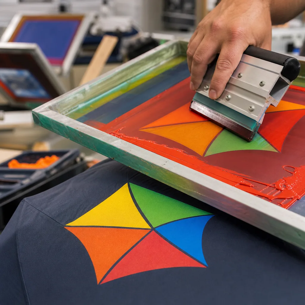
Color-Blocking Strategies for Brand-Driven Umbrella Design
Show how color-blocked umbrella layouts strengthen brand recognition while staying production-friendly, with fabric, pri...
Read More »Umbrella Color Blocking for Stronger Brand Recognition
Plan color-blocked umbrellas that read clearly at distance, fit MOQ budgets, and stay consistent across 190T or 210T can...
Read More »