How to Build a Strong Umbrella Branding Program Across SKUs
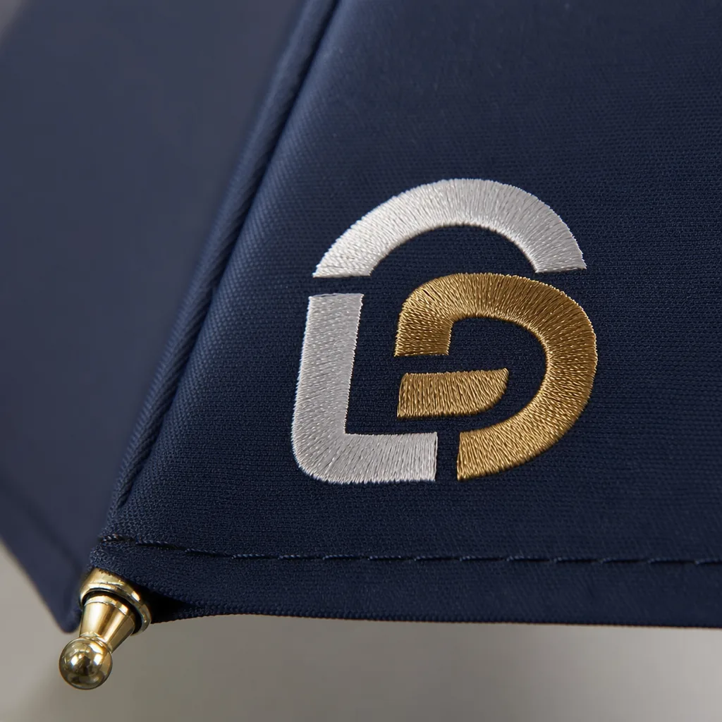
A strong umbrella branding program fails when each SKU is treated like a one-off. At the factory level, consistency depends on locking down the same visual rules, materials, placement, and packaging standards across styles, colors, and handle options so buyers do not get drift between samples and bulk production. When those decisions are made early, sourcing becomes faster, approvals get cleaner, and every order looks intentional on the shelf.
Why umbrella branding needs a system
A strong umbrella branding program only works when you stop treating each SKU like a one-off decoration job. If one style uses a 21" auto-open compact with a centered chest logo, another uses a 30" golf frame with a large panel print, and a third changes handle shape, thread color, and carton art without a rulebook, the brand starts drifting fast. Buyers notice it first in the sample stage: the same red looks different across pongee 190T canopies, logo size shrinks on smaller canopies, and a soft-touch EVA handle suddenly appears next to a straight black rubber grip. That is not variety; it is inconsistency.
The practical fix is to standardize the decisions that matter most: custom logo placement, approved Pantone matching, handle families, and retail packaging. One brand should define where the logo can sit on a 23" stick umbrella versus a 27" vented golf umbrella, what minimum clear space surrounds the mark, and which canopy colors are acceptable on private label umbrellas. On the production floor, that means locking artwork files, stitch positions, print tolerances, and carton specs before mass production starts, so every order follows the same visual logic instead of being adjusted ad hoc by the sales team or the factory.
Packaging needs the same discipline because it is part of the product, not an afterthought. If the shelf box, hangtag, polybag insert, and master carton labels vary by supplier or by order size, the customer’s brand story breaks at retail even when the umbrellas themselves are decent. A proper umbrella branding program sets one rulebook for materials, color references, logo zones, and packaging hierarchy, then applies it across all SKUs and reorder batches. That is what keeps umbrella brand consistency intact when you move from a simple manual model to an auto-open-close design, or from a budget PVC canopy to a higher-end UV-coated golf umbrella.
How to standardize logo placement by product type
For a real umbrella branding program, the first rule is to standardize the logo zone by product type instead of forcing one artwork layout onto every frame. Straight umbrellas usually give you the cleanest space on one or two canopy panels, especially on 23" and 27" models where a centered screen print reads well from a distance. Folding umbrellas are tighter, so the safe move is a smaller mark on one panel, a tie strap, or the sleeve; if the canopy is busy or the panels are narrow, heat transfer often holds detail better than screen print. Golf umbrellas give you the most usable real estate, and that is where brands can scale up to larger marks on alternating panels without making the canopy look overworked.
Patio umbrellas are a different animal because the viewing distance is farther and the canopy geometry is larger, so the logo usually belongs on the valance, one main panel, or a collar area if the frame allows it. For private label umbrellas, I prefer tying the branding decision to fabric and finish: 190T pongee and 210T pongee take screen print cleanly, while coated POE or PVC surfaces often need heat transfer or a sewn woven label to avoid cracking or edge lift. Woven labels make sense on sleeves, straps, and carry cases, not on high-flex canopy panels. That split keeps umbrella brand consistency intact across SKUs without fighting the construction of each model.
The practical way to protect Pantone matching is to lock one approved artwork file per logo size and one reference panel location per umbrella family, then test it on actual fabric before release. Screen print is still the most economical for flat colors and simple marks, but it needs enough open area and good stitch discipline around seams; heat transfer is better for small text, gradients, or multicolor retail logos; woven labels work best as a secondary identity element when the customer wants a softer, premium finish. Once the placement rules are set, your custom logo placement stays predictable across the line, and retail packaging can reinforce the same mark so the buyer sees one system instead of a bunch of disconnected products.
How color control protects brand consistency
Pantone matching is the only sane starting point for an umbrella branding program if you want private label umbrellas to look like one family across 21" foldables, 23" autos, and 27" golf styles. The number on the Pantone chip is not the whole story; you have to control the dye lot, the base fabric finish, the coating, and even the print method. On the factory floor, the usual failure is not a dramatic color error but a subtle drift: one batch looks slightly warmer, another slightly duller, and the customer reads that as weak umbrella brand consistency. Our standard practice is to lock the target color against a physical master swatch, then hold the production tolerance tight enough that canopy panels, straps, and sleeves all land in the same visual band under daylight and store lighting.
Canopy fabric matters more than most buyers expect because 190T and 210T pongee do not reflect light the same way. A 190T weave usually feels a little softer and lets more light scatter through the cloth, so the same dye can look lighter or less saturated; 210T is denser, with a flatter face that often makes the color read deeper and cleaner. That difference becomes obvious when you compare umbrellas side by side under fluorescent lights, warm LEDs, or outdoor sun, which is why Pantone matching has to be tested on the actual fabric weight, not just on a lab dip card. For retail packaging and custom logo placement, the same rule applies: if the canopy shifts tone, the logo edge and carton art will look off even when the print file is correct.
The practical way to protect umbrella brand consistency is to treat color control as part of the full specification, not a cosmetic check at the end. Define the approved Pantone reference, the acceptable fabric basis weight, the coating finish, and the inspection standard for each SKU, then keep those records tied to artwork and retail packaging approvals. That matters especially for mixed programs with promotional and retail lines, because a matte 190T auto-open can read very differently from a glossy 210T manual style even when both are technically “the same blue.” If the brand wants repeatable results across orders, color approval has to happen before bulk cutting, not after sewing, or the umbrella branding program turns into a guessing game.
How packaging supports retail and gifting identity
Sleeves, boxes, hangtags, and insert cards are not afterthoughts; they are part of the umbrella branding program and should be specified alongside the canopy, handle, and closure style. For private label umbrellas, I treat packaging as a real brand surface: a printed sleeve can carry the product story and size information, a folding box can make the piece giftable, and a hangtag can anchor barcode, compliance text, and care instructions without cluttering the canopy. If you want umbrella brand consistency across 21" compact, 23" stick, and 30" golf formats, the packaging language has to stay aligned with the same Pantone matching discipline used on the print itself, otherwise the product looks assembled from different suppliers.
Packaging decisions also change freight math faster than most buyers expect. A flat sleeve adds very little cubic volume, but a rigid box increases carton size, carton weight, and pallet count, which matters on both FOB and DDP quotes. Retail packaging with a window or heavy insert card improves shelf appeal, but it also pushes up material cost and usually raises MOQ because the printer needs a larger run to justify plates, lamination, and die cutting. In practice, I see buyers underestimate how much custom logo placement on the package affects total setup cost; once you add multiple SKUs, even a small change in artwork versioning can create separate print runs.
For gifting programs, insert cards are where the brand does the quiet work: warranty notes, campaign messaging, QR codes, and care instructions without fighting the umbrella decoration. That is the cleanest way to support an umbrella branding program when the product line includes different closure mechanisms, canopy fabrics, and retail channels, because the packaging can stay consistent even when the umbrellas vary by size or frame build. The practical rule is simple: choose the minimum packaging structure that still protects the product, looks intentional on shelf, and does not blow up the MOQ or shipping cost. Anything beyond that should earn its place by improving sell-through, not just by looking premium in a mockup.
How to brief a factory for multi-SKU programs
For a multi-SKU umbrella branding program, the factory brief has to be exact or you will get drift across colors, print placement, and packaging. I want vector logo files in AI or EPS, not a screenshot, plus one named Pantone reference for every ink or trim color that matters. If the line includes private label umbrellas with different sizes or mechanisms, spell out which SKUs share the same artwork and which need separate layouts so umbrella brand consistency does not break when the canopy changes from 21" to 30" or from manual to auto-open-close.
Custom logo placement needs a dimensioned drawing, not a vague note like "front panel". State panel count, print width, distance from seam, and whether the artwork sits on pongee 190T, 210T, or a POE canopy, because the same file can look different on each substrate. For Pantone matching, give the tolerance you will accept in daylight and under indoor light, and attach an approved sample if you already have one. If you skip that step, you invite color arguments later, especially when different production lots or retail packaging runs are being built in parallel.
The QC package should be written like a production standard, not a marketing wish list: sample approval status, AQL 2.5 target, carton drop requirements, print adhesion checks, frame opening-cycle expectations, and any wind-resistance claim that must be supported by test data. Our standard practice is to confirm the final golden sample before mass production, then lock the same artwork, canopy spec, handle spec, and label spec across all SKUs so the umbrella branding program stays uniform. Also define Incoterm expectations up front — FOB if you control freight, DDP if you want landed cost clarity — and specify retail packaging early, because hangtags, inserts, and barcode labels often create the last avoidable delay.
Frequently Asked Questions
What causes the biggest branding mismatch on custom umbrellas?
The most common issues are weak color control, logo placement inconsistency, and packaging that does not match the retail position. These problems usually appear when the buyer does not define one master spec across all SKUs.
Can one branding program work for both promo and retail umbrellas?
Yes, but the asset set should change by channel. Promo programs usually prioritize logo visibility and cost, while retail programs need tighter color control, packaging quality, and a more polished finish.
What artwork files should a buyer submit to keep branding consistent across multiple umbrella SKUs?
Submit vector files in AI, EPS, or editable PDF format, plus a brand sheet listing Pantone codes, logo clear space, minimum print size, and placement rules by panel, strap, handle, and packaging. For mixed SKU programs, many factories can apply one master branding spec across folding, straight, and golf umbrella styles with separate dielines for each package type.
How much color variation should buyers expect when matching Pantone colors on different umbrella materials?
Some variation is normal because pongee, polyester, RPET, plastic handles, and woven straps absorb color differently. Buyers usually approve a physical pre-production sample, and for large programs it is common to define tolerance by material so the canopy, sleeve, and carton branding stay commercially consistent even if they are not visually identical under all lighting.
Can retail packaging and on-product branding be standardized if the umbrella program includes several sizes and opening mechanisms?
Yes, if the factory builds a modular spec covering fixed elements such as logo position, Pantone references, barcode location, warning text, and hang tag layout. Buyers often standardize these elements first, then adjust only the dieline size and pack count by SKU, which helps shorten artwork approval and reduce packaging errors on repeat orders.
Looking to Launch Your Custom Umbrella Line?
ZheBrella is a Zhejiang-based OEM/ODM umbrella manufacturer with 17 years of export experience. Free design, low MOQ from 100 pieces, windproof construction, full-color print.
Get Free Quote Now »People Also Search For
Related Articles
Brand Color Consistency Across Umbrella Collections
Keep umbrella colors and logo finishes consistent across multiple SKUs with clear Pantone targets, fabric limits, and fa...
Read More »
How to Specify Branded Umbrellas for Retail and Corporate Programs
Build a practical spec for branded umbrellas that protects logo placement, color control, packaging, and landed cost acr...
Read More »
Retail Umbrella Header Cards and Belly Bands for Brand Impact
Compare header cards and belly bands for retail umbrellas, with practical guidance on sizing, materials, compliance spac...
Read More »