Umbrella Artwork Setup: Panel Alignment, Bleed, and Color Tolerance
Umbrella artwork setup fails when the file looks right on screen but lands crooked across stitched panels, with seams cutting through logos and colors drifting from one reorder to the next. At the factory floor, the critical variables are panel count, seam-safe bleed, and a Pantone tolerance that is realistic for the fabric, ink, and print method. If those are fixed before sampling, the artwork can be repeated cleanly without surprises.
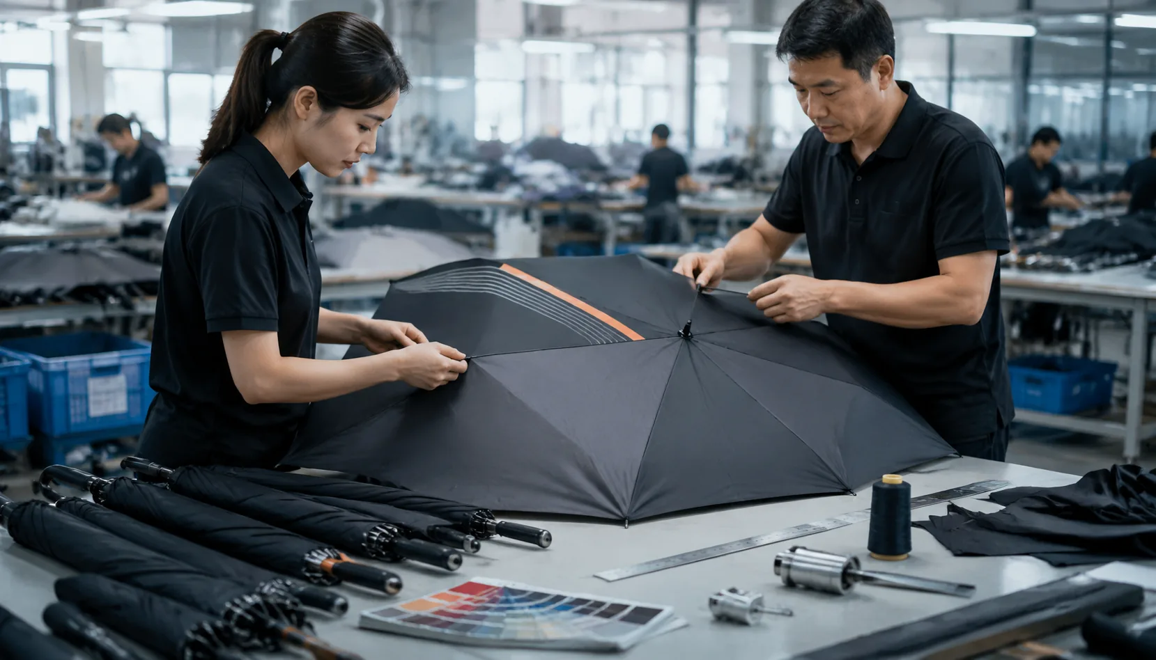
Understand how curved panels distort artwork
Umbrella artwork setup starts with the panel count, because a 6K, 8K, or 16K canopy does not behave like a flat sheet once it is sewn and tensioned. On a 6K frame, each panel is wider, so a logo placed too close to a seam will wrap hard and show visible distortion at the stitch line. On 8K, the geometry is more forgiving for centered marks, but seam visibility still matters if the artwork crosses panel boundaries. On 16K, the smaller panel width usually improves repeat accuracy across the canopy, yet it also means more seams and more chances for a misregistered graphic to look busy. A flat mockup can look correct because it ignores the crown curve, panel taper, and fabric stretch. Once the canopy is assembled, the same art shifts toward the edge and the viewer sees a different shape than the one approved on screen.
The practical fix is panel alignment printing, not generic centering. I map the logo to the stitched panel layout, then check where the art lands after seam allowance, hem turn, and peak tension are applied. A mark that looks centered on the dieline can still drift 5 to 12 mm on the finished umbrella, especially on 23 inch and 27 inch frames with pongee 190T or 210T fabric. Canopy bleed also needs to be set with the actual construction in mind, because edge graphics are the first thing to break when the fabric is pulled tight. For umbrella branding, I usually keep critical text and fine outlines away from seams and avoid placing face details across two panels unless the client accepts a minor visual break.
Color control is the other place where flat-art approvals mislead buyers. Pantone tolerance on textile printing is not the same as on coated paper, and the final result changes again if the canopy uses sublimation, screen print, or heat transfer on POE, PVC, or EVA material. Dark inks tend to read heavier on curved panels, while light colors can wash out near seam stress and top-to-bottom lighting changes. For umbrella artwork setup, I treat the approved sample as a production reference, not an absolute color promise, and I keep the tolerance discussion explicit before mass production. At ZheBrella, the normal practice is to confirm the panel map, seam break points, and Pantone tolerance on the first sample, because once the canopy is cut and stitched, there is no clean way to move a logo without redoing the print file and sometimes the tooling.
Specify file format, bleed, and safe zones
For umbrella artwork setup, start with vector AI or PDF files only, with all fonts outlined and images embedded at print size. Raster JPEG or PNG files create soft edges, bad separations, and color drift once they are scaled across curved panels. At ZheBrella, we treat that as a file-quality problem, not a press-room problem, because if the source file is weak, panel alignment printing will never land cleanly on the sew lines. The artwork should be built to the exact canopy size, with a seam-safe margin of 3 to 5 mm on every panel so critical text, logos, and thin strokes do not disappear into the stitching or rib tension. For umbrella branding, that margin matters more than people expect, especially on 8K and 10K frames where the panel shape changes slightly as the canopy is tensioned.
For full-wrap artwork, every panel needs its own print layout instead of one continuous image dumped across the canopy. The printer has to add canopy bleed to each panel, because the sewn seam will consume part of the image and small registration shifts are normal during cutting, bonding, and sewing. The correct workflow is to separate the artwork by panel, mirror or rotate it as needed for the pattern direction, and mark the seam lines clearly before production starts. If the design includes borders, repeated graphics, or type running edge to edge, the seam-safe margin must be wider than 3 mm in practice, because even a small shift can make the border look broken once the umbrella is opened. This is standard on manual, auto-open, and auto-open-close models alike; the mechanism does not change the geometry of the panel.
Color control should be specified with Pantone tolerance upfront, not left as a vague “close match” note. On coated pongee 190T or 210T fabric, the same ink can read differently than it does on paper because the weave, coating, and light angle all affect the final appearance. A practical spec should name the Pantone reference, acceptable delta range, and whether the target is for screen print, heat transfer, or sublimation, since each process holds color differently. If the order includes white-on-dark, fine lines, or small logos, ask for a production proof against the final canopy color before mass printing. That is the only reliable way to catch panel alignment printing issues, seam distortion, and color shifts before they turn into scrap. For buyers, this is the difference between a controlled umbrella artwork setup and a batch of umbrellas that technically printed correctly but look wrong when opened.
Set color targets the factory can actually hit
For umbrella artwork setup, the first control point is the color target, not the file. A Pantone reference is only useful if the factory has a defined Pantone tolerance and a measured Delta E target; in practice, we aim for Delta E under 2 on the approved production lot, not on a one-off lab swatch. That matters because umbrella branding is judged in real light, and a red or navy that looks correct under a booth lamp can drift under daylight. The same ink will also read differently on matte and lightly coated canopy fabrics, so a match on one substrate does not guarantee the same appearance on another. On 190T pongee, the weave is a little more open and the surface usually reads softer; 210T tends to look denser and slightly deeper in tone, even when the ink formula is unchanged.
Panel alignment printing is the other place where jobs go wrong. A clean logo can still look amateur if the seam breaks through the type or if the repeat does not respect the panel geometry, so the art file needs to be built around the actual canopy layout, not a flat circle. Canopy bleed should be specified with the panel shape in mind, usually enough to cover cutting and sewing movement without pushing critical text into the seam allowance. For umbrella artwork setup, we check alignment against the production canopy size, then confirm the ink draw on the exact fabric lot because 190T versus 210T changes how much color absorbs and how much sits on top. That is why a strong Pantone tolerance and a signed strike-off are more reliable than a PDF preview, especially when the order has multiple panel positions or edge-to-edge artwork.
Approve proofs and strike-offs before bulk production
A digital proof is only a layout check. It tells you whether the logos, copy, panel numbers, and color callouts are placed correctly in the file, but it does not confirm how the artwork behaves once it wraps over curved panels, seams, and tips. For umbrella artwork setup, the real risk is panel alignment printing: a graphic can look centered on a flat PDF and still drift once each panel is cut and sewn. Buyers should treat the proof as a preflight step, not approval of the final product. If the canopy has a vent, contrast panels, or edge-to-edge branding, the proof should clearly show panel break lines, seam allowances, and any art that crosses from one panel to the next.
A printed strike-off is the first sample that tells you what the ink system can actually hold on the selected canopy fabric. This is where canopy bleed, halftone breakup, small text legibility, and Pantone tolerance get tested against the real substrate, not the art file. On 190T or 210T pongee, a color can shift a little darker after curing; on POE or PVC, the same ink may sit differently and change edge sharpness. A strike-off should be checked under the intended light source, because some brand colors look acceptable on screen and fail once you compare them to a physical Pantone swatch. This is the step to reject a weak red, a muddy navy, or a logo that is technically printed but visibly off-brand.
The sewn sample is the only approval that confirms the umbrella as a finished object. It shows the actual canopy shape, the tension at the seams, the way the panels meet at the runner, and whether the logo still reads correctly when the frame is opened fully. That final signoff should be on the opened umbrella, not on a flat file preview and not on a loose printed panel. If the artwork crosses panels, the buyer should inspect alignment at the seam line, the hem, and the top crown, because those are the places where distortion shows up first. For umbrella branding, we normally require approval of the digital proof, the strike-off, and the sewn sample before bulk production; skipping any one of them is how you end up with a batch that is technically within spec but wrong in the hand.
Document the spec for reorders and multi-SKU programs
For repeat orders, the file set has to be locked down before production starts: the exact logo version, panel count, repeat spacing, approved color chips, and the finished umbrella size. If any of those shift, the artwork moves and the canopy does not register the same way from one batch to the next. In umbrella artwork setup, I also keep the print method tied to the record, because screen print, heat transfer, and sublimation each handle edge sharpness and color density differently. Our standard practice at ZheBrella is to treat the first approved sample as the master reference, not a casual approval image. That matters when the same promotion gets reordered months later by a different buyer or a different plant contact.
Panel alignment printing is where most reorders go wrong, especially on 8K and 10K frames with narrow panels. The repeat has to follow the real panel geometry, not a flat mockup, and the artwork record should note where the logo lands relative to the spine, seam, and vent if the canopy is vented. I keep the approved placement tied to the exact panel count and umbrella size, because a 21-inch folding umbrella and a 30-inch golf umbrella do not share the same visual spacing even if the logo file is identical. Clear records reduce inconsistency when a program moves from 500 units to 5,000 units, because the operator is not guessing which proof was approved or whether the canopy bleed was adjusted for a wider cut.
Canopy bleed and color tolerance need to be written down, not assumed. The file should state the bleed allowance at the panel edge, the safe zone for text, and the Pantone tolerance the buyer will accept under the actual fabric and print process. On pongee 190T or 210T, color can read differently than on POE or PVC, and UV coatings can shift the final appearance again, so a chip-only approval is not enough for umbrella branding. For multi-SKU programs, I keep one master artwork record per size and one approval record per colorway, so a 23-inch auto-open and a 27-inch manual model do not get crossed. That is the simplest way to keep repeat orders stable without re-litigating artwork every time the PO lands.
Frequently Asked Questions
Should buyers send PNG files for umbrella artwork?
PNG is useful as a reference, but vector AI or PDF is the correct production file because the artwork must scale cleanly across curved panels. If the logo has fine text or thin lines, vector is not optional.
How much bleed should a canopy print include?
Use a 3 to 5 mm seam-safe margin as a starting point, and increase it for large logos that cross multiple panels. The factory should confirm the final number against the actual canopy size and stitch allowance.
How much bleed should I add for umbrella canopy artwork?
For most OEM umbrella canopies, plan on at least 3 to 5 mm of bleed past the seam-safe area on each panel. If the design crosses multiple panels, confirm the exact bleed with the factory before final artwork approval because panel width and seam construction can change the safe zone.
What Pantone tolerance should I expect on printed umbrellas?
A practical tolerance for mass production is usually within a delta of about 2 to 3 on coated Pantone references, depending on fabric, ink system, and weatherproof coating. For repeat orders, approve a physical strike-off or pre-production sample so the target is locked before bulk production.
What information should be included in an umbrella artwork spec sheet?
Include panel count, panel width, seam location, bleed allowance, logo position by panel, Pantone references, and the approved sample version. If you reorder later, keep the same spec sheet tied to the original production sample to reduce registration and color drift.
Looking to Launch Your Custom Umbrella Line?
ZheBrella is a Zhejiang-based OEM/ODM umbrella manufacturer with 17 years of export experience. Free design, low MOQ from 100 pieces, windproof construction, full-color print.
Get Free Quote Now »People Also Search For
Related Articles
Umbrella Print Registration Tolerance for Clean Branding Results
Set practical print registration tolerances for umbrellas, including panel alignment, bleed, and QC checkpoints that hel...
Read More »
Artwork Setup Rules for Clean Umbrella Branding Results
Get practical artwork setup rules for umbrellas, including bleed, panel alignment, safe zones, and production tolerances...
Read More »Refined Logo Placement Specs for Branded Umbrella Canopies
Plan logo placement on umbrellas with clear specs for panel size, safe zones, seam breaks, and repeat-order consistency ...
Read More »