Umbrella Branding Locations That Improve Retail Shelf Impact
When an umbrella disappears into a crowded shelf bay, the wrong branding location can turn a good product into a missed sale. Buyers need placement that matches how customers pick up, open, and carry the umbrella, because canopy panels, straps, and sleeves each create a different kind of retail visibility. Choosing the right umbrella branding locations is less about decoration and more about making the product easier to notice, remember, and buy.
Primary branding zones and what each one does
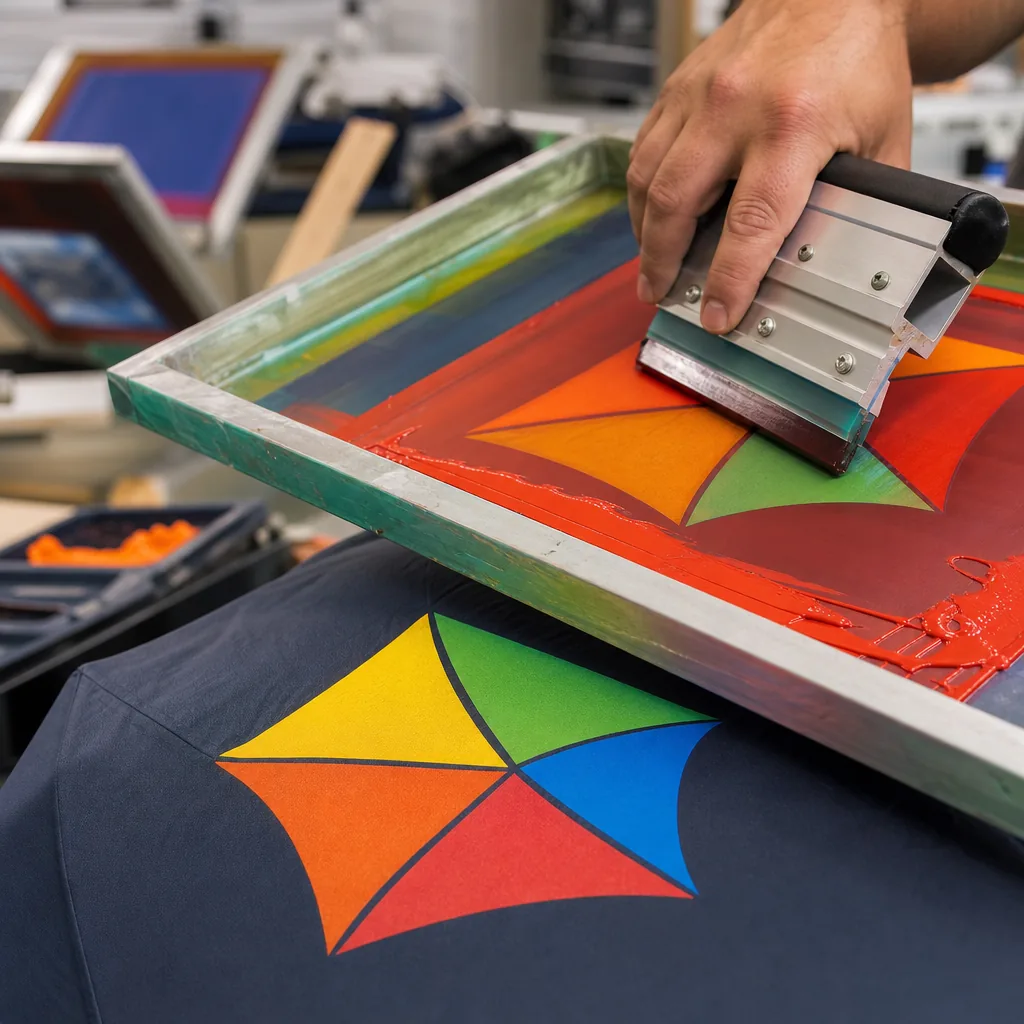
Canopy panels carry most of the visual weight, so they are the first place I’d evaluate for umbrella branding locations. A full panel print gives the strongest read from several feet away, while a smaller logo placement on umbrella panels near the edge works better when you want cleaner retail shelf impact and less ink cost. For retail display, the outer canopy is the money spot because it shows through packaging and on a hook; for corporate giveaways, a single-panel mark or repeating small logo is usually enough and keeps the piece from looking overloaded. On 190T pongee and 210T pongee, screen print is fine for flat logos, while sublimation makes more sense on light-colored polyester when you need sharper gradients or all-over custom umbrella branding.
Tie straps, handles, sleeves, and hangtags do different jobs, and ignoring them leaves free branding value on the table. The tie strap is small, but it is useful for a clean logo or web address that stays visible when the umbrella is rolled up; the handle is the tactile point, so a debossed or pad-printed mark often reads better than a busy graphic. Sleeves matter most in retail because they control the first impression on shelf or in a bin, especially for 23-inch and 27-inch umbrellas sold as promotional products. Hangtags are the best place for SKU, price, material callouts, and a short brand story, which helps the product sell itself without crowding the canopy.
For shelf-facing programs, I prefer a simple hierarchy: sleeve first, canopy second, then handle and tie strap. That order gives the buyer instant recognition before the umbrella is opened, which is why it improves retail shelf impact more reliably than logo placement on umbrella panels alone. In giveaway programs, the sleeve is often removed, so the canopy and handle do more of the work; a compact mark on one panel plus a printed handle keeps costs under control while still looking intentional. ZheBrella’s standard practice is to match the branding zone to the channel, because the same artwork that works for a trade-show handout can look too quiet in a retail box or too loud on a premium gift umbrella.
How logo size and placement affect readability
Logo size is the first thing buyers get wrong. On a folded umbrella, the viewer rarely sees a full panel head-on; they see a curved surface, partial folds, and sometimes only one quadrant sitting on a shelf. For that reason, umbrella branding locations have to be judged by real viewing distance, not by the artwork proof on a flat screen. I keep logos large enough to read at 3 to 5 feet, but not so large that thin letters collapse when the canopy is tensioned. Safe zones matter: leave margin away from panel edges, vent seams, and tip pockets, because ink spread, stitching drift, and panel shrinkage will eat into the art once the frame is opened.
The practical rule is simple: the more ribs you have, the more fragmented the message becomes. On 8K layouts, each panel is wide enough for a centered logo or a short repeated mark, so logo placement on umbrella panels is straightforward if you keep the design away from the rib line. On 10K, the panels narrow and the logo starts to wrap visually, so text-heavy marks need simplification or the words will feel cramped. On 16K canopies, I usually advise either a small repeated pattern or a split-brand approach across alternate panels, because a single wide logo can get chopped into unreadable segments once the canopy curves around the frame.
Seam crossings are where custom umbrella branding looks cheap if nobody checks the art flow. When a logo straddles a seam or rib pocket, registration shifts from panel to panel and the eye notices the break immediately, especially on solid-color pongee where contrast is high. For promotional products aimed at retail shelf impact, a cleaner solution is to place the main mark on two or three adjacent panels with intentional spacing, then use a secondary repeat on the opposite side so the brand is visible whether the umbrella is open, tied, or hanging. That approach usually beats oversized artwork that fights the geometry of the canopy and loses readability in real use.
Matching branding method to the umbrella build
Screen print is still the cheapest workhorse when the canopy is flat enough and the run is large enough to justify screens, usually 500 pieces and up. On 190T or 210T pongee you get clean color blocks and decent edge control, which is why it stays the default for logo placement on umbrella panels, but it falls apart fast on complex gradients or tiny text. Heat transfer is the better call when the art has more colors, fine lines, or variable data, and it behaves well on small and medium runs where setup cost matters less than flexibility. For custom umbrella branding, I usually treat screen print as a volume method and heat transfer as a design method; both can work, but they do different jobs.
Woven labels are not for the canopy itself so much as for seams, ties, sleeves, and packaging, where they add a premium cue without fighting the fabric coating. They make sense on retail programs where umbrella branding locations need to support a stronger shelf read, especially when the product will sit folded in a carton window or hang tag presentation. Embossing is a different animal: it only works when the handle material can hold detail, so PVC and some EVA handles are fair game, while soft-touch foams and very low-density EVA often lose definition. On those parts, embossing gives a durable mark that does not crack or peel, which matters more than people admit on promotional products that get handled a lot.
Material choice changes the decoration plan more than buyers expect. Pongee accepts print well because the weave is stable and the coating is predictable, but PVC can distort under heat, so transfer settings need to be conservative and sometimes the handle or runner is a better branding target than the canopy. EVA handles are common on budget umbrellas, but they limit sharp emboss depth and can show compression marks if the die is too aggressive. For order volume, I would push screen print for simple art on 1,000-unit-plus runs, heat transfer for mixed-color branding from 100 to 1,000 units, woven labels for retail-facing finishes, and embossing only where the handle resin is dense enough to keep the mark. That is the practical split if you want custom umbrella branding to improve retail shelf impact instead of just adding a logo for the spec sheet.
Branding choices that influence perceived quality
Perceived quality on an umbrella starts with what the shopper can see before they ever open it. Full-panel or edge-to-edge print reads as a deliberate design decision, while a small chest logo often looks like a commodity item unless the fabric, panel count, and color blocking do some of the work. In practice, the best umbrella branding locations are the canopy panels, the tie strap, the sleeve, and the ferrule area, because those surfaces stay visible in retail and in use. For promotional products, that matters more than most buyers admit: a clean logo placement on umbrella components can move the piece from giveaway to retail-ready without changing the frame.
Matte handles and color-matched components are doing real work here, not decoration. A matte EVA or rubberized grip suppresses glare and fingerprints, which makes the product look more controlled and less mass-produced, especially under store lighting. When the runner, tip caps, shaft, and canopy trim are matched intentionally, the whole umbrella reads as custom umbrella branding instead of a random logo on an off-the-shelf frame. That helps retail shelf impact because shoppers register coherence fast; mismatched colors or shiny plastics signal cost cutting even when the fabric is decent.
Double-canopy and vented styles give you more premium branding opportunities because the construction itself tells a quality story. A vented crown, contrasting inner layer, or hidden print on the underside adds depth that flat single-canopy models usually cannot carry, and that depth supports stronger retail shelf impact. Premium sleeves also matter: a 210T pongee sleeve with a woven label or subtle spot print looks far better than a thin poly bag, and it protects the umbrella from looking dusty or damaged on the shelf. On higher-end retail programs, that sleeve is part of the product, not packaging, and it should be treated that way in custom umbrella branding decisions.
Spec sheet details that prevent artwork mistakes
The fastest way to avoid artwork mistakes is to treat the spec sheet like a production document, not a sales note. For `umbrella branding locations`, the supplier needs Pantone references in both coated and uncoated format if color accuracy matters, plus vector logo files in `AI`, `EPS`, or clean `PDF` with text outlined. For raster art, insist on at least `300 dpi` at final size, because blown-up `JPG` files are where jagged edges and fuzzy type come from. If the job uses multiple print methods, label each panel separately: canopy panel, sleeve, tie strap, handle tag, and carry case, since the right `logo placement on umbrella` depends on the actual construction, not a generic mockup.
Placement diagrams should show exact dimensions, distances from seams, vent openings, ribs, and hems, with a clear centerline reference and a top-view or flat template. For `custom umbrella branding`, I want the supplier to mark the printable area in millimeters, note whether the logo must stay inside the stitching margin, and state any tolerance notes such as ±2 mm for screen print or a wider allowance for heat transfer on curved panels. If the umbrella has 8K, 10K, or 16K construction, panel geometry changes enough that a logo centered on one size can drift on another, so the spec should call out the exact model, canopy material, and panel count before artwork is released.
Before mass production, align the approval sample against the spec sheet panel by panel, not just by eye from a distance. Check Pantone match under daylight or a D65 light source, verify logo scale and orientation, and confirm that seam crossings do not cut through fine text or icon strokes. For promotional products, the sample sign-off should include a signed reference photo set, because once printing starts the shop floor will follow the approved sample, not the email thread. After printing, run AQL 2.5 checks on the first bulk lot for registration, color shift, pinholes, smudging, and misplacement, and quarantine any unit where the logo creeps outside the agreed tolerance or lands too close to the edge for retail shelf impact.
Frequently Asked Questions
Where is the best place to put a logo on an umbrella?
For broad visibility, the canopy panel is usually strongest. For premium perception, combine canopy branding with a sleeve, strap, or handle mark so the product stays recognizable when closed.
Can logo placement affect umbrella balance or function?
The print itself usually has little mechanical effect, but heavy decoration, badges, or oversized labels can add weight or interfere with folding. Good suppliers check artwork placement so branding does not disrupt opening or closing.
Which umbrella branding location usually gives the strongest shelf visibility in retail packaging?
For boxed or sleeved retail umbrellas, the canopy panel and the outer sleeve usually get the most visual attention on shelf. If the umbrella is hung or displayed open, the canopy panel near the leading edge is often the first branding area shoppers notice.
Is logo placement on the handle or strap a good choice for B2B retail orders?
Yes, but handle and strap branding work best as secondary placements. They support the main logo on the canopy and are useful when buyers want subtle branding without affecting the clean retail look.
How should branding locations change for folded umbrellas versus golf umbrellas?
Folded umbrellas usually need branding that is visible when closed, such as sleeves, straps, and handle marks. Golf umbrellas have more canopy space, so larger panel logos and repeated branding across multiple panels are more effective.
Looking to Launch Your Custom Umbrella Line?
ZheBrella is a Zhejiang-based OEM/ODM umbrella manufacturer with 17 years of export experience. Free design, low MOQ from 100 pieces, windproof construction, full-color print.
Get Free Quote Now »People Also Search For
Related Articles
Retail Umbrella Header Cards That Improve Shelf Branding
Design retail umbrella header cards that carry brand identity, product claims, barcodes, and planogram needs without slo...
Read More »
Branded Umbrella Color Blocking for Stronger Shelf Impact
Learn how panel color layouts, trim choices, and fabric specs shape logo visibility, shelf impact, and production consis...
Read More »
Custom Umbrella Branding Areas Beyond the Canopy Print
Explore high-value umbrella branding zones, from handles and sleeves to tags and packaging, with practical guidance for ...
Read More »